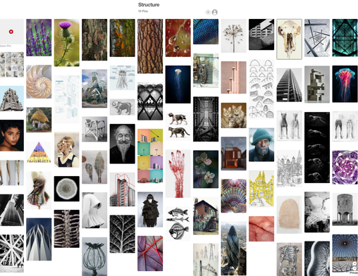
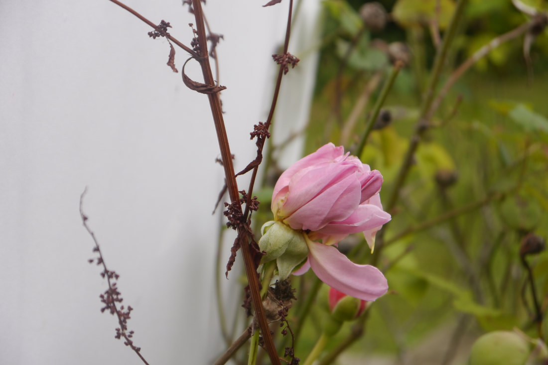
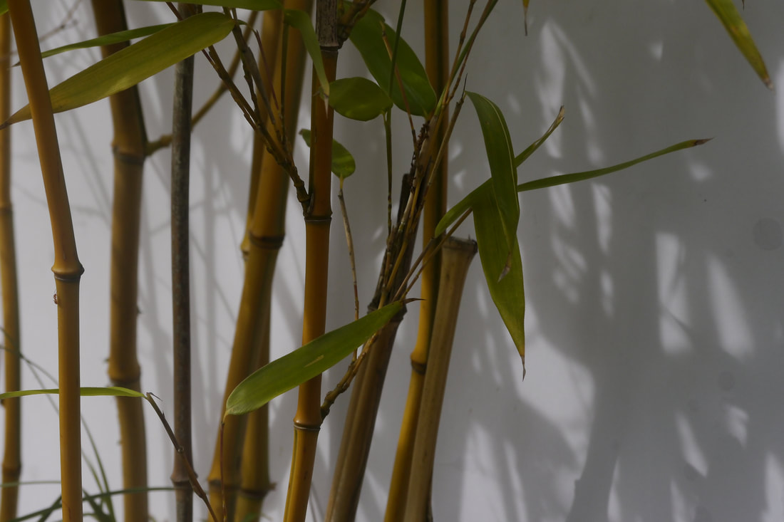
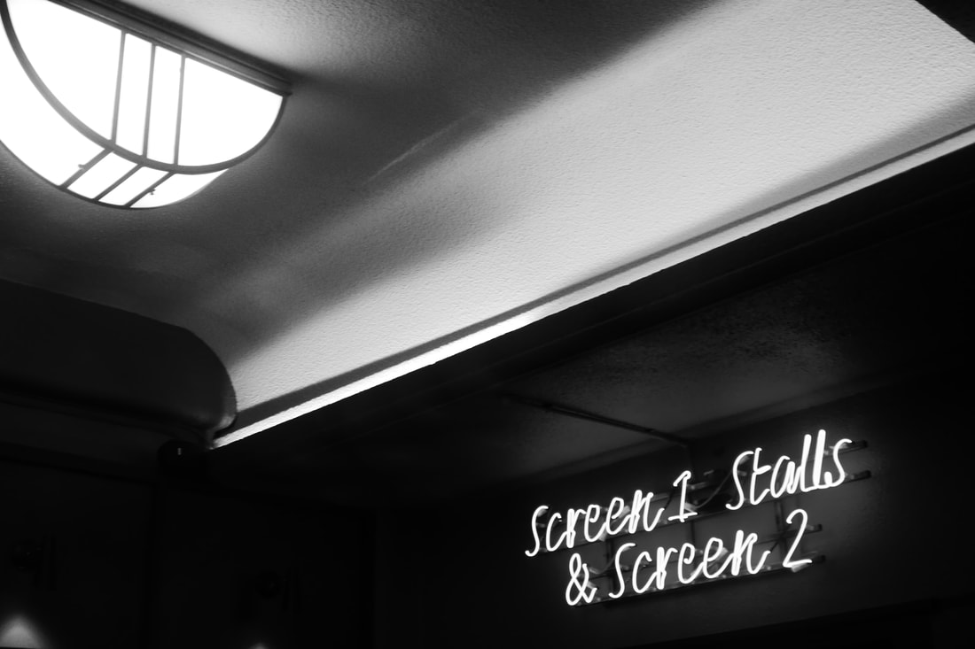
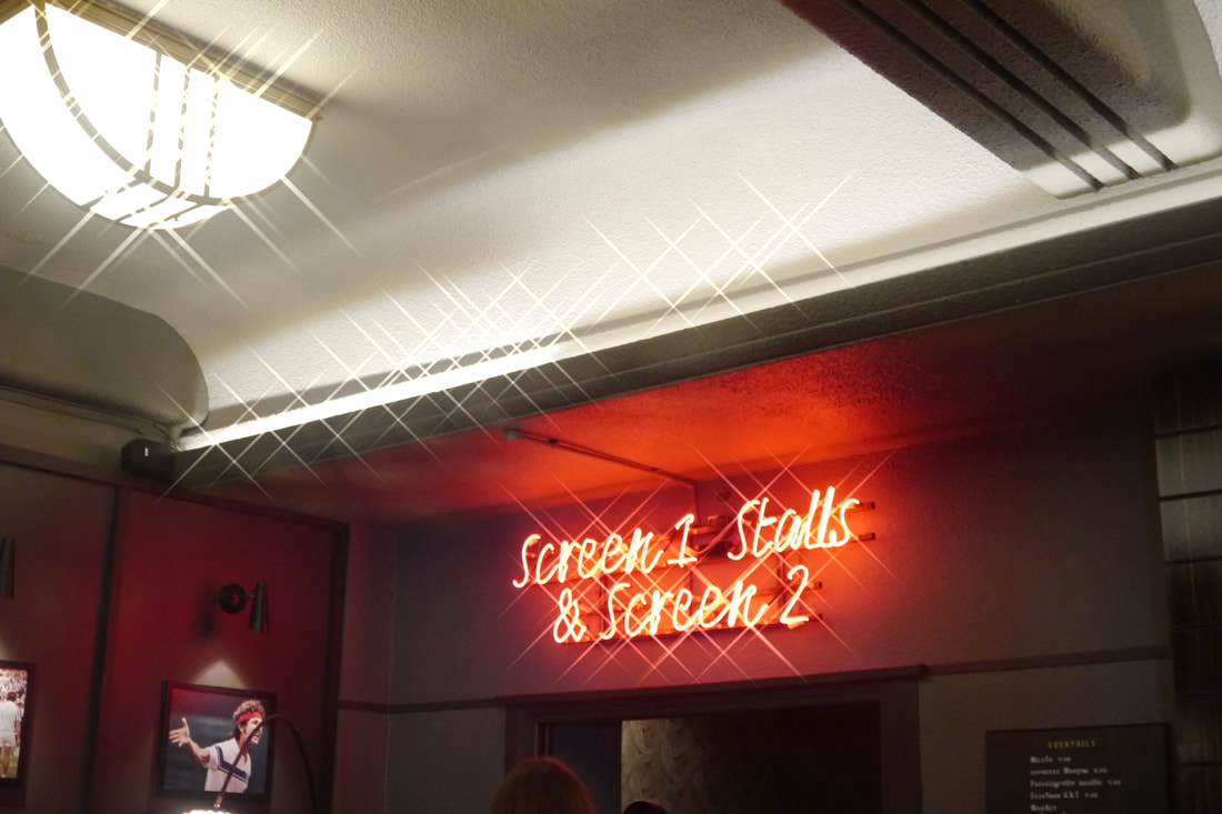
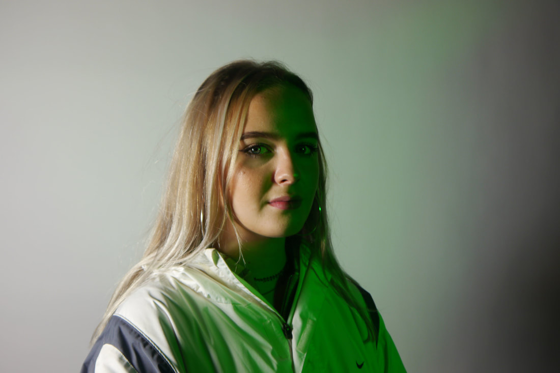
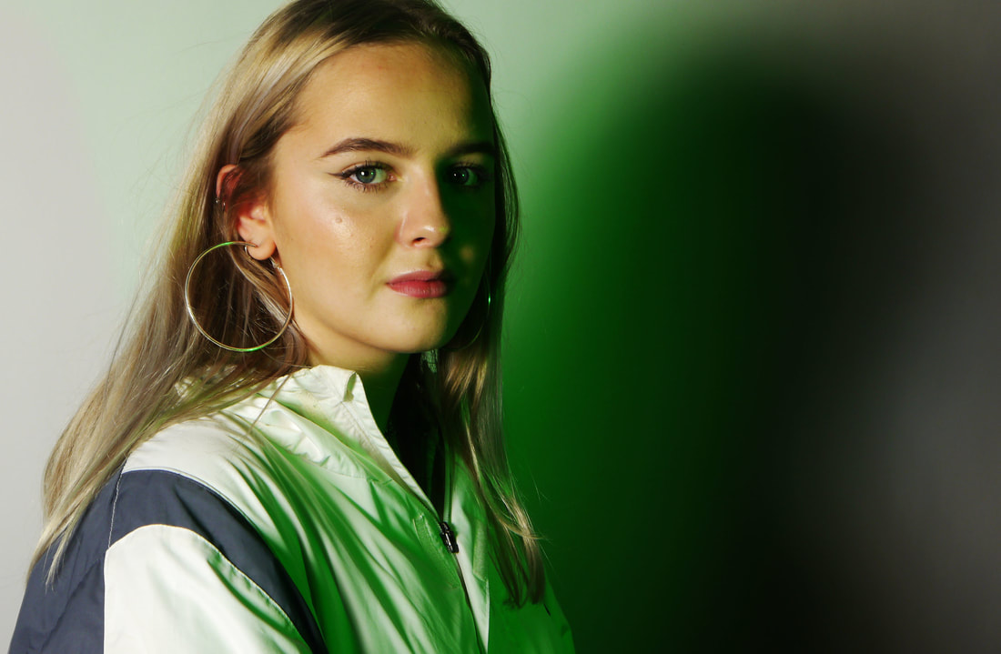
Structure in Nature
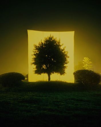
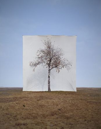
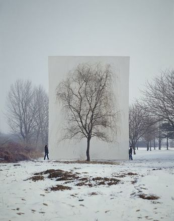
study 1 inspired by :myoung ho lee
Myoung Ho Lee photographs solitary trees framed against white canvas backdrops in the middle of natural landscapes
Myoung Ho Lee, a young artist from South Korea, has produced an elaborate series of photographs that pose some unusual questions about representation, reality, art, environment and seeing.
Simple in concept, complex in execution, he makes us look at a tree and its structure in its natural surroundings, but separates the tree artificially from nature by presenting it on an immense white ground, as one would see a painting or photograph on a billboard.
His works are largely composed by following four procedures:
1. Selection of The Subject
2. Separation of The Subject (meta-subject)
3. Photographing
4. Confirmation of The Separation
The object becomes a ‘separated object’, an ‘ambiguous subject’ and a ‘meta-subject’.
|
|
|
first response
|
|
|
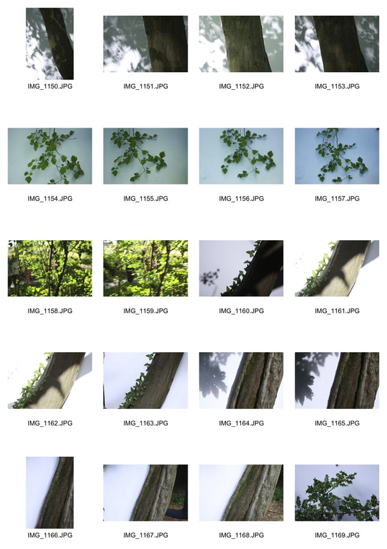
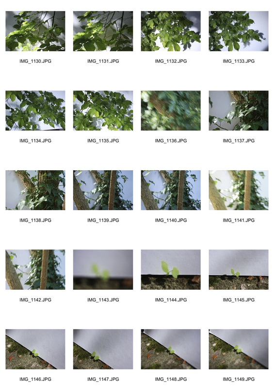
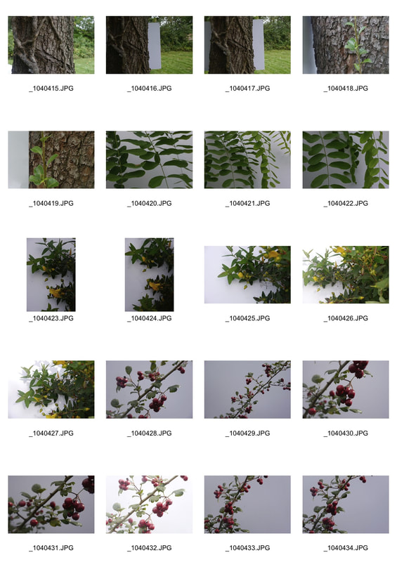
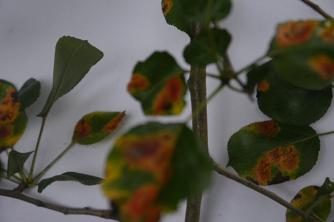
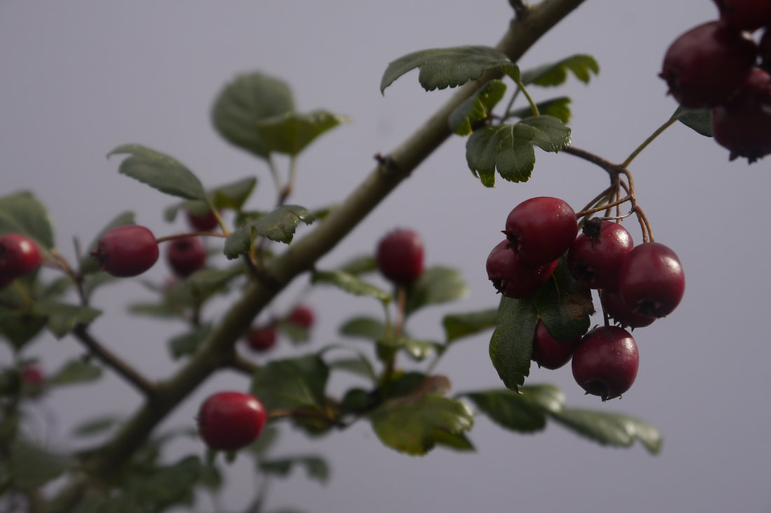
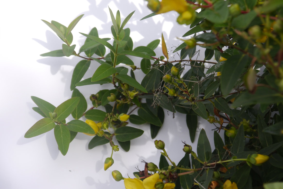
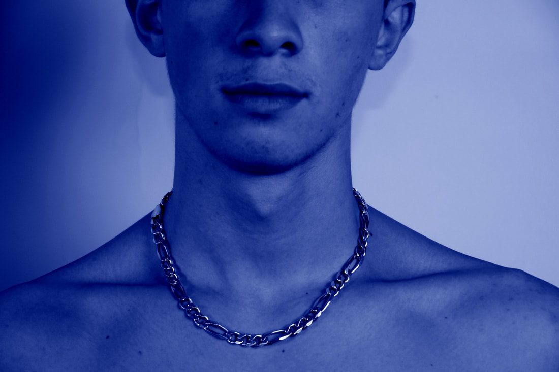
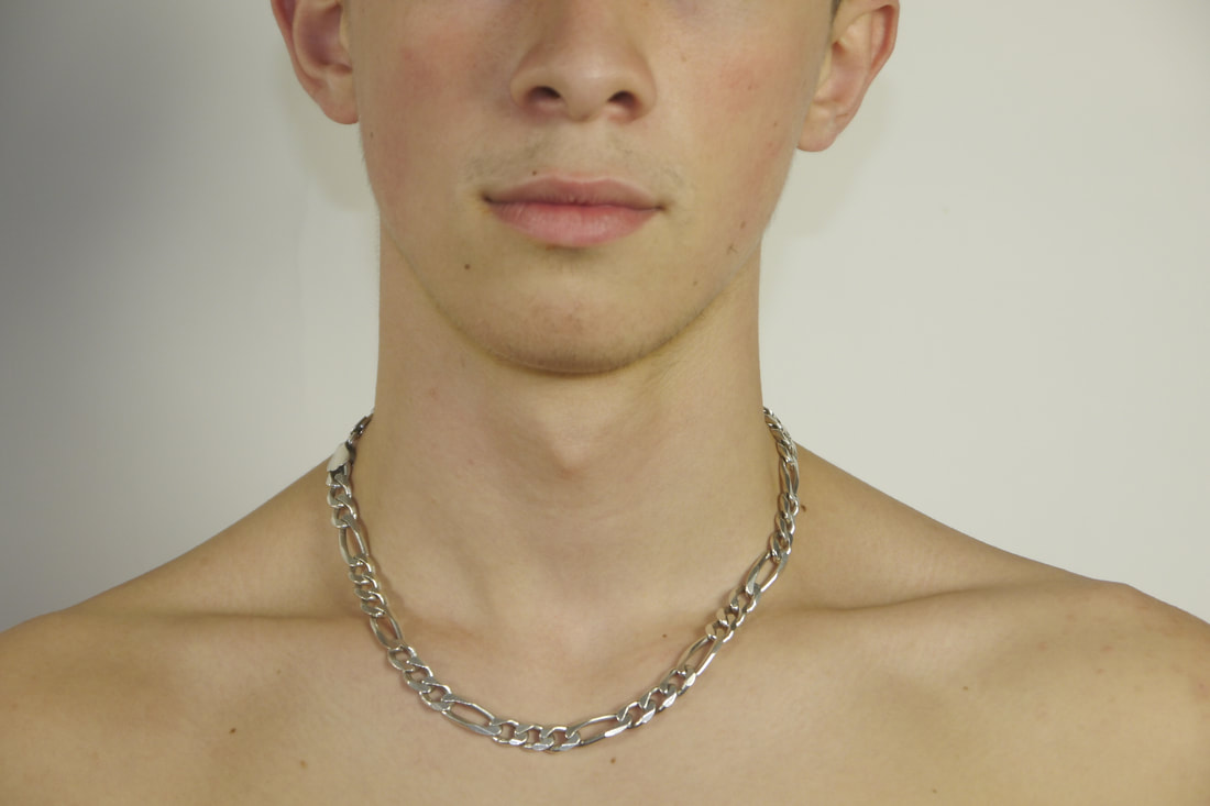
When using Ho Le's work as inspiration, I took a white piece of card out into the natural environment and looked for interesting structures in nature that i could photograph against the white background. I experimented with having the white page fill the frame and also showing the context around which the some photographs were taken.
second response
|
|
|
|
|
|
|
|
|
|
|
|
|
|
|
|
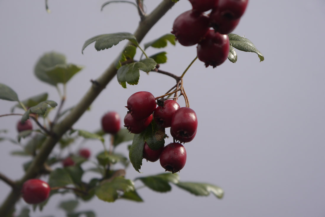
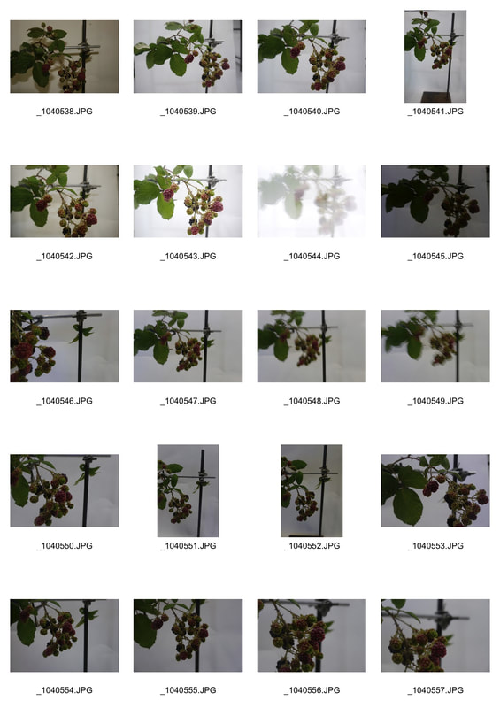
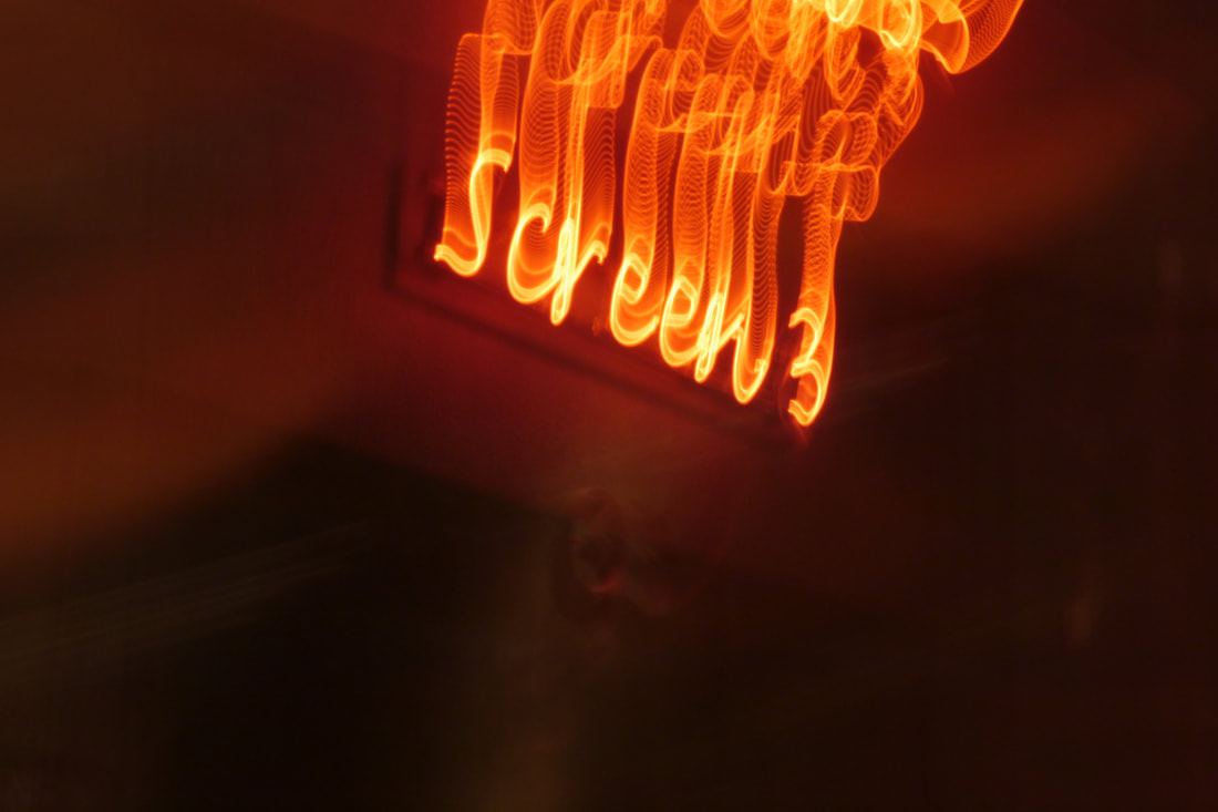
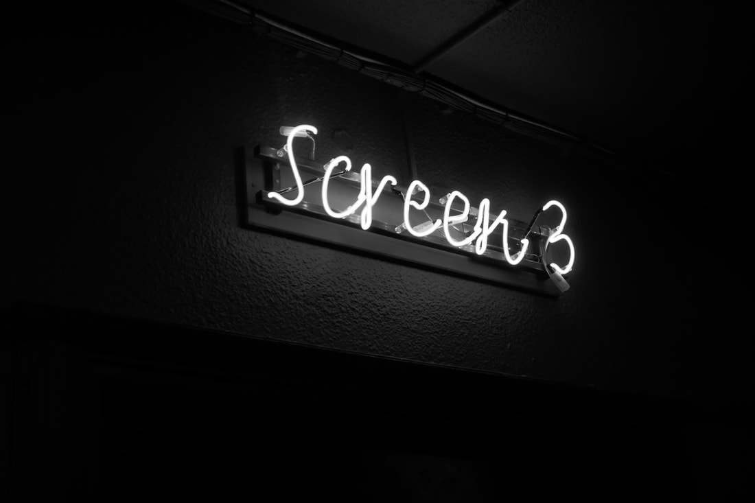
technical focus- aperture and depth of field
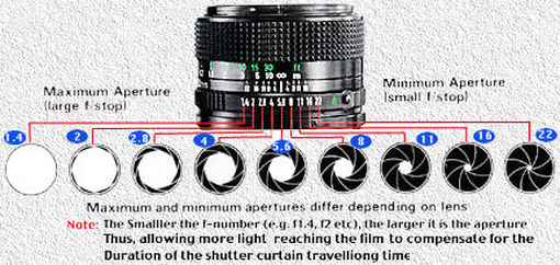
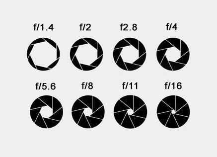
During this task, the technical response used was the adjustment of aperture, to create depth in the photograph or a single pinpoint focus on a particular structure in nature, as the aperture setting used has an impact on the amount of focal range in focus in front and behind the structural subject. Which is known as the Depth of Field. Aperture is measured in f-stops, the lower the f-stop for example f/1.4 the larger the hole in the camera (aperture) which allows more light to reach the film to compensate for the duration of the shutter curtain travelling time thus focusing only on a specific point of the picture, often blurring the background. Whereas when using minimum aperture, at the other end of the aperture ranger, for example f/22, less light is allowed into the camera as the hole is smaller- which allows the camera to focus on all of the subjects inside of the frame.
|
|
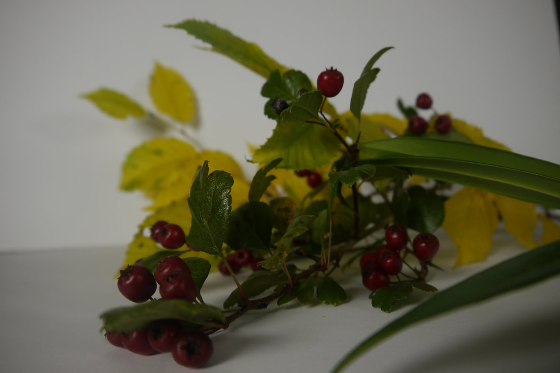
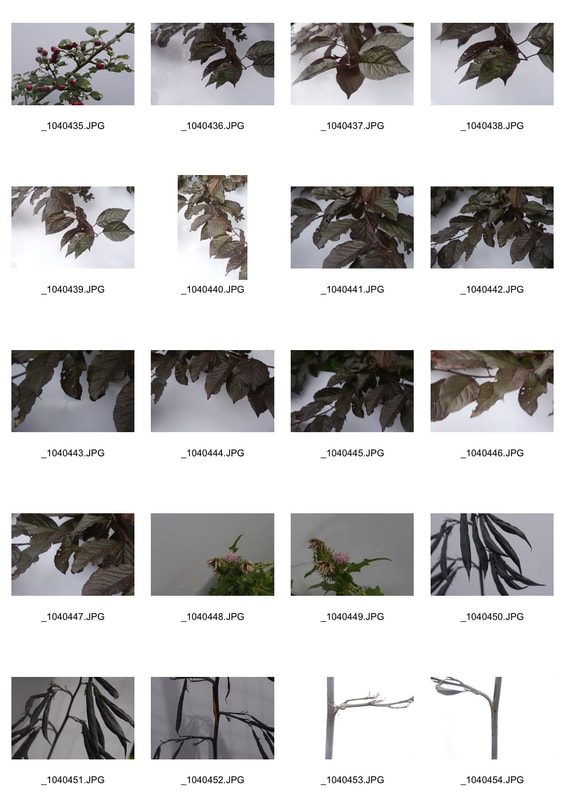
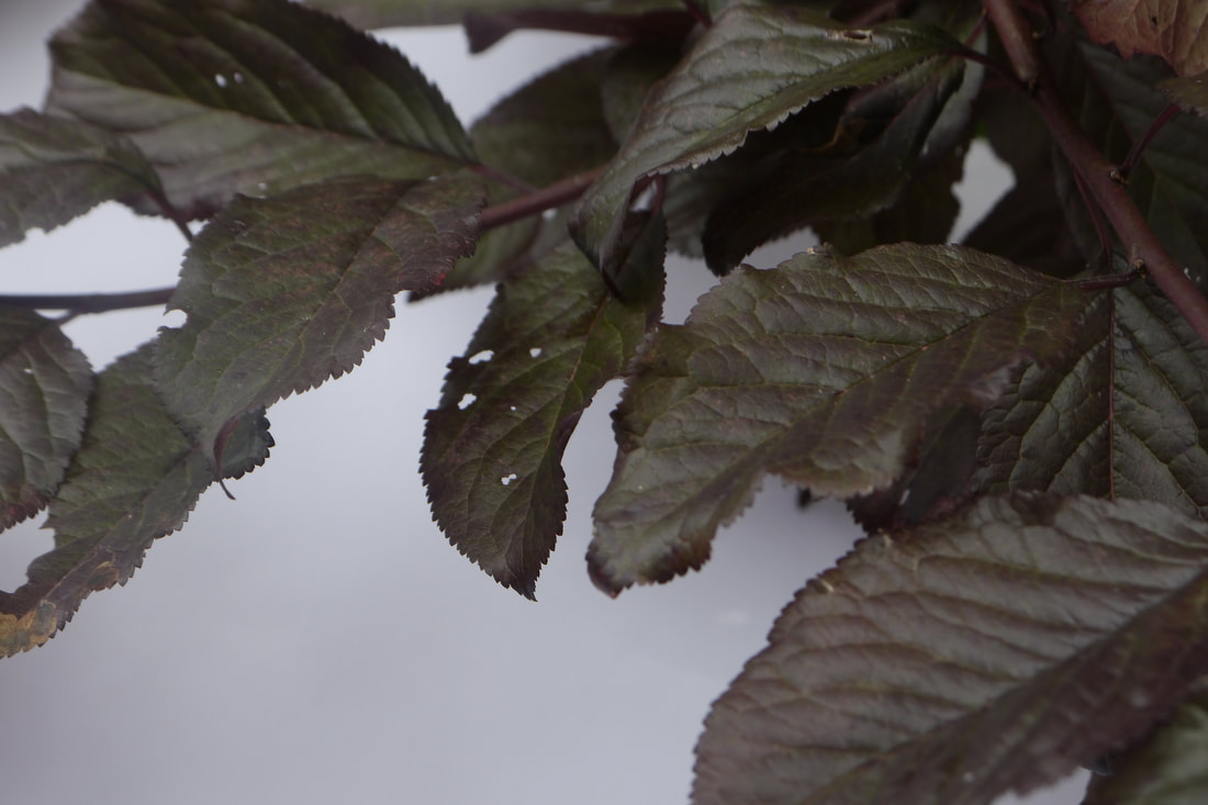
In this first photograph of the study,the aperture is set to f/3.6. Which means that as much light as my camera would allow was entering the film yet the picture is dark as my camera compensated aperture to the IOU. Yet as you can see the effect of the big aperture was that the berries were beautifully focused on, whilst the yellow leaves and dark green leaves going across the right bottom corner are blurred, thus adding depth to the photograph and adds distance within the picture as the berries are brought forward as they are might by your eyes first, whilst the blurred yellow leaves are sent to the back of the frame. |
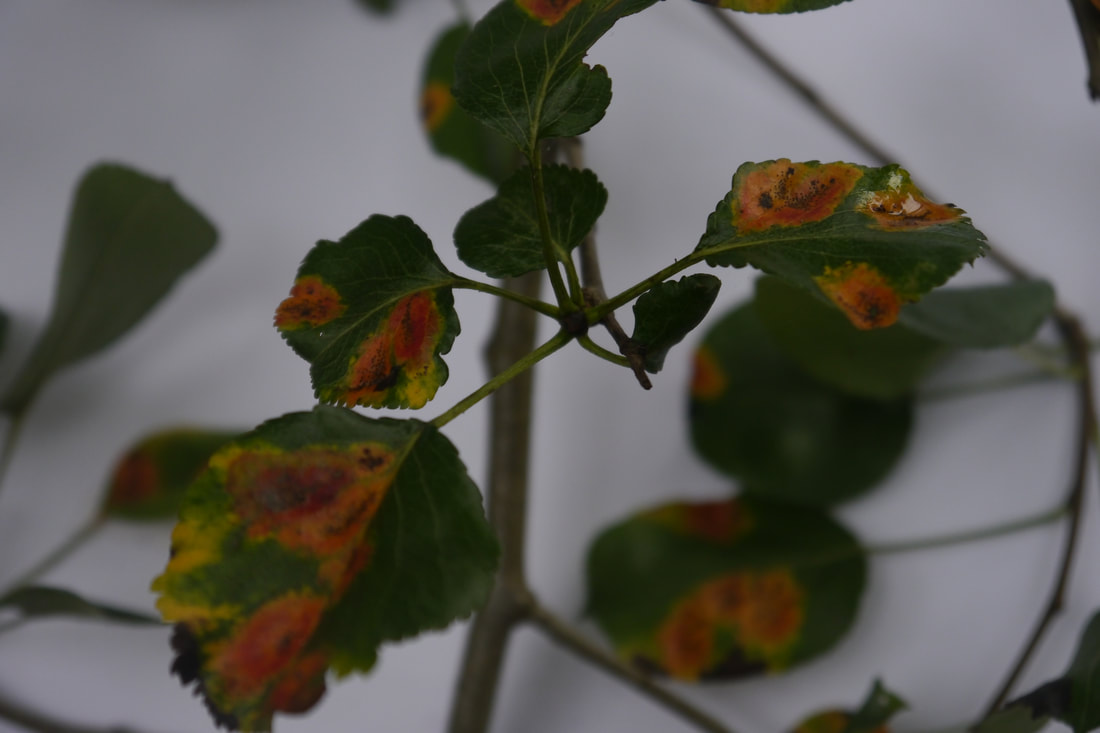
In this second photograph, i adjusted the aperture to f/13, which means that less light was allowed into the camera, thus improving the focus on all of the leaves and berries inside of the image. The difference in aperture is particularly shown in the change in focus of the yellow leaves in the background in this picture compared to the first picture. As you can see the structure of the leaves and their veins are beginning to be shown and the long green leaf's outline , across the bottom right corner of the photograph, is no longer blurred as it was with f/3.6.
|
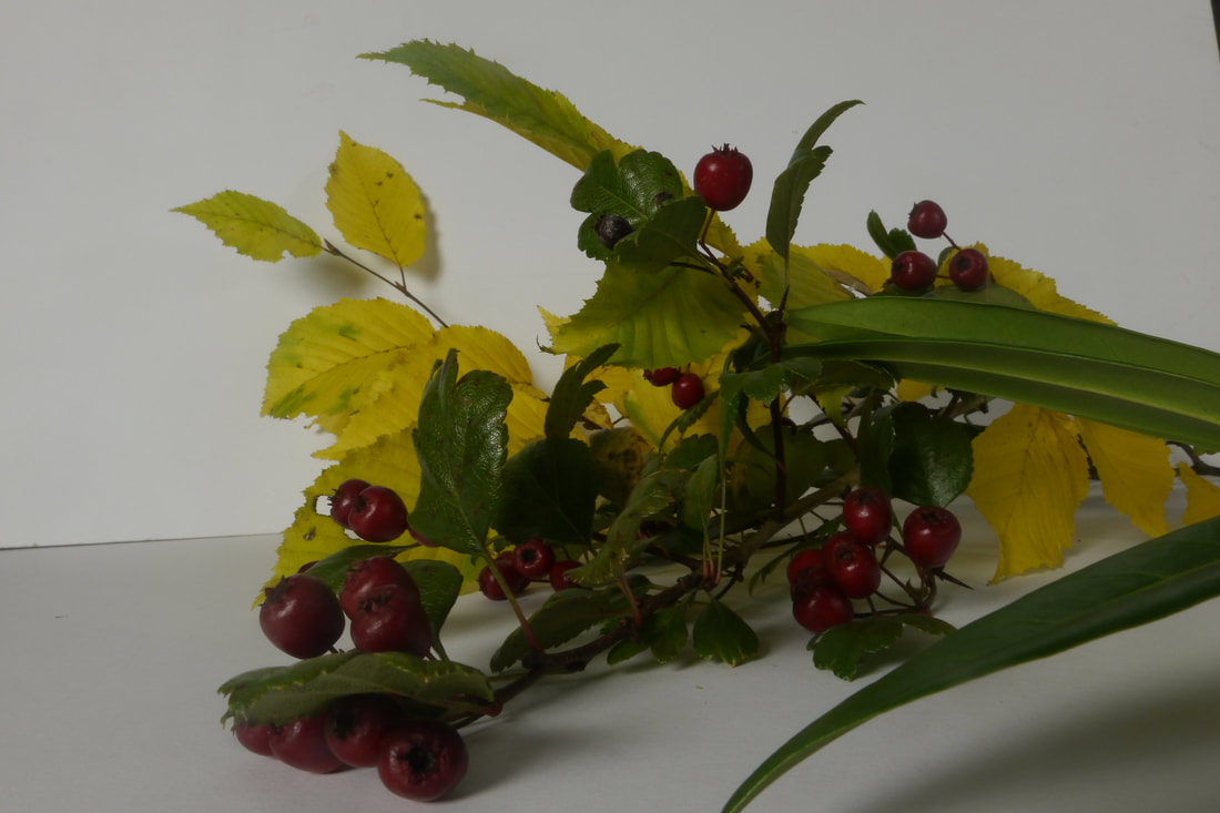
In this final photograph of this technical study, the aperture is set to f/22. Which means that the camera's hole was as small as my camera would allow, therefore letting the least possible amount of light into the photograph. Which allows all of the plant subjects inside of the frame to be focused; which without the shadows within the picture would come across as 2D. Yet this extreme amount of focuses means that the outlines of all of the leaves are shown and the vein and details within each leaf are brought to the viewers eye, whereas in comparison to the first photograph they are completely blurred and pushed to the back of the picture. |
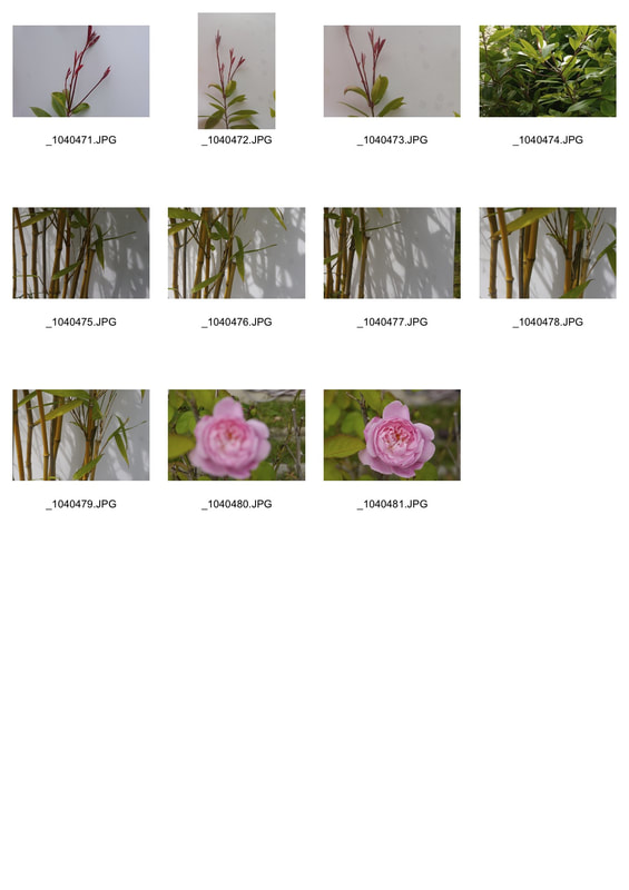
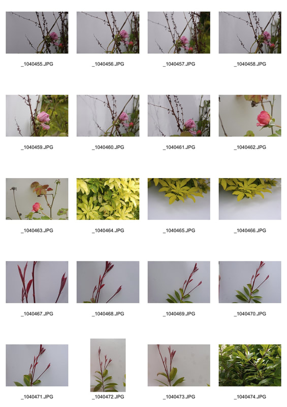
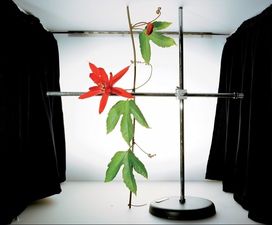
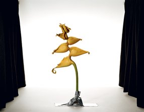
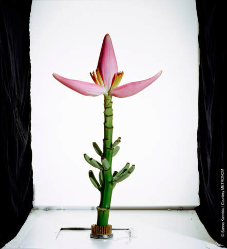
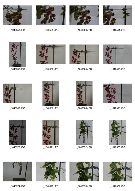
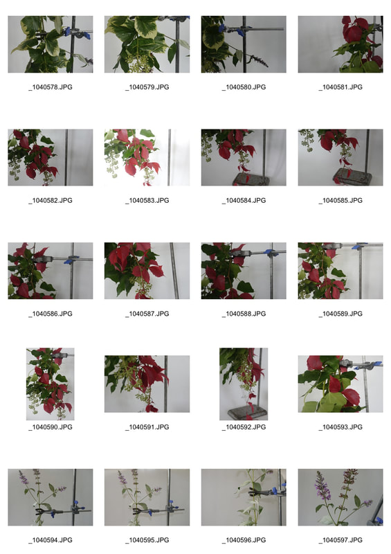
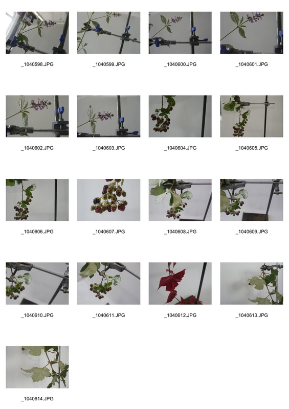
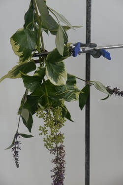
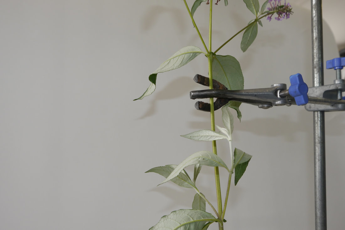
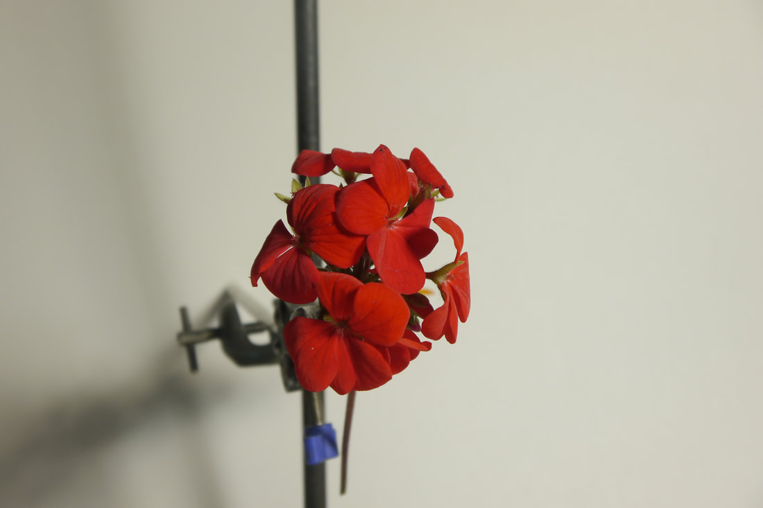
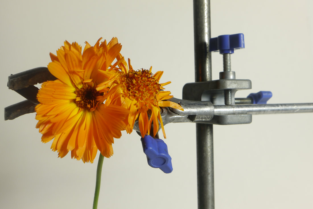
study 2 inspired by- Sanna kannisto - Field works
The core practice of the natural sciences is to collect in order to inspect more closely. Collecting implies taming and containment, traits shared to some extent by photography. Breaking away from the conventions of scientific documentation, which typically presents specimens in isolation and devoid of context, Kannisto’s work addresses the acts of staging and image-making. Her photographs, with their biologically correct titles, show not only the breathtaking beauty of nature, but also the tools used to achieve the would-be image at center—the velvety black drapes at each side, the difficult “neutral” lighting rig, the seamless white background.
|
|
first response
|
|
|
|
When doing this task, i chose flowers from around my garden to add a personal link to the photographs and put them in the scientific apparatus of a clam, in front of a white background. This created an artistic representation of their natural structure, the beauty of each plant, in contrast to the man made scientific structure of the clamp. Yet i was slightly disappointed with my photographic results as i felt that all of my pictures were quiet dark in comparison to the vibrance of Sanna Kannisto's pictures.
|
|
|
|
|
second response
i felt that the first set of photos i took inspired by sanna kannisto were quite dark and bleak so i retook some photos with more vibrant flowers and i higher aperture and iso.
|
|
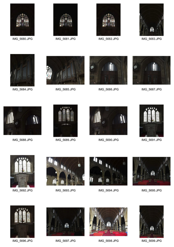
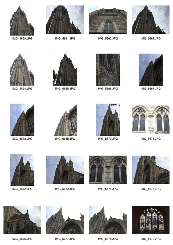
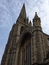
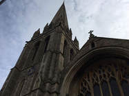
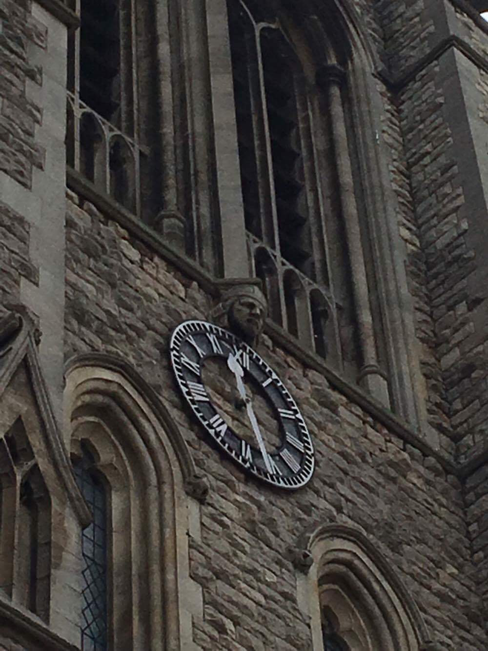
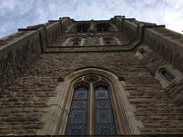
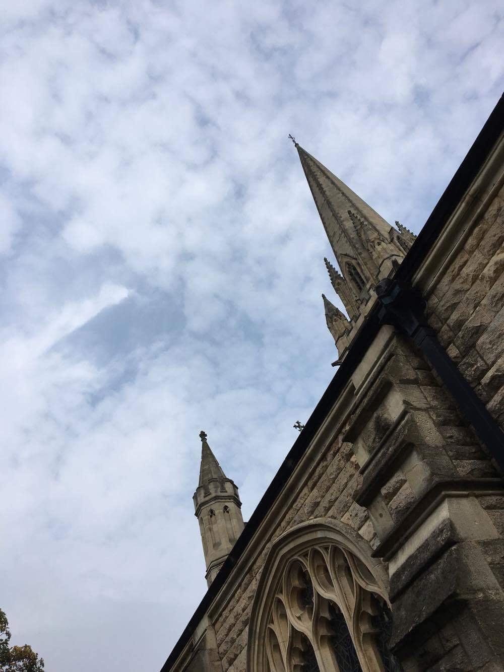
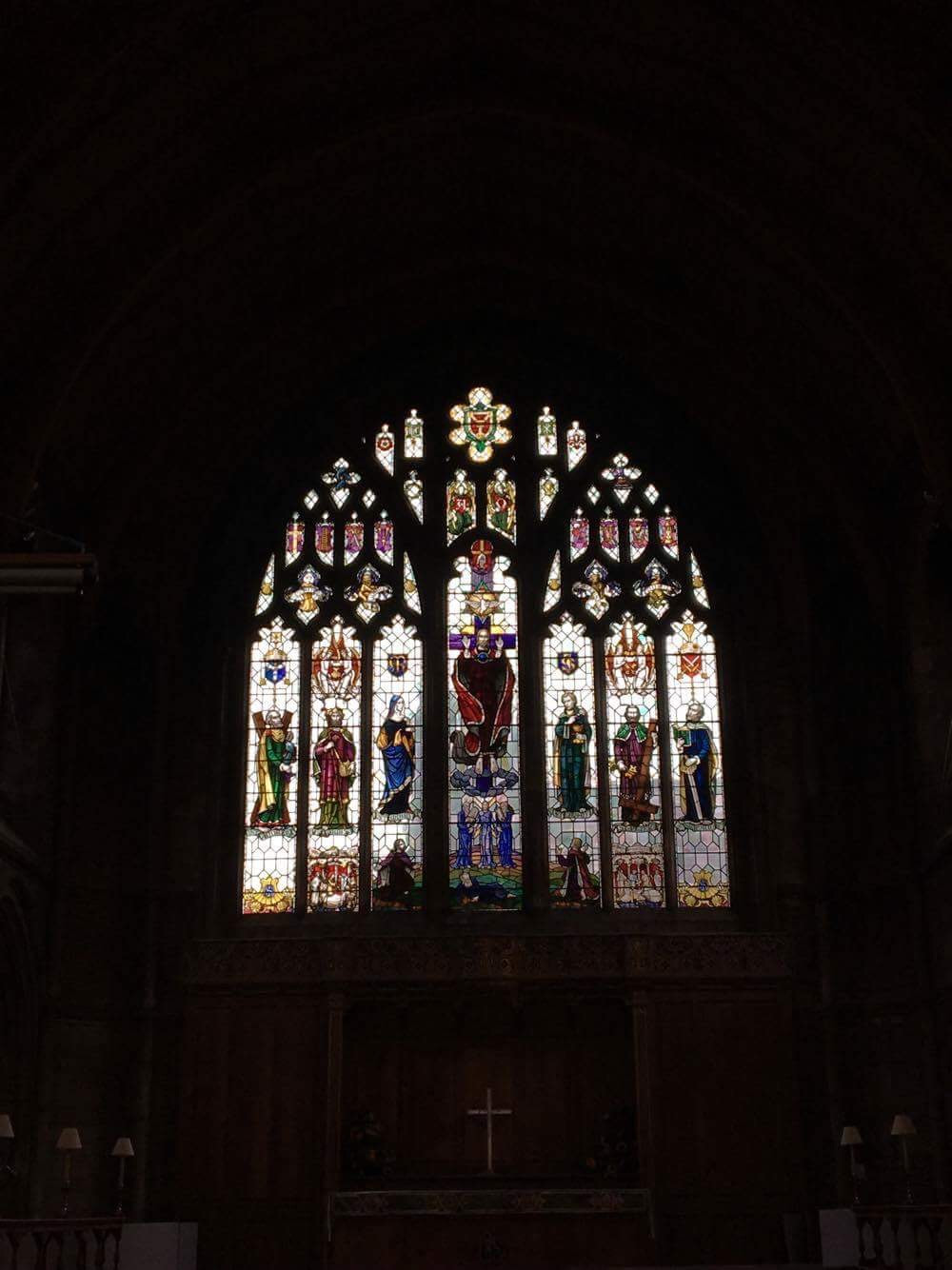
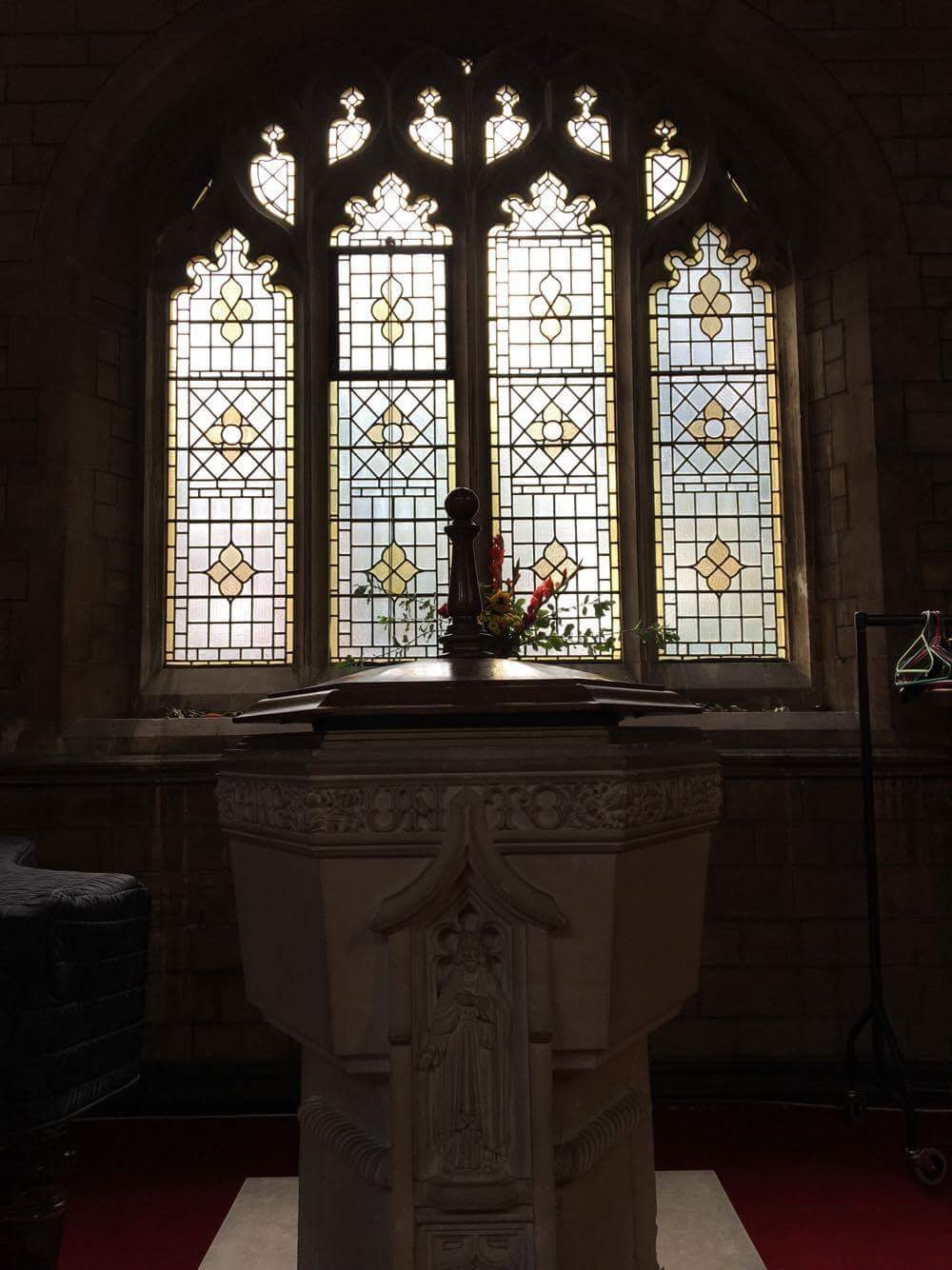
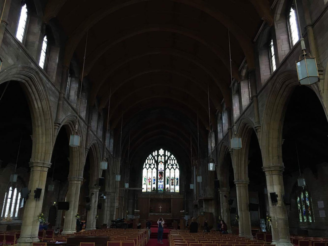
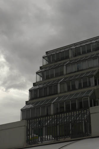
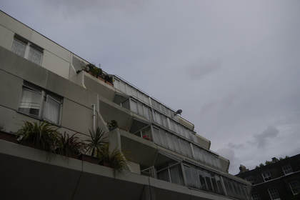
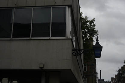
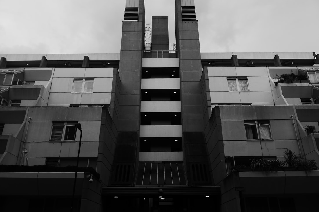
structure in architecture
|
|

|
|
|
|
|
|
|
|
|
|
|
|
|
|
|
|
|
|
|
|
|
|
iso study
|
|
|
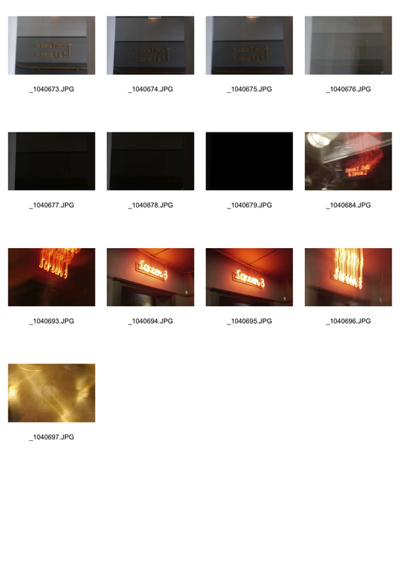
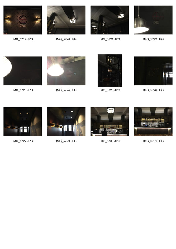
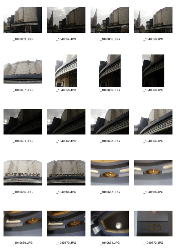
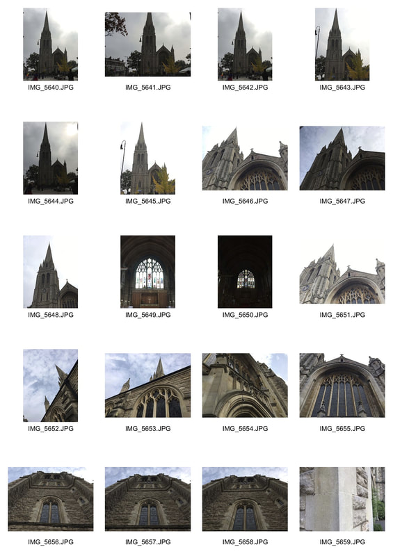
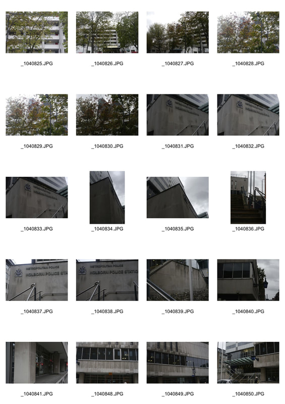
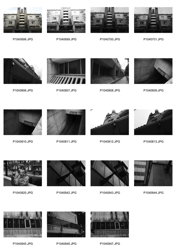
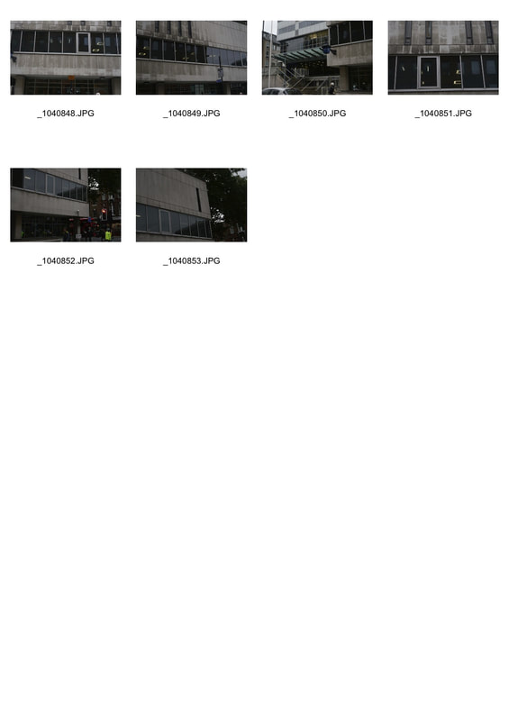
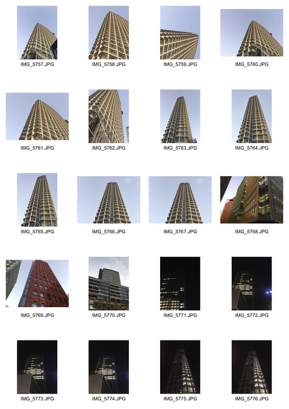
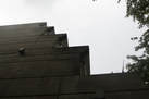
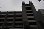
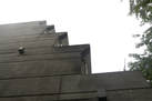
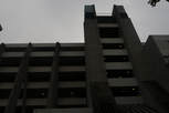
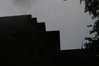
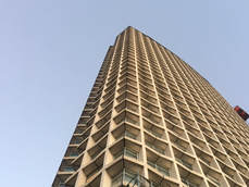
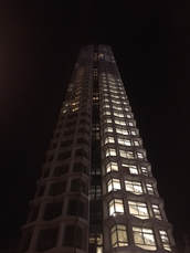
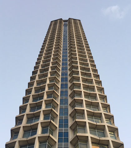
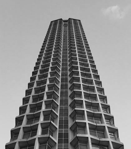
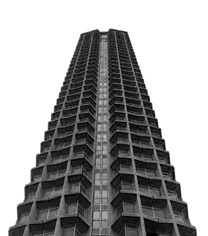
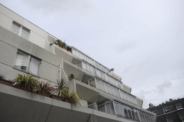
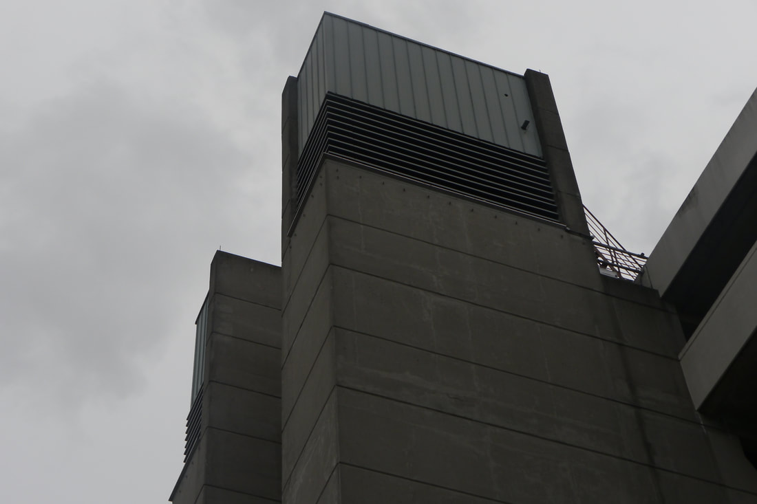
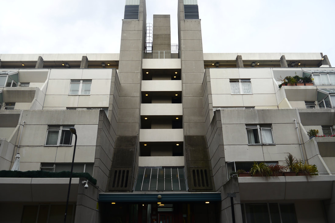
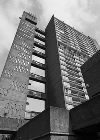
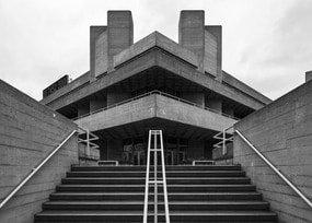
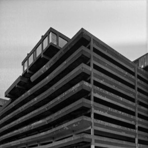
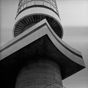
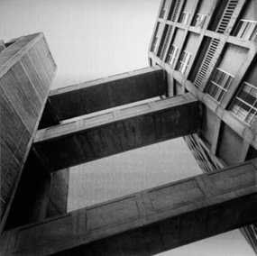
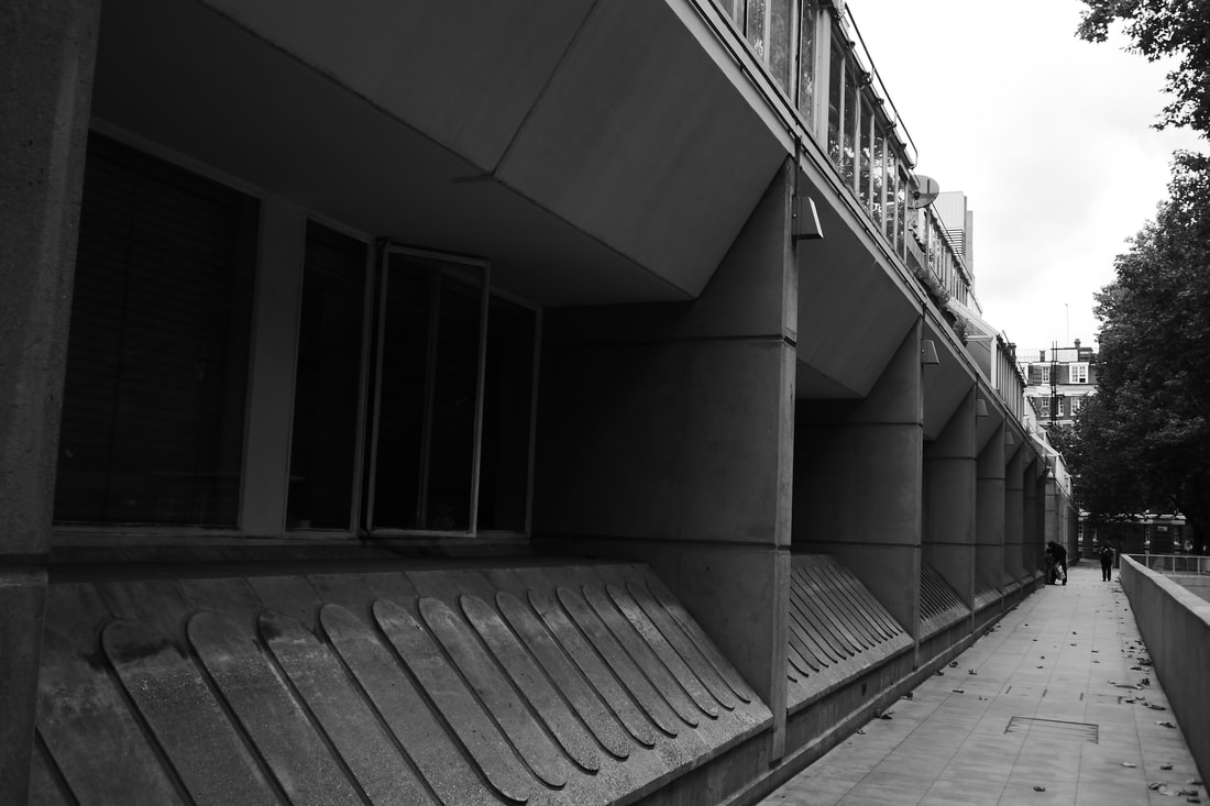
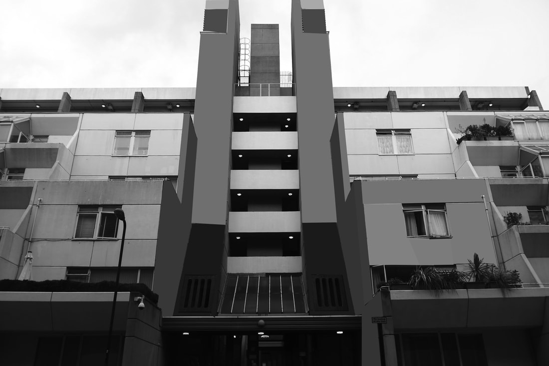
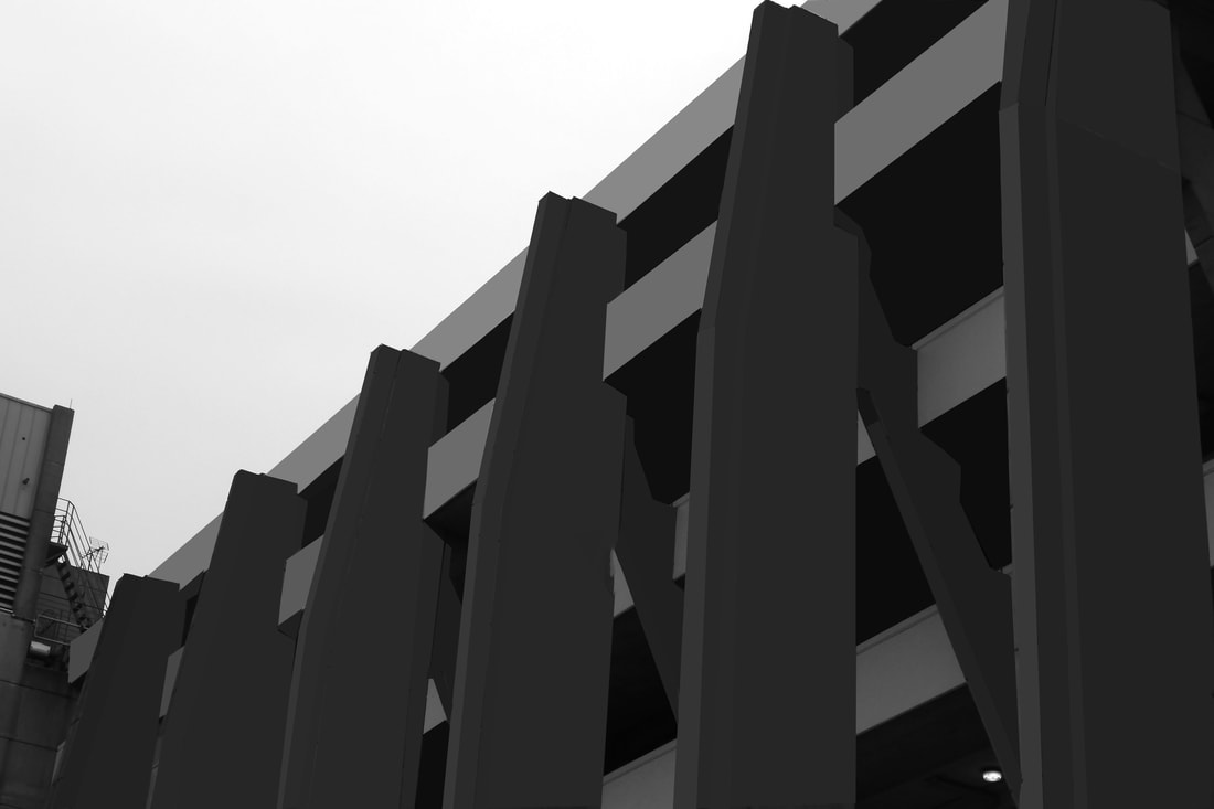
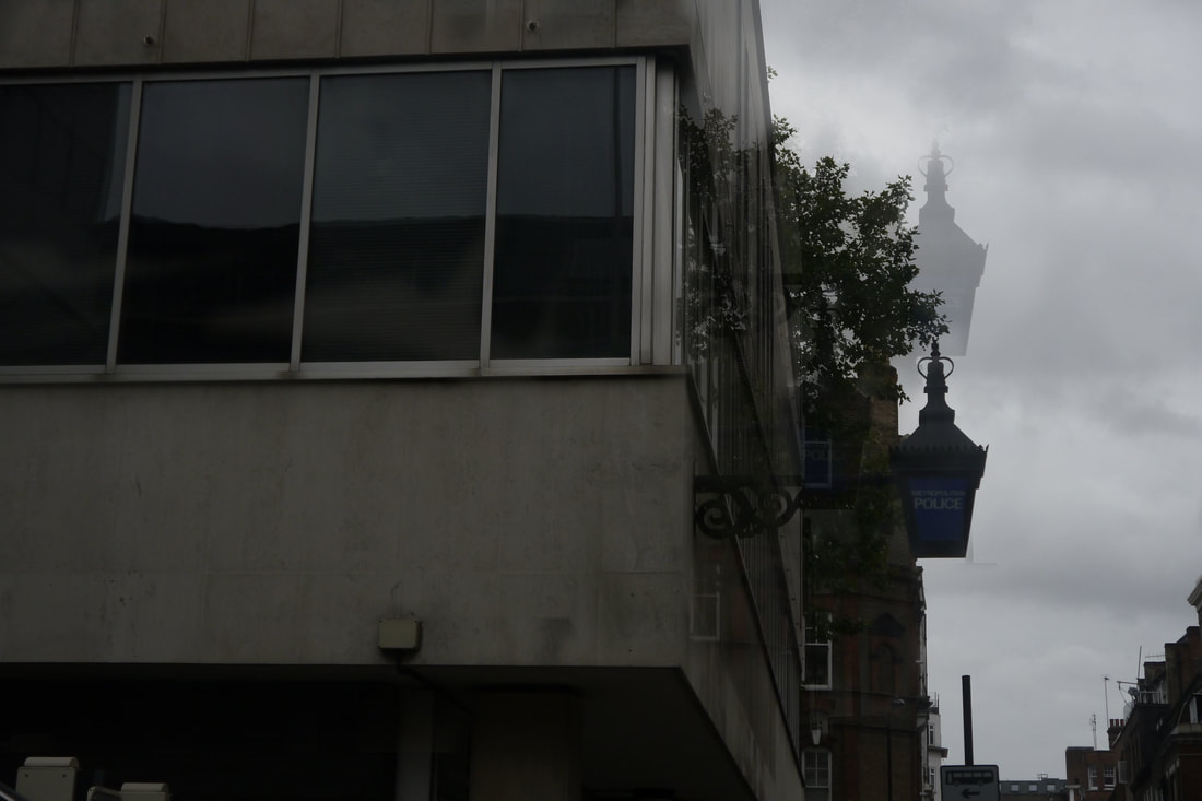
brutalist structures
|
|
|
|
|
|
|
|
|
|
|
|
|
|
|
|
|
|
|
|
|
|
|
|
|
|
|
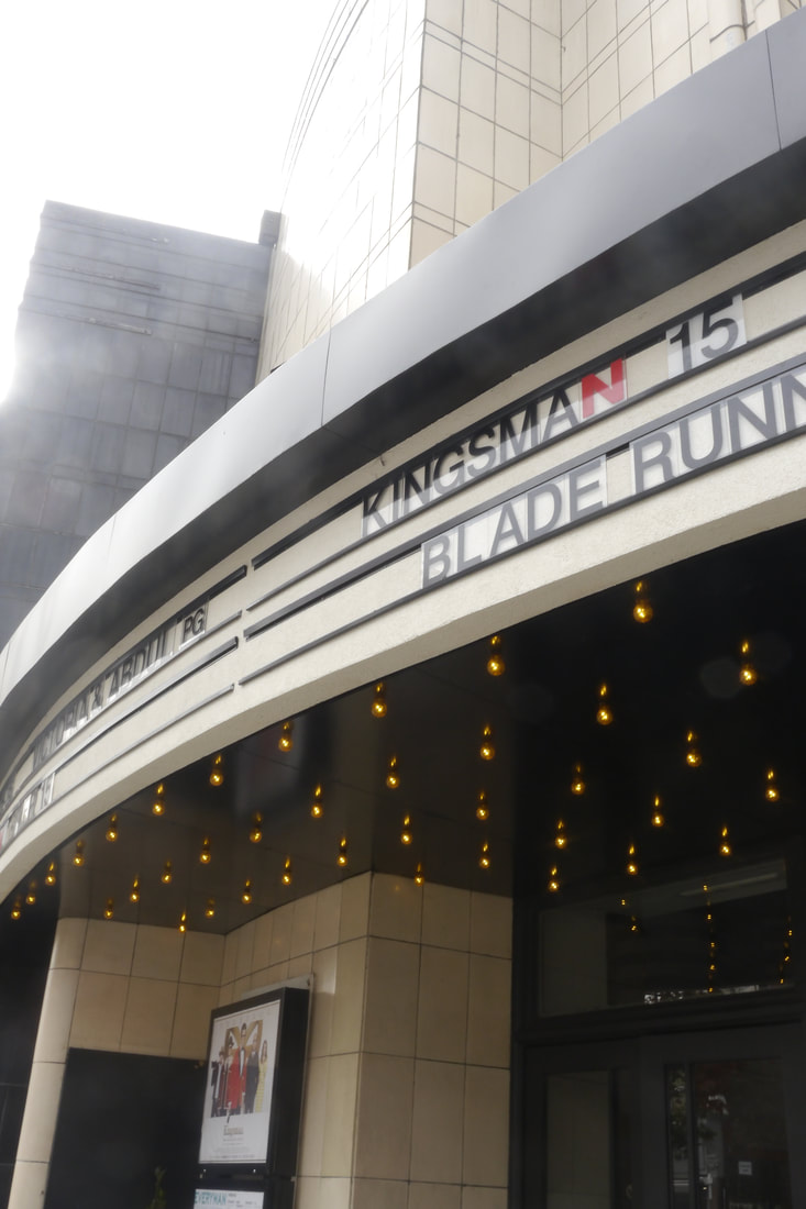
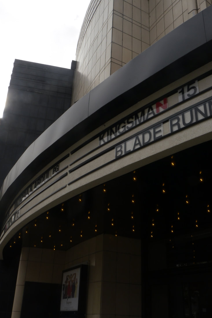
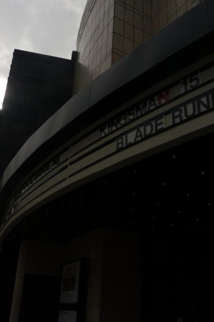
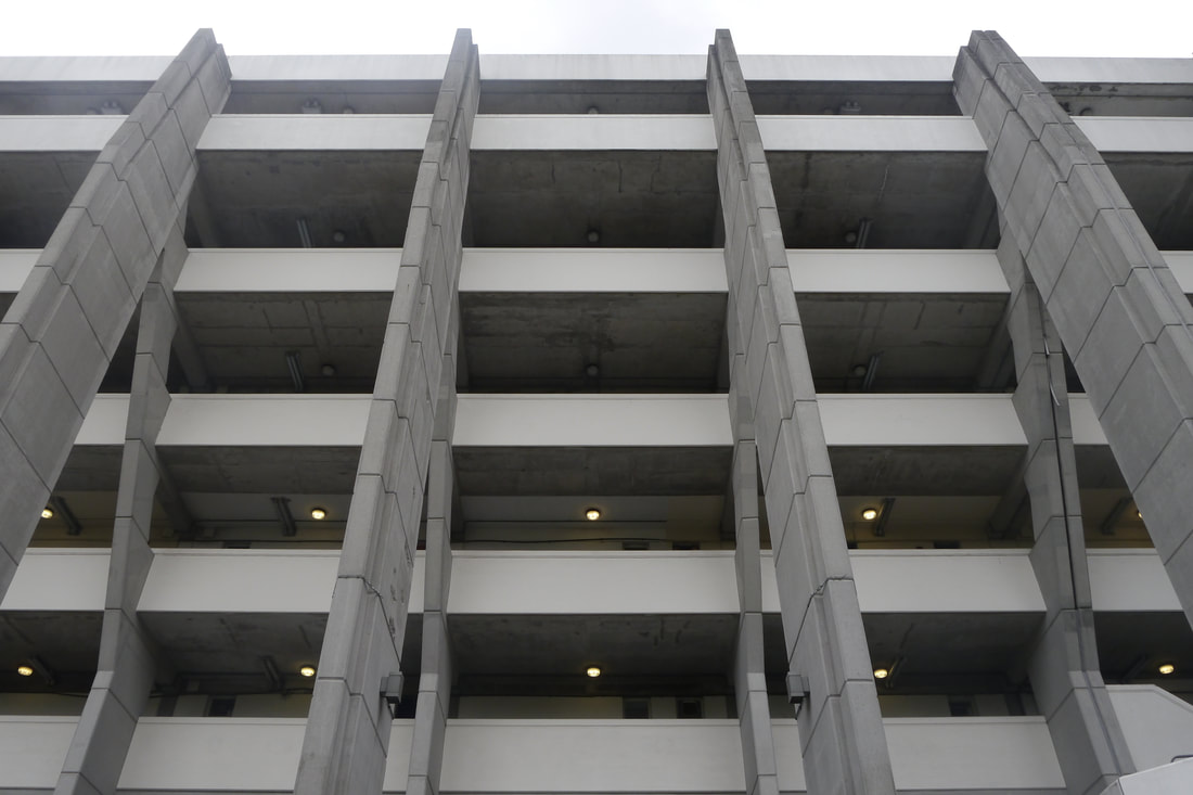
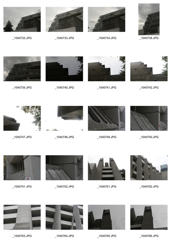
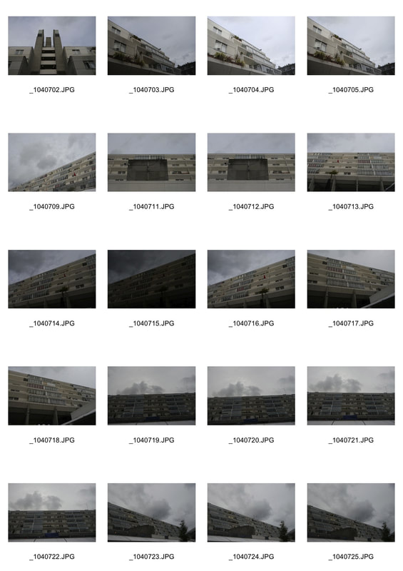
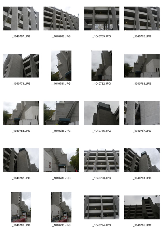
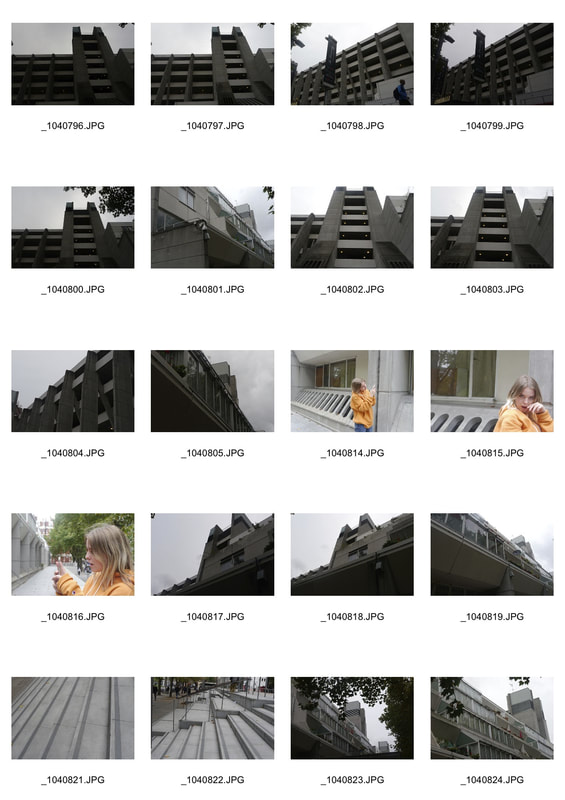
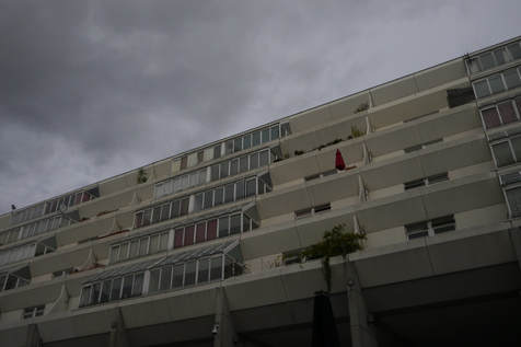
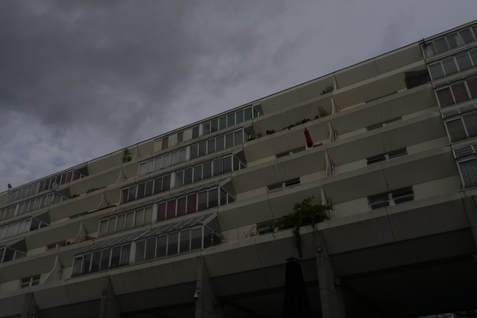
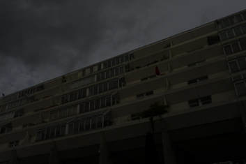
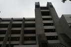
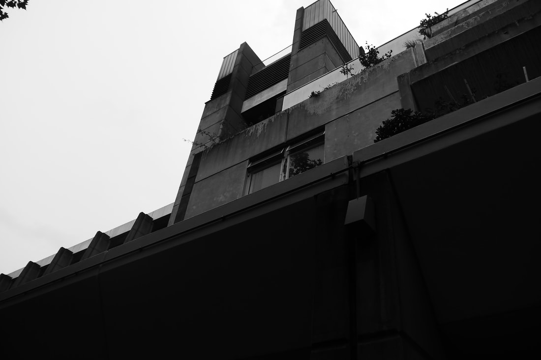
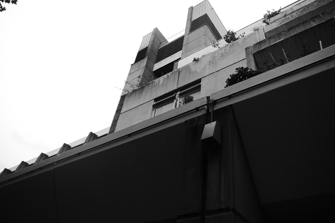
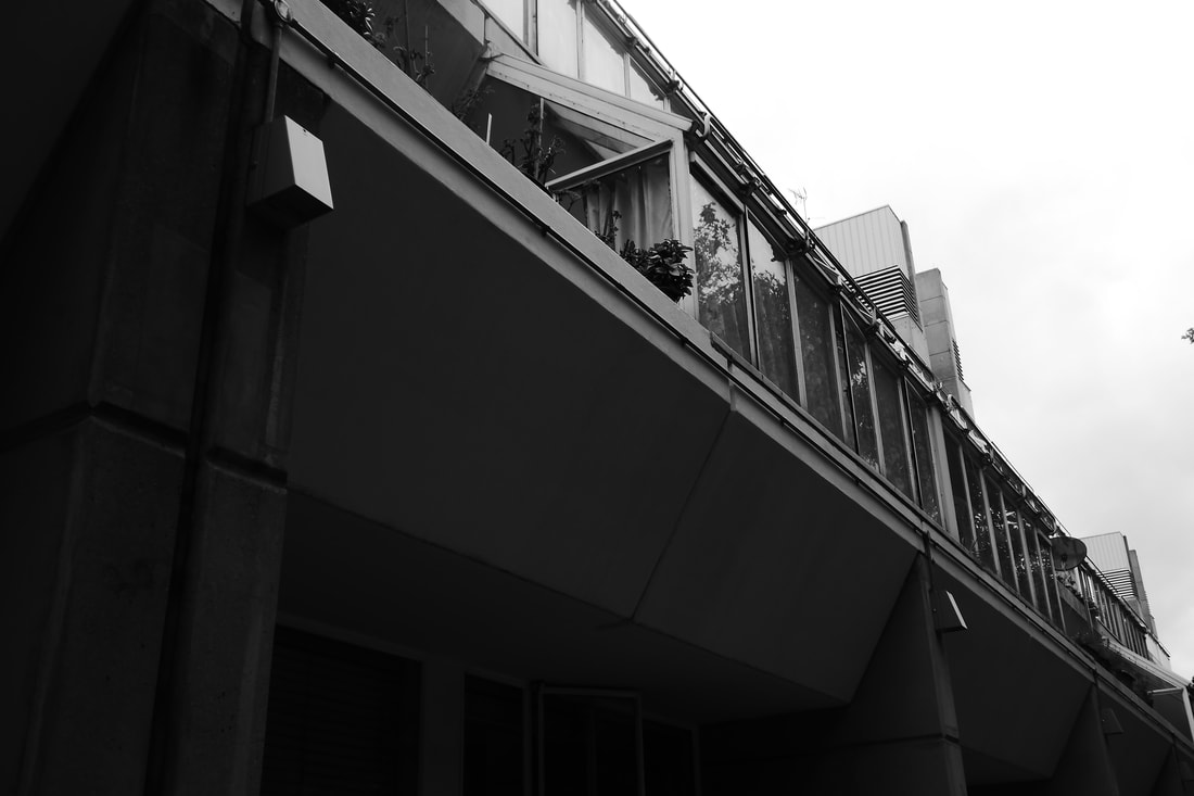
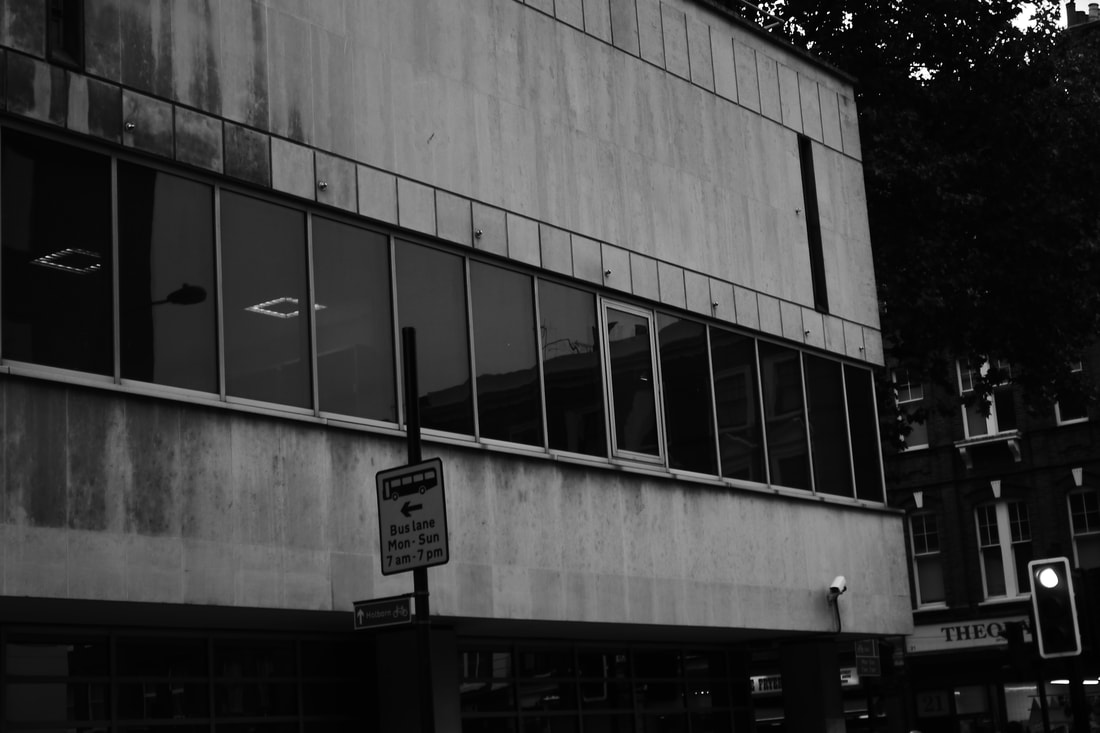
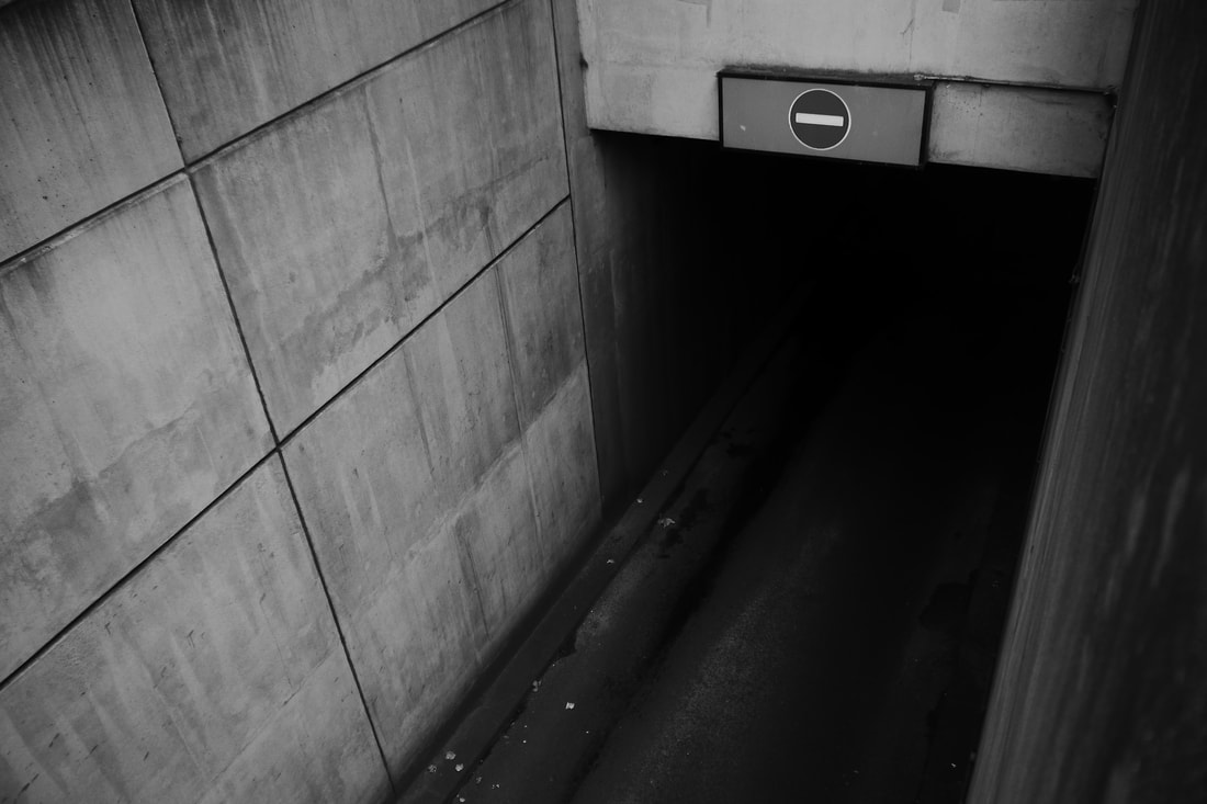
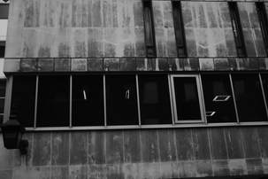
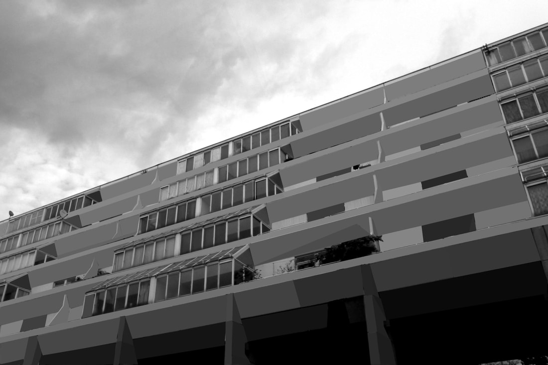
"The city’s changing architecture is a kind of memorial of humanity’s endeavours and schemes, for all buildings have been fashioned according to the ideologies of their days".
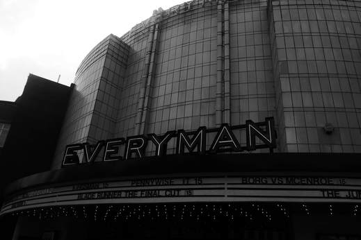
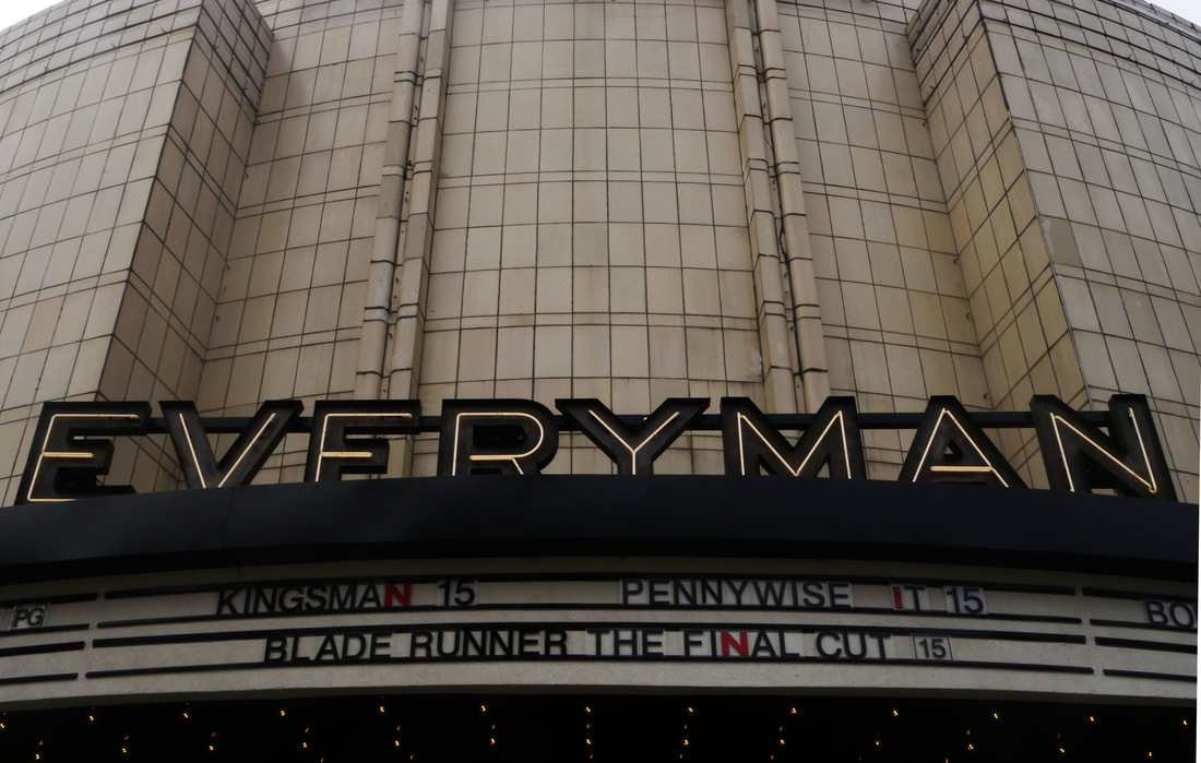
The term Brutalism was derived from the French ‘Béton brut’, or raw concrete, was a term coined for the futurist architecture being created by Le Corbusier and others like him. From this label the term Brutalism was created as a way to classify this style of architecture.The expression became associated with a movement emerging in postwar British architectural offices. The architecture itself is characterized by the large size of the buildings and the use of raw unfinished concrete. Brutalist buildings also make use of geometric forms in a way to attempt to communicate the buildings function and what the rooms behind the slabs of concrete are used for
The photography by Simon Phipps provides a unique perspective and portrays Brutalist architecture in a sensitive, realistic and distinctive manner. Phipps has spent the last 15 years photographing and documenting Brutalist and buildings in the UK, creating a survey of photographic images that demonstrate the breadth of this contentious architectural style.
|
|
|
|
|
|
|
|
|
|

|
|
|
|
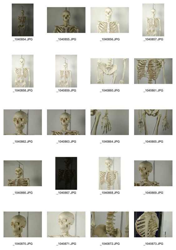
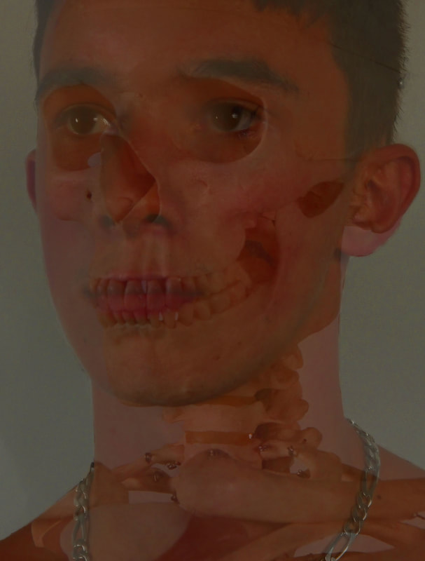
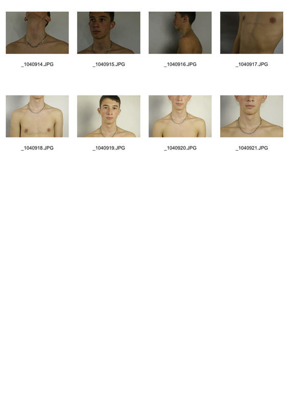
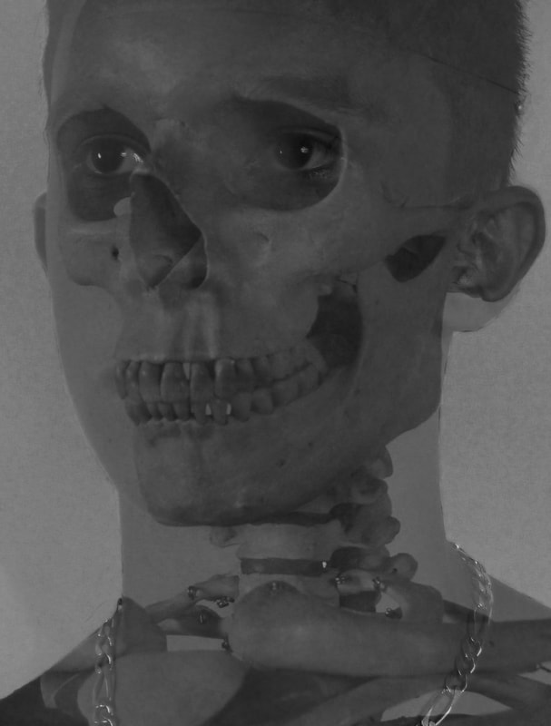
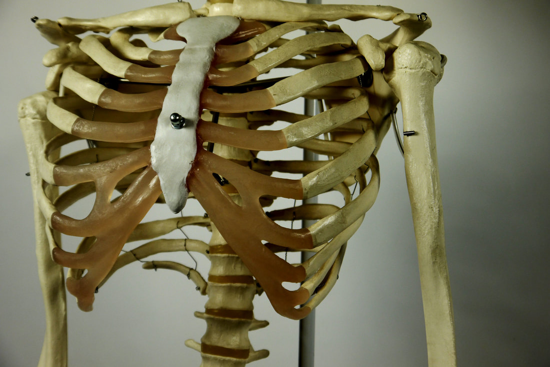
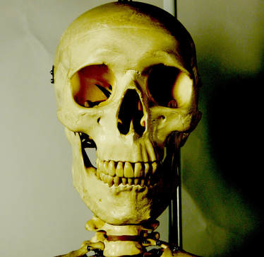
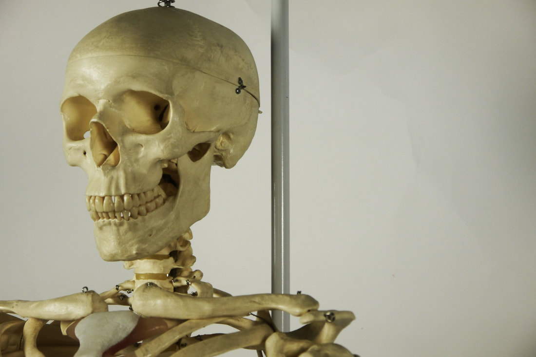
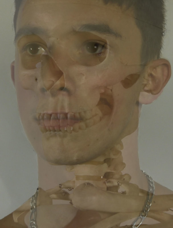
structure of the body
|
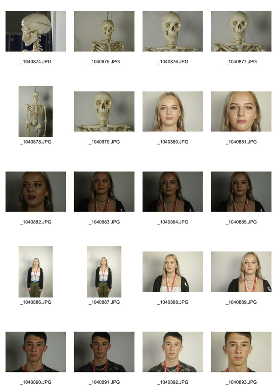
|
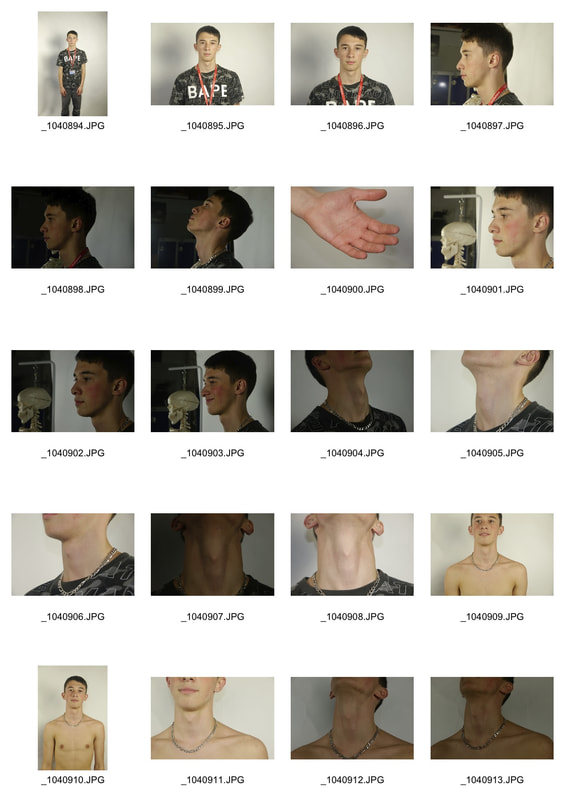
|
|
|
|
|
|
|
|
|
Responses to the theme
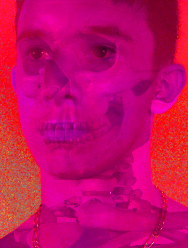
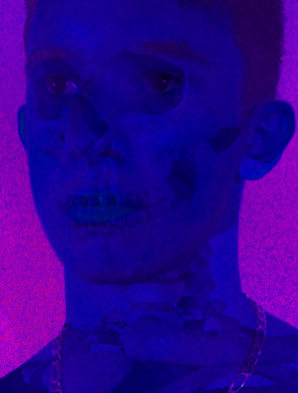
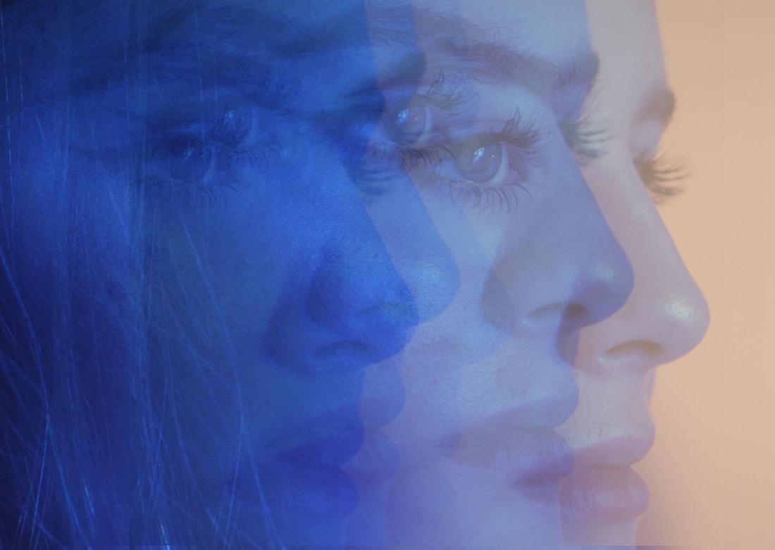
Strand 1- layered and disfunctional structure
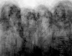
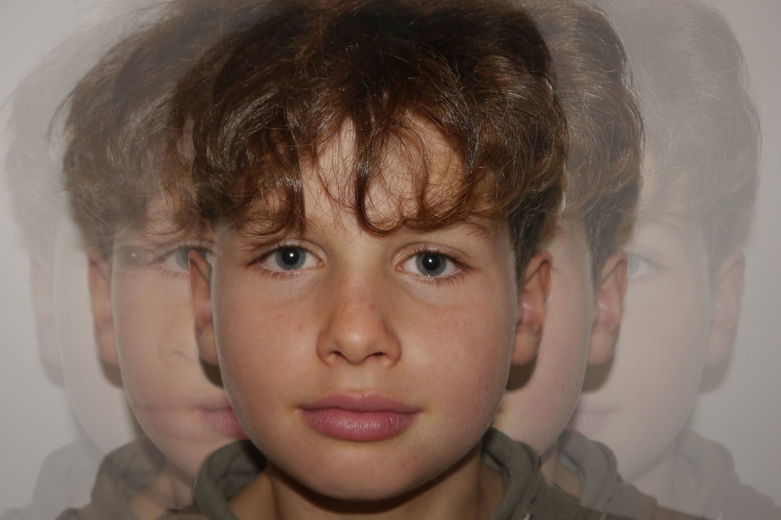
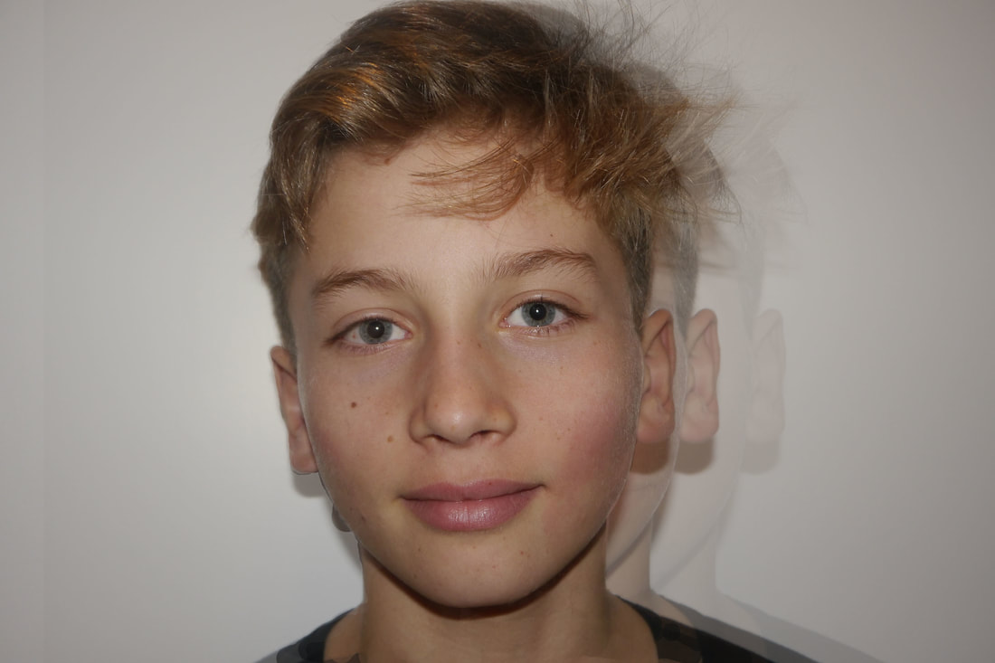
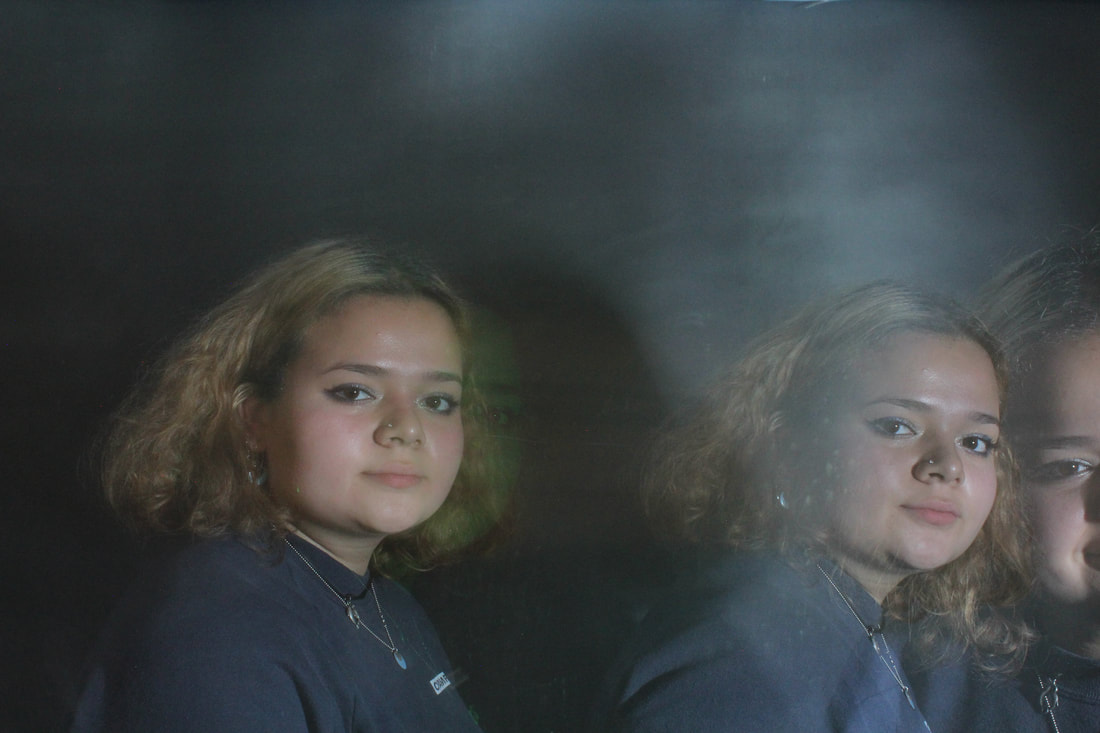
for my first strand, i focused on how the theme 'structure' could be manipulated and repeated to the point where the viewer is unable to tell which of the outlines of a body feature or building is in fact the real structure of the feature, through layering my pictures and changing the opacity of each layer to the point where a blur effect is created.
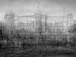
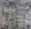
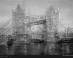
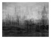
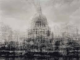
idris khan
FOR THIS STRAND, I TOOK INSPIRATION FROM THE PHOTOGRAPHER AND ARTIST idris khan, WHO DRAWS INSPIRATION FROM THE HISTORY OF ART AND MUSIC AS WELL AS KEY PHILOSOPHICAL AND THEOLOGICAL TEXTS, IDRIS KHAN INVESTIGATES MEMORY, CREATIVITY AND THE LAYERING OF EXPERIENCE. KHAN'S WORKS – IN MEDIA INCLUDING SCULPTURE, PAINTING AND PHOTOGRAPHY – RELY ON A CONTINUOUS PROCESS OF CREATION AND ERASURE, OR THE ADDING OF NEW LAYERS WHILE RETAINING TRACES OF WHAT HAS GONE BEFORE. HE IS WELL KNOWN FOR HIS LARGE-SCALE WORKS IN WHICH TECHNIQUES OF LAYERING ARE USED TO ARRIVE AT WHAT MIGHT BE CONSIDERED THE ESSENCE OF AN IMAGE, AND TO CREATE SOMETHING ENTIRELY NEW THROUGH REPETITION AND SUPERIMPOSITION, I USED THIS TECHNIQUE WHEN CREATING MY WORKS AND SIMILARLY CREATED NEW IMAGES FROM THE INITIAL IMAGE.
His work and process have been described as "experiments in compressed memories"and "all-encompassing composites." As Khan describes: "It is a challenge to not define my work as a photograph but using the medium of photography to create something that exists on the surface of the paper and not to be transported back to an isolated moment in time." Khan's visual layering also occurs in his videos, such as Last Three Piano Sonatas…after Franz Schubert, a three-channel video installation wherein he uses multiple camera angles to capture numerous performances of Schubert's last sonatas, composed on his deathbed.
|
|
|
|
|
|
during the process of creating my pictures, i took portrait photos of members of my family and friends and of houses and high rise buildings, i then uploaded them on to photoshop and selected the entire images , then repeatedly copied and pasted them on top of the original image. i then edited the opacity of each layer and using the eraser tool blurred them together.
|
|
|
|
|
i also experiment with simply copying the outline structure of some of the portraits and erasing parts of the layers of the picture, to create a gradient of opacity of the outlining structure. |
|
|
strand 2-
|
|
|
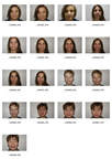
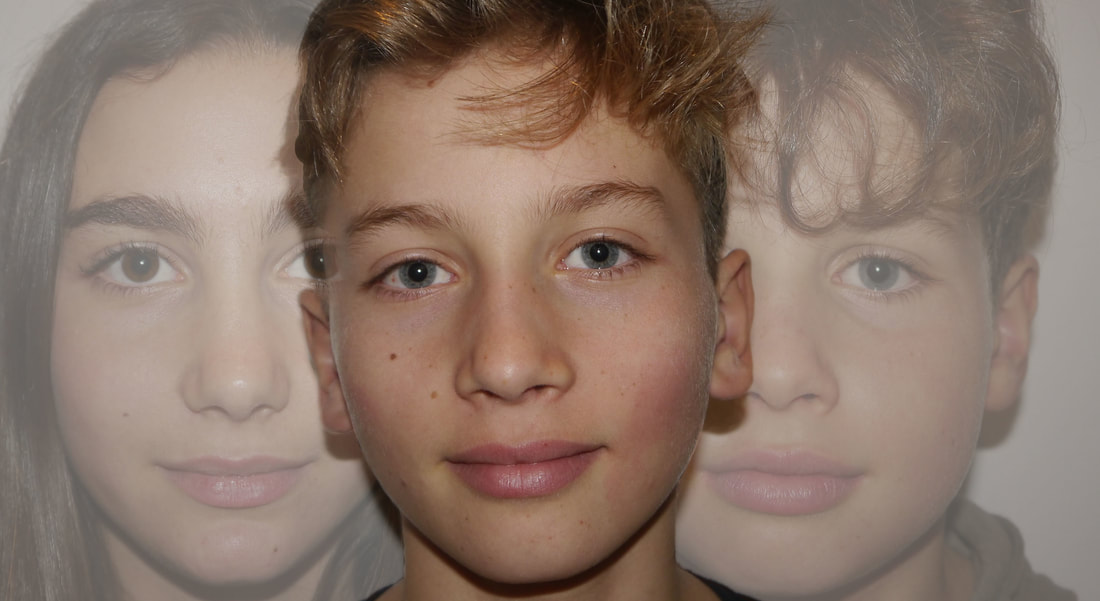
for my second task, i looked at combining the structure of a face and family structure, i did so by focusing on specific facial features that are passed down through generations in a family and are repeated through time, as they are inherited through genes. |
|
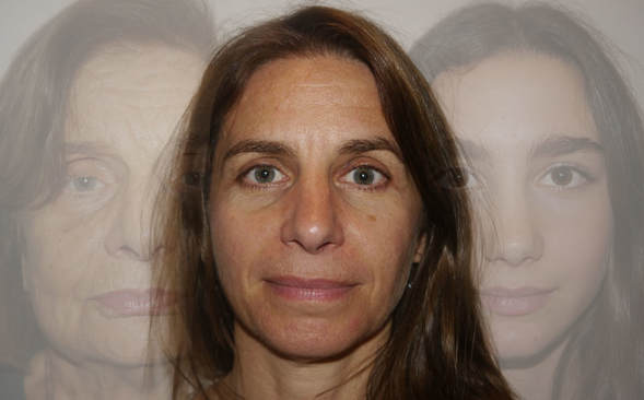
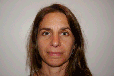
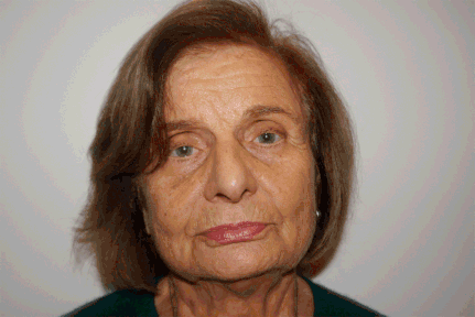
i firstly looked at my grandmother, aunty and cousin and tried to find similarities between their faces . initially i made a gif of their three faces, in the first one (top left) i made the speed extremely fast so that you can see that their faces melt into each other and they have so many inherited features. i also noticed that my aunty's portrait almost disappears in the gif as her face merges into her mother and daughter's face. so when i then layered a photo of my aunty with my cousin and grandma faintly overlapping her face, you can see from left to right what features are passed on through generations and which features are lost.
|
|
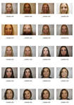
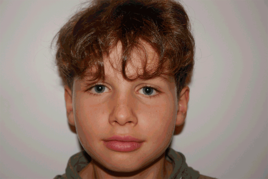
i also looked at the shared structures of a face between siblings, in the top left you can see that the two brothers almost have identical eyes, nose, mouth and ears yet in the two sisters you cn see that almost all of their features change apart from the constant identical shape of their faces. The different shape of their eyebrows which particularly frame the face, are shown in the gif to be completely different and thus makes their whole faces look different. I made both of the gifs fast in order to see that the one of the boys show that they are almost identical and there is little change between each flash of the picture, whereas in each quick change of the ones of the sisters you can see that they have almost no similar features, yet the structure of their faces are almost identical.
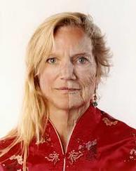
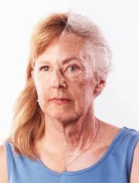
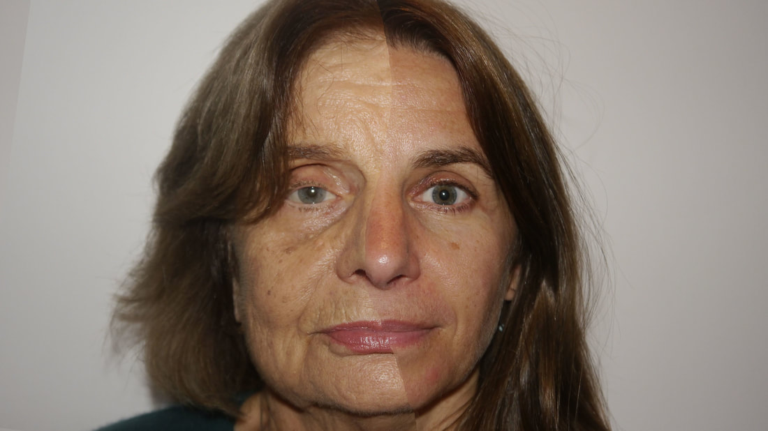
bobby neel adams
for this second strand, i was inspired by Adams's study of composite photographs he calls 'family tree', in which he studies similarities and differences among individuals' physical appearances from generation to generation, during the process of ageing, and between genders. Using this manipulated photographic methods, Adams depicts the body as a malleable entity subject to disturbingly unmanageable elements.
"It is human nature to ask who am I? And beyond that, where did I come from? By asking these questions, we try to both understand our connection to this world and ground our identities in long history of our families and forebears. Family Tree is a series of portraits that combine two separate photographs of immediate family members into one picture. To accomplish this, individual portraits are made of two family members in similar poses. The negatives are printed at equal size and torn and glued together to make one image of two family members. My technique for assembling this montage is 100% analog – film to paper. No digital manipulation is used to alter or enhance the original images. The two images blend together or don’t. Families endlessly discuss whether a new baby resembles his or her mother or father, because physical resemblance is the most striking and primary evidence of a genetic connection. The Family Tree portrait visually maps the genetic characteristics we inherit from our parents and demonstrates how some aspects of our futures were codified at the moment of conception. This composite photograph could be viewed as an eerie life-map as the montage of two different family members is sometimes mistaken for a montage of the same person at ages."
- bobby neel adams
|
|
|
|
|
|
|
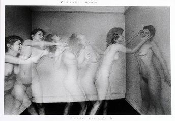
strand 3- movement of structure in light and time
|
|
|
|
|
|
|
|
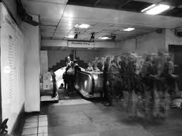
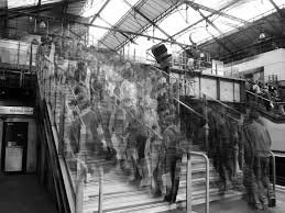
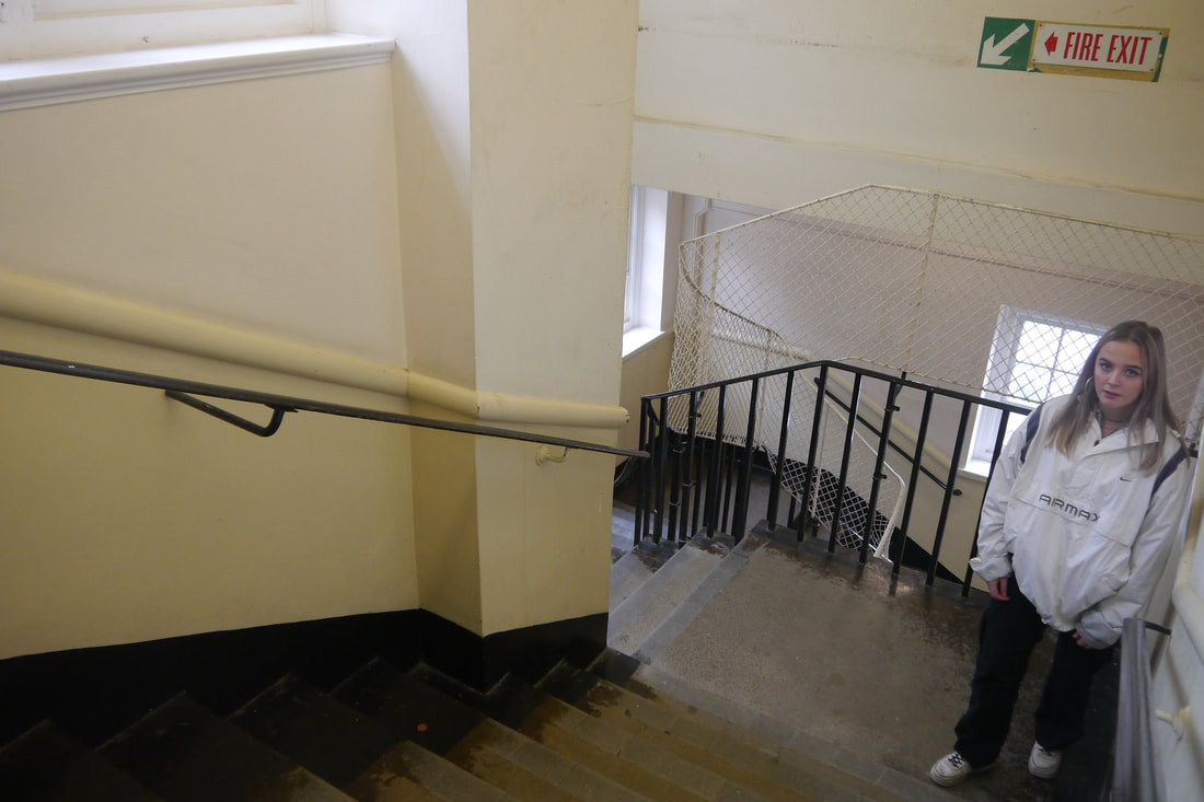
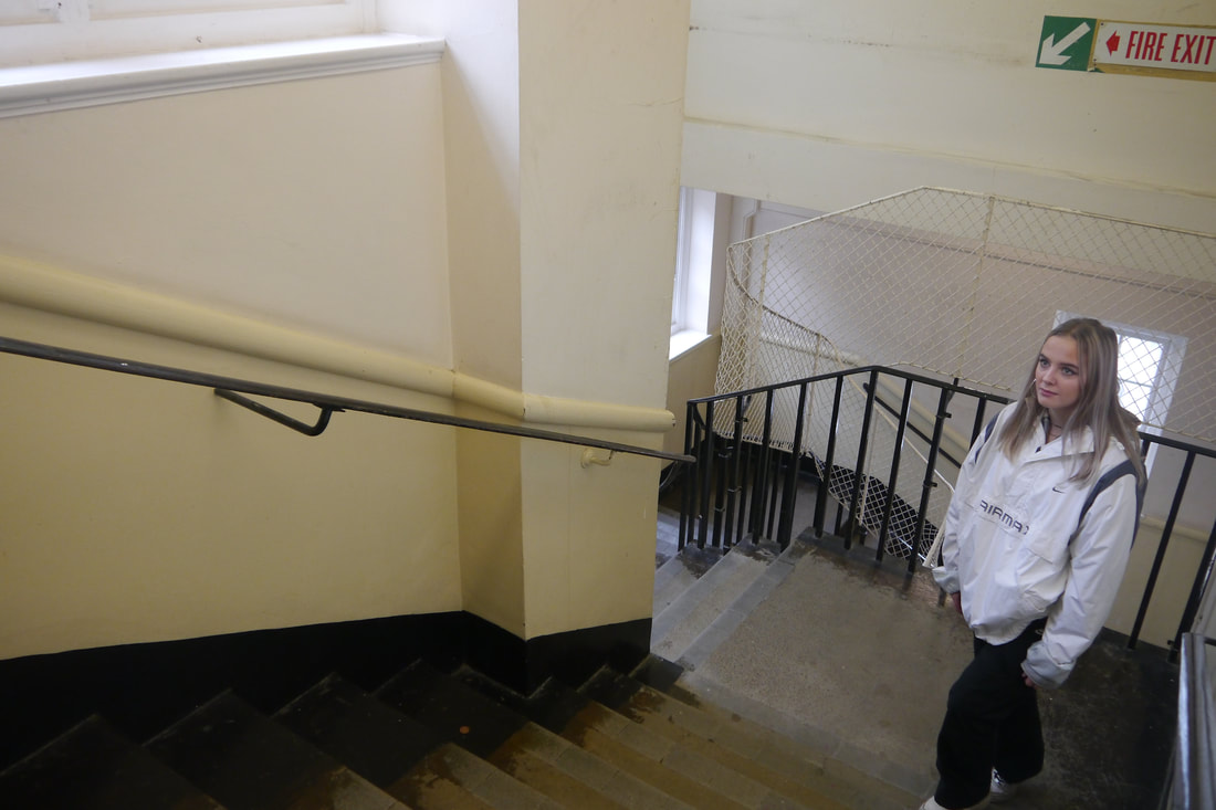
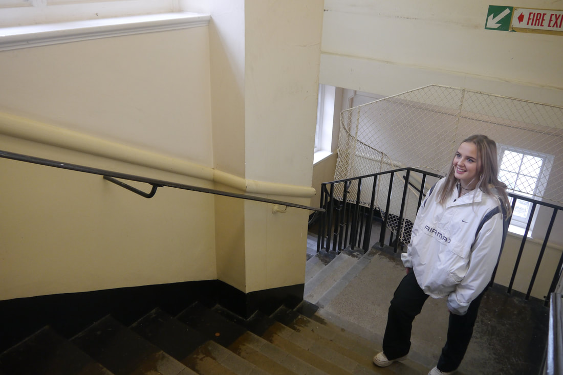
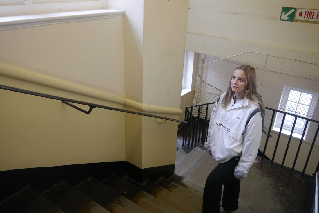
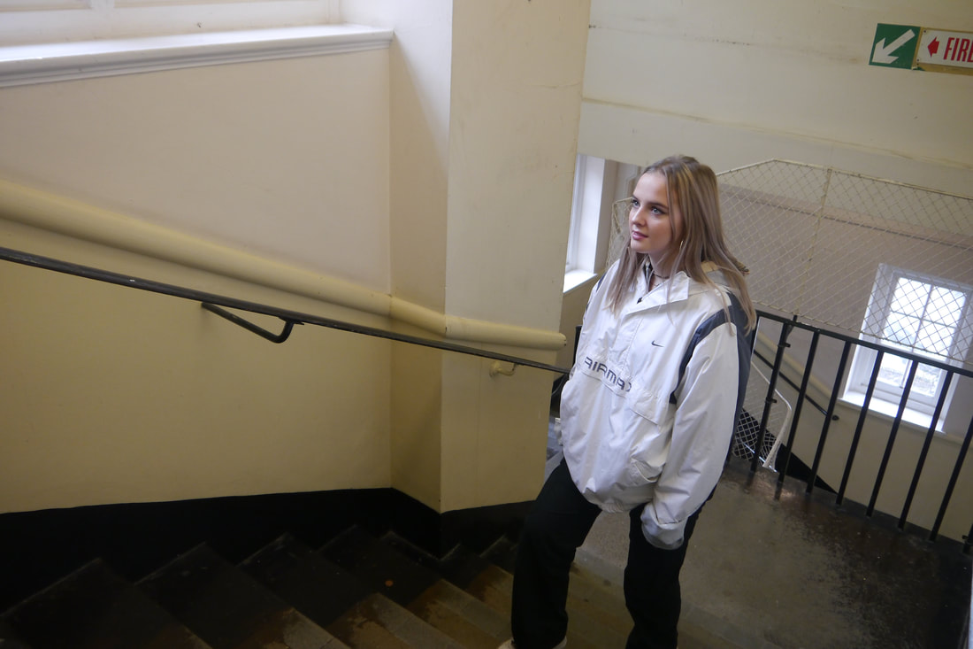
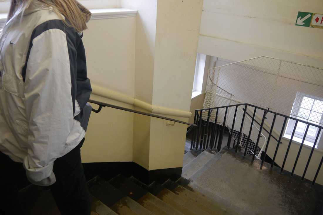
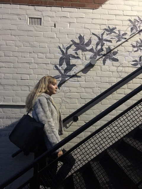
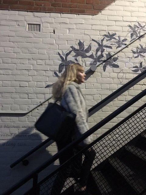
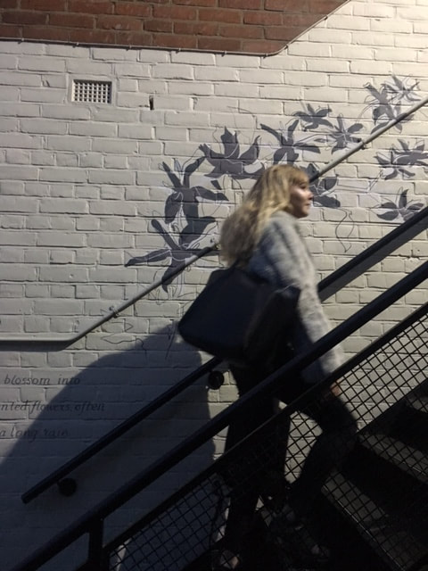
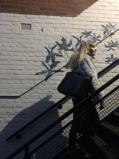
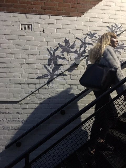
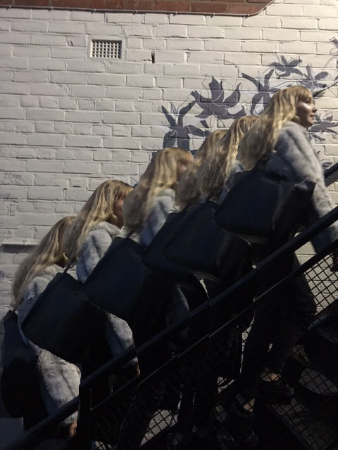
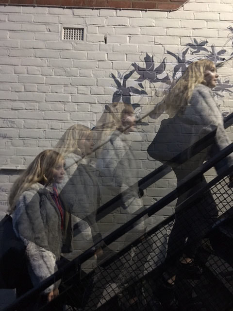
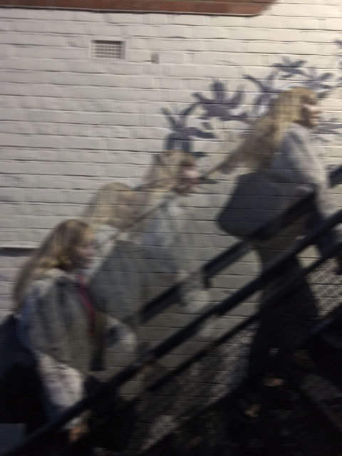
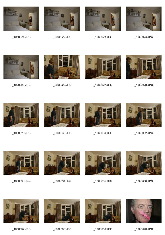
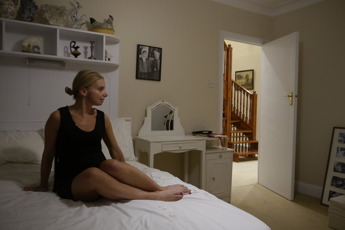
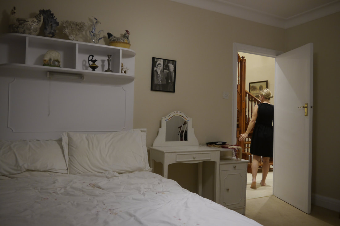
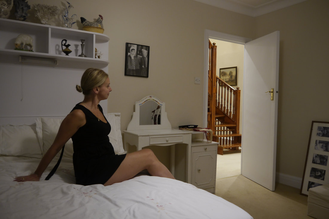
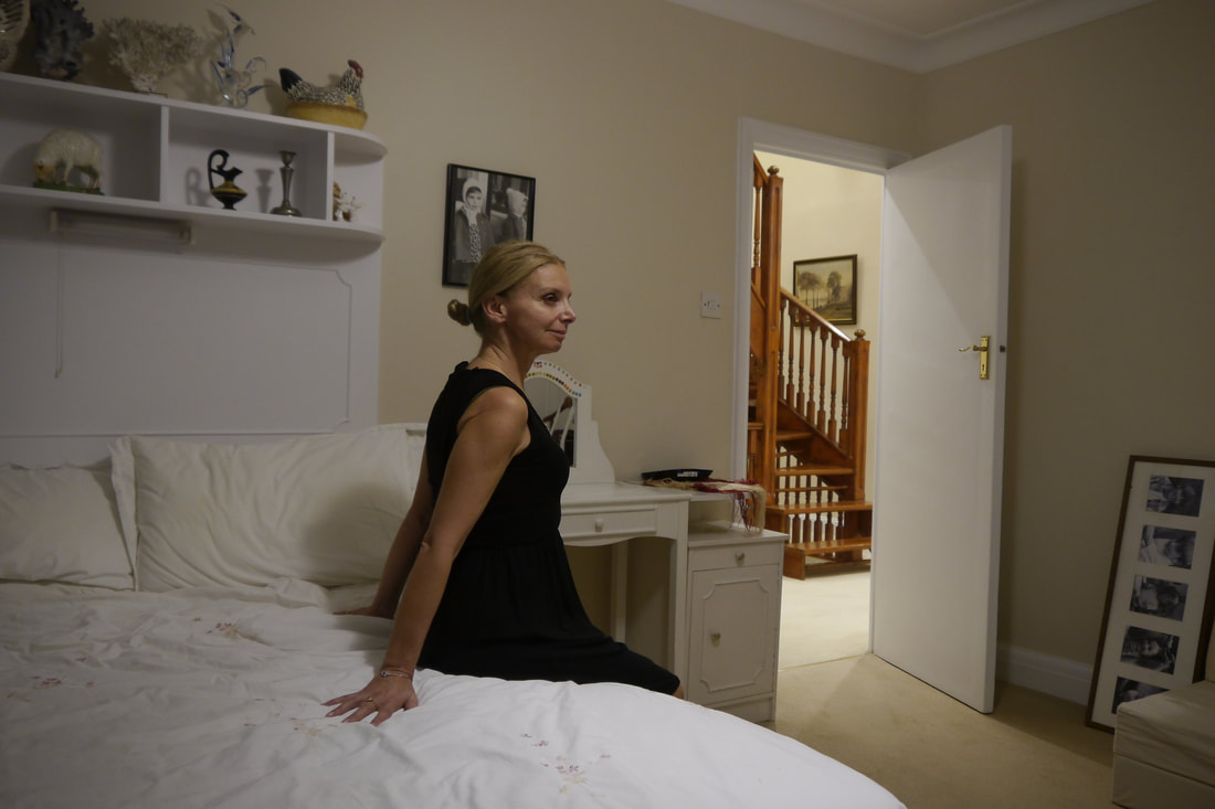
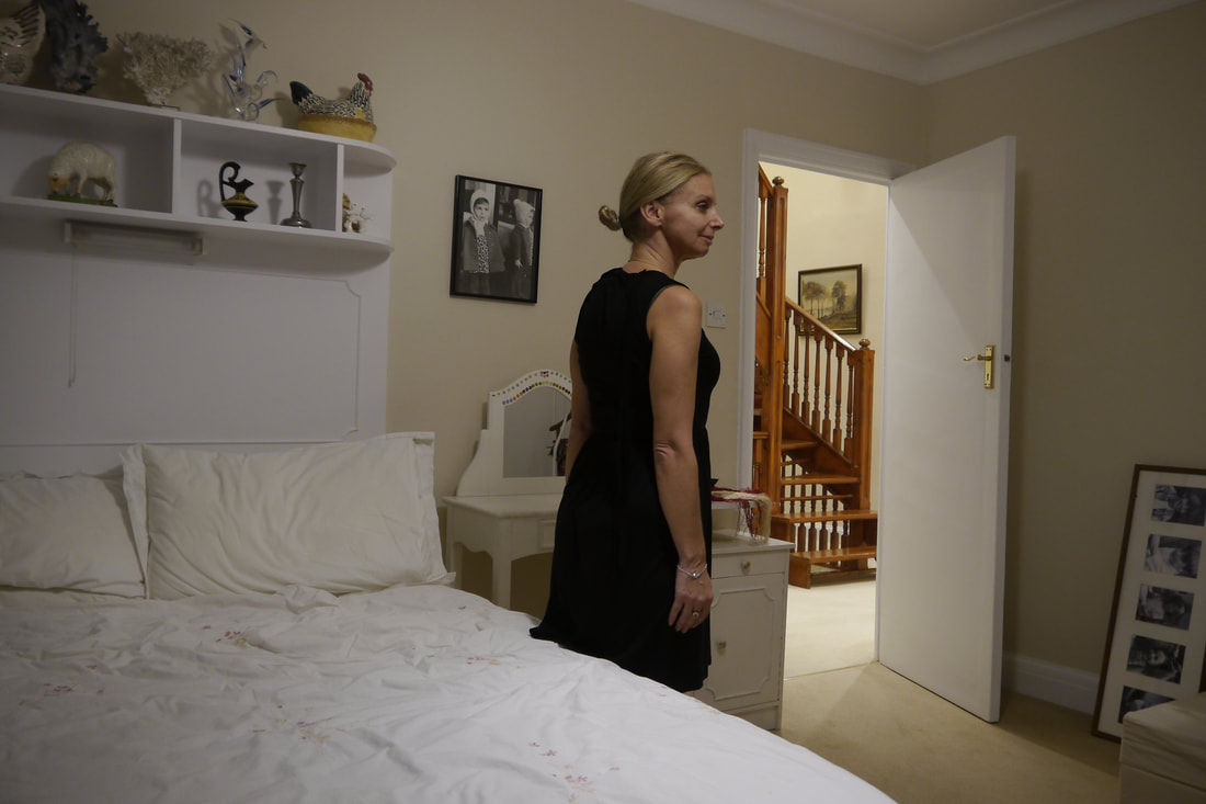
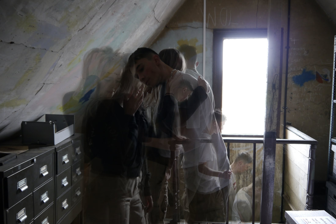
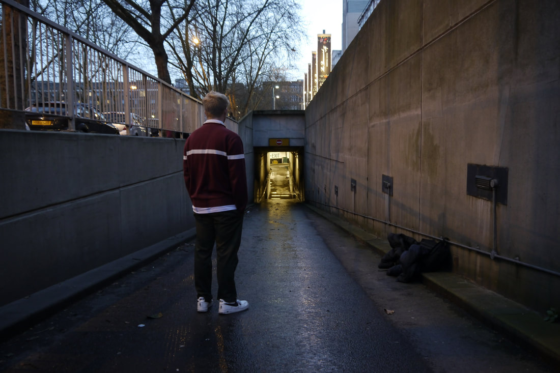
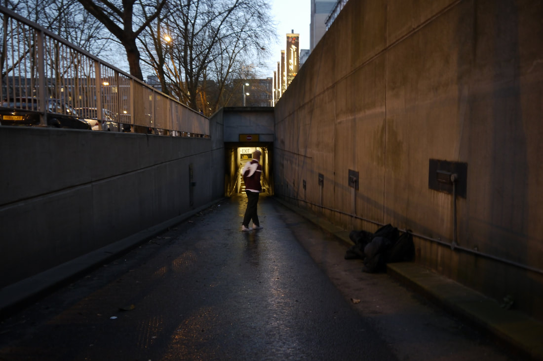
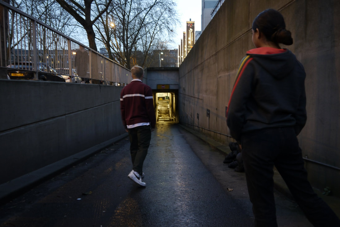
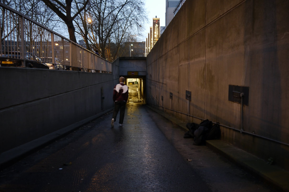
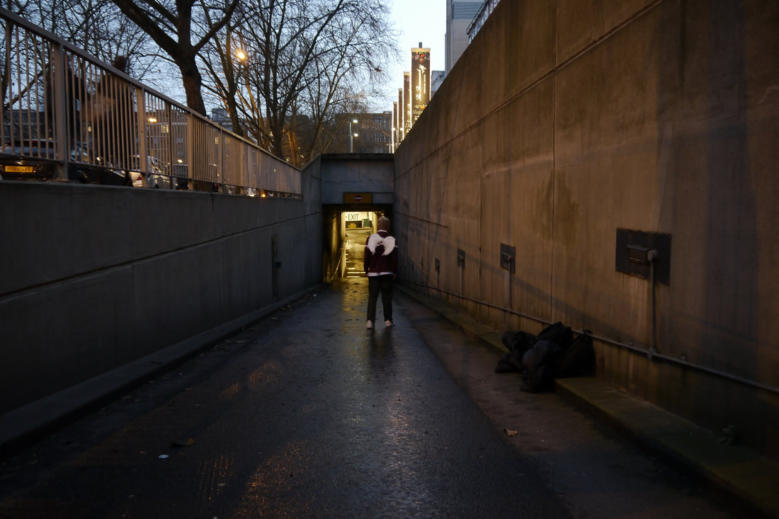
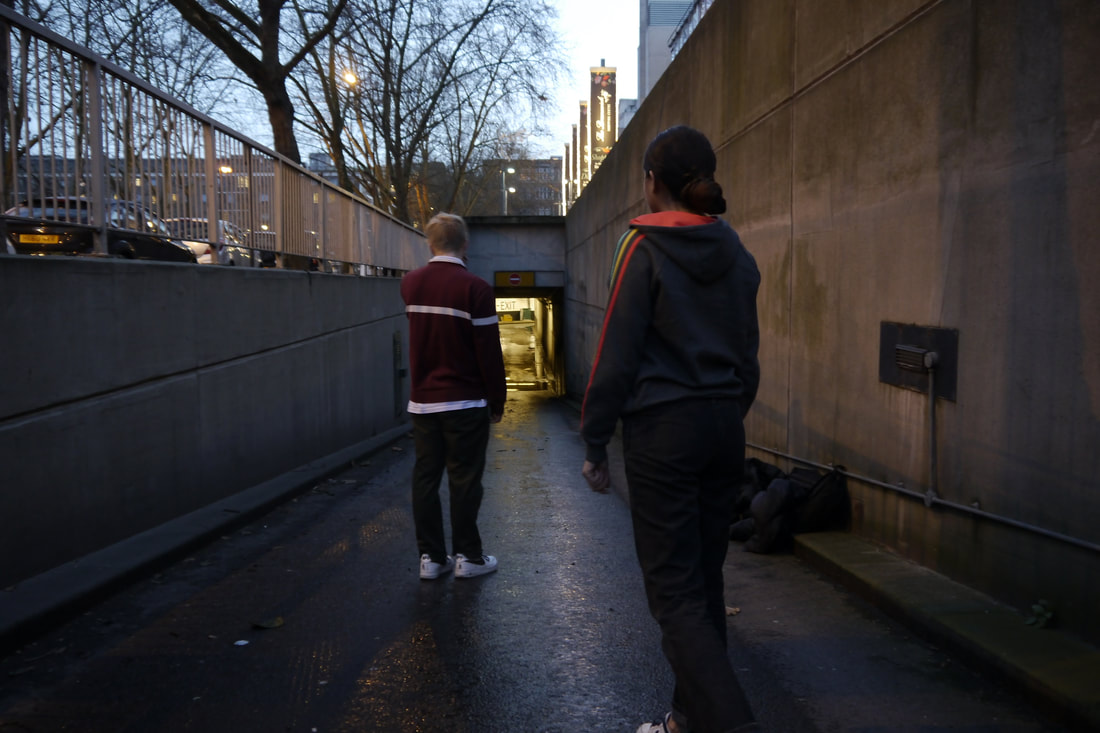
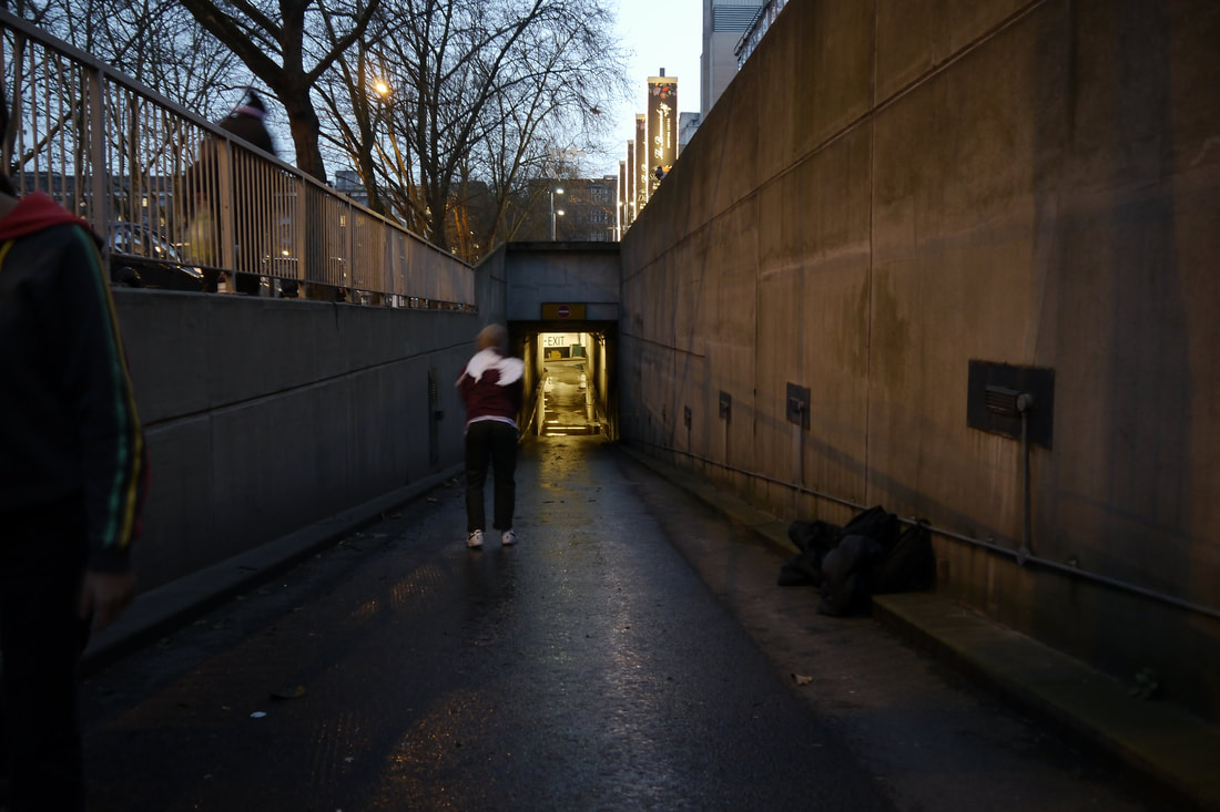
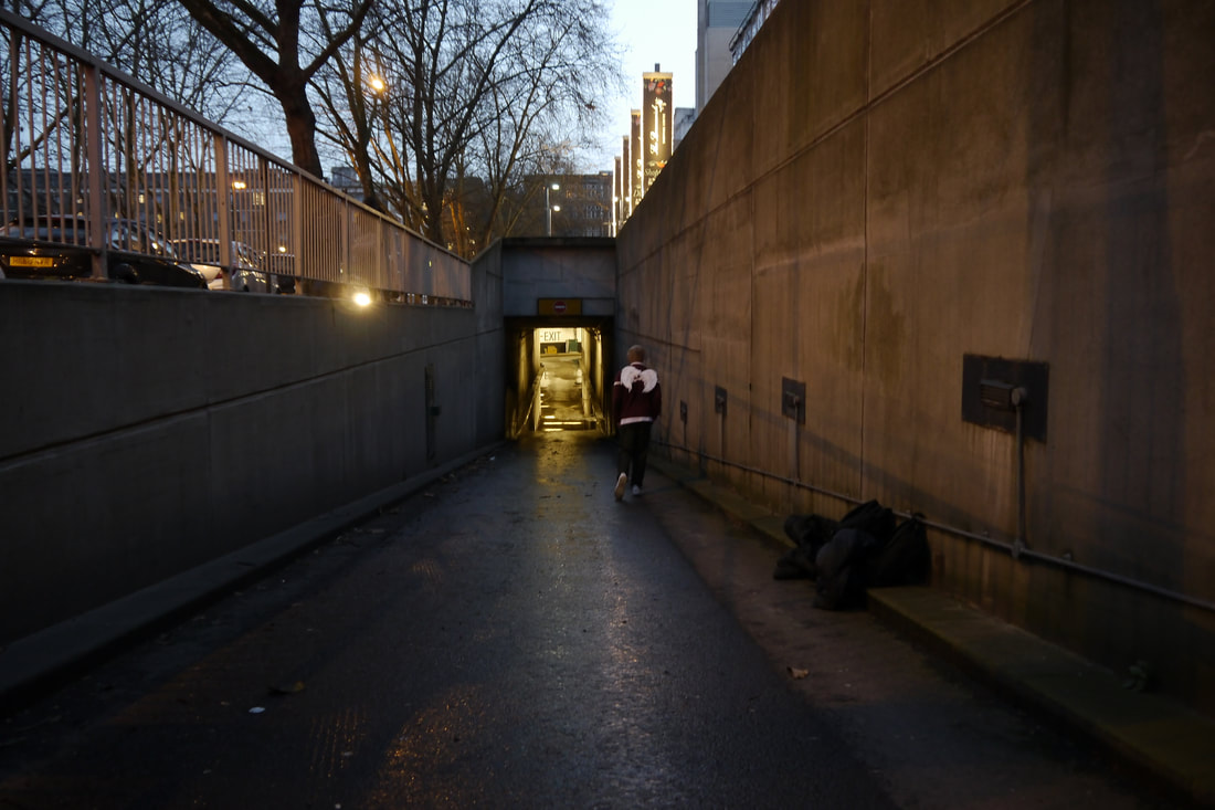
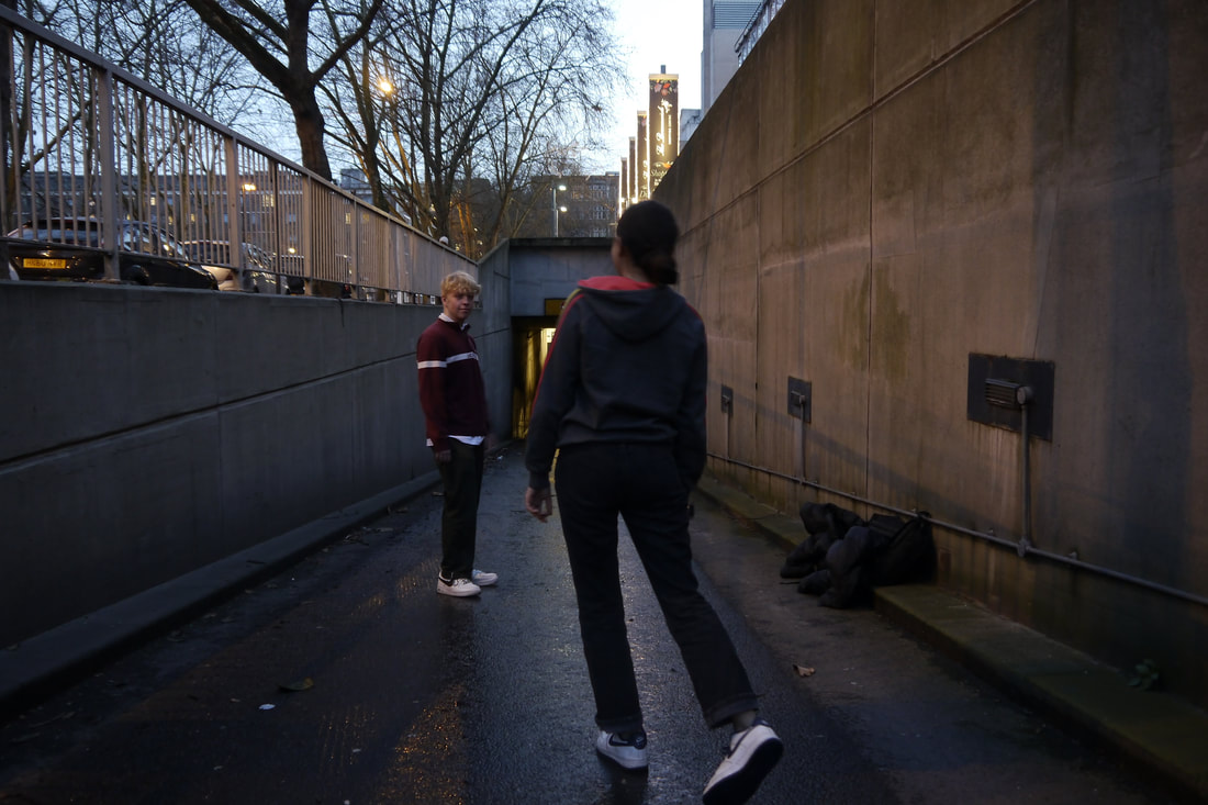
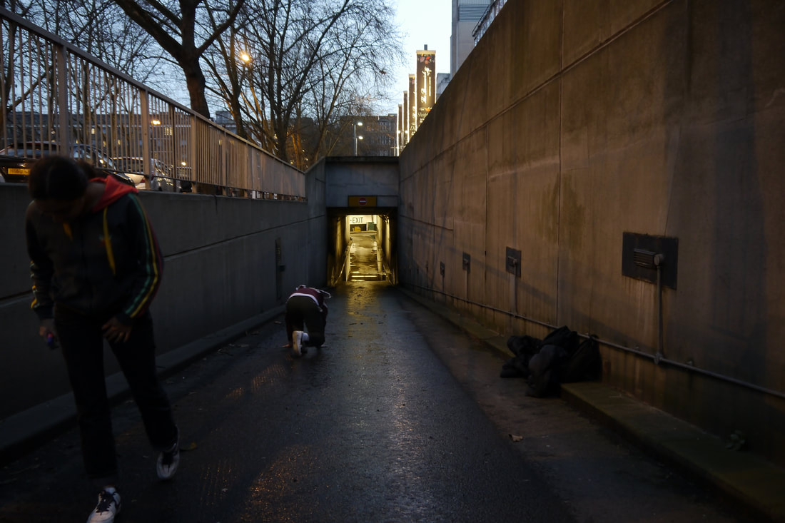
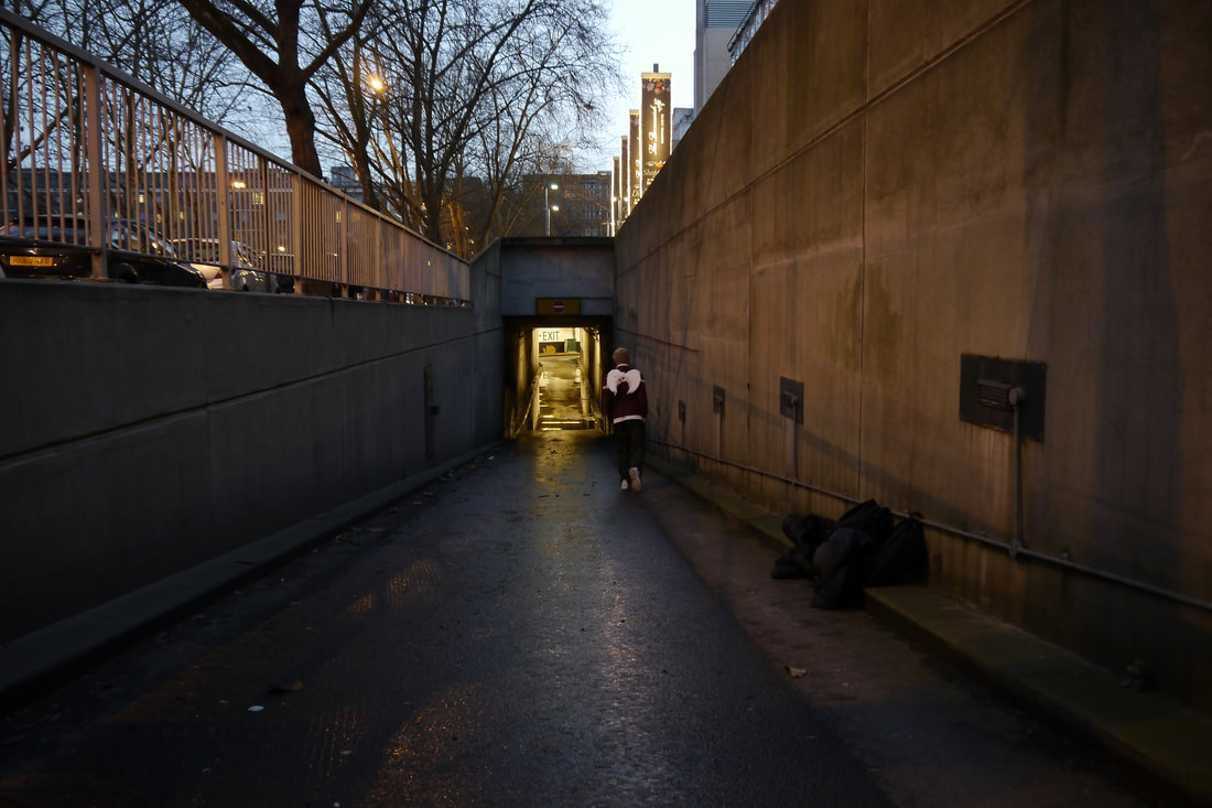
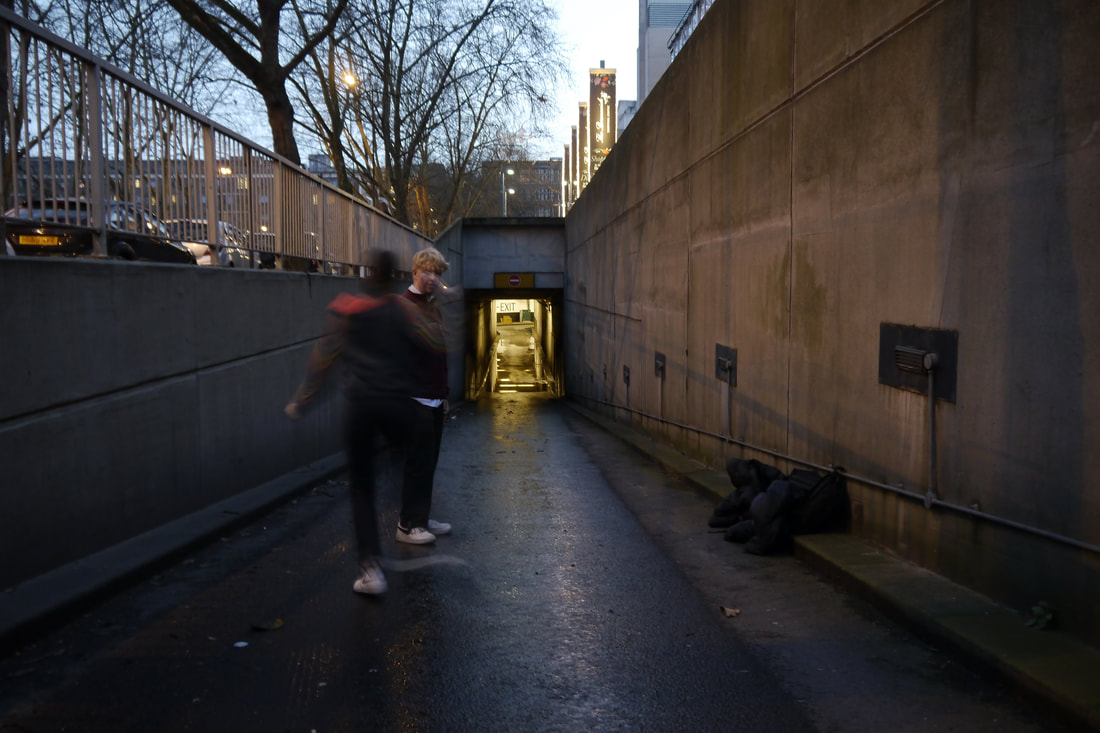
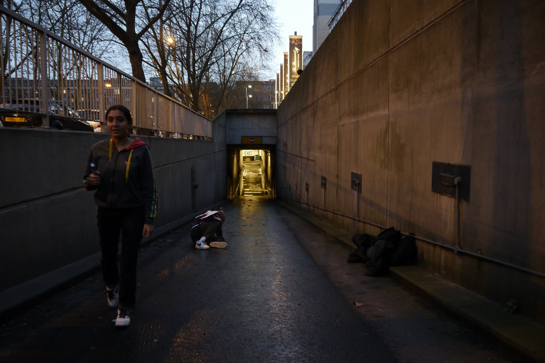
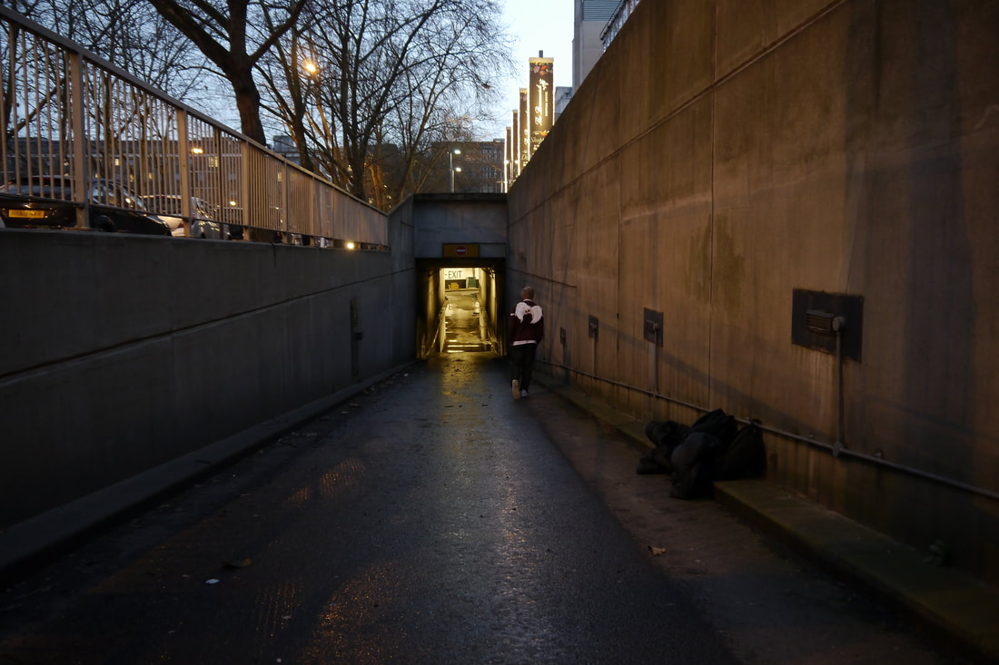
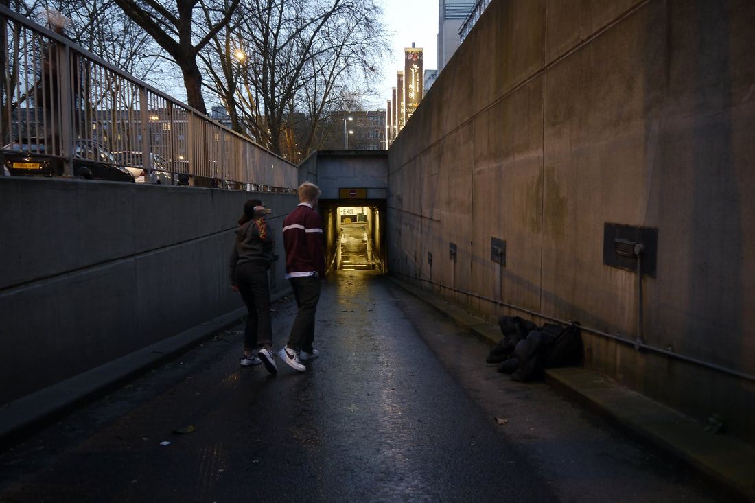
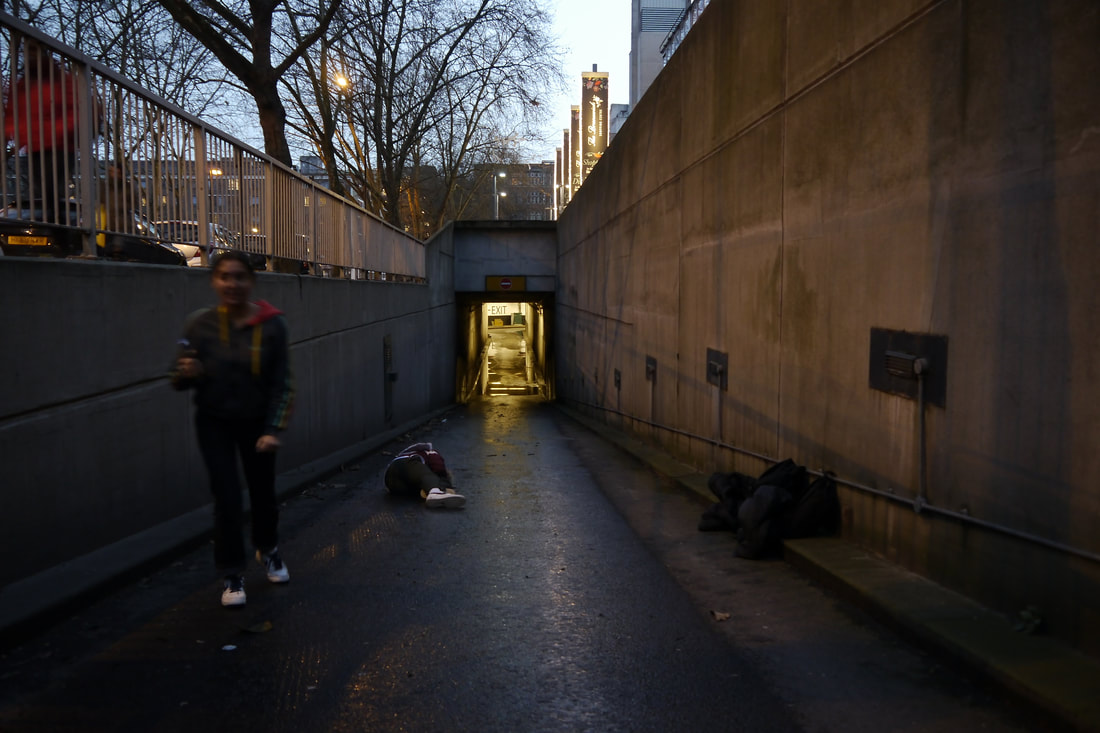
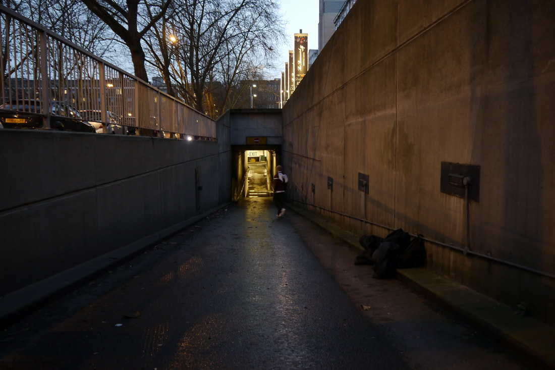
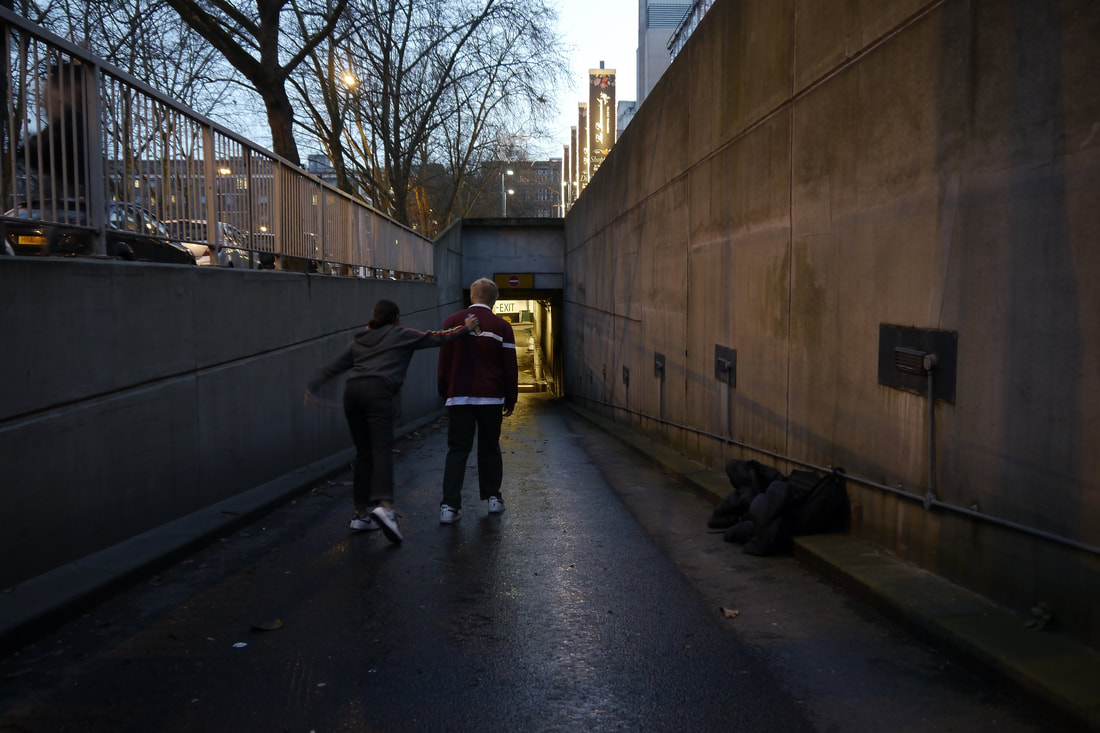
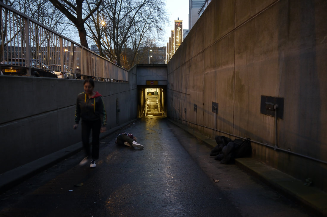
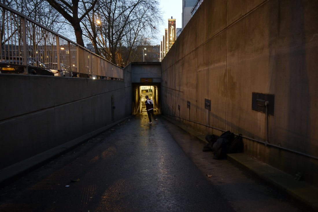
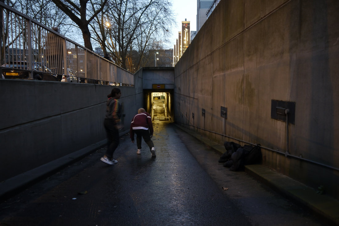
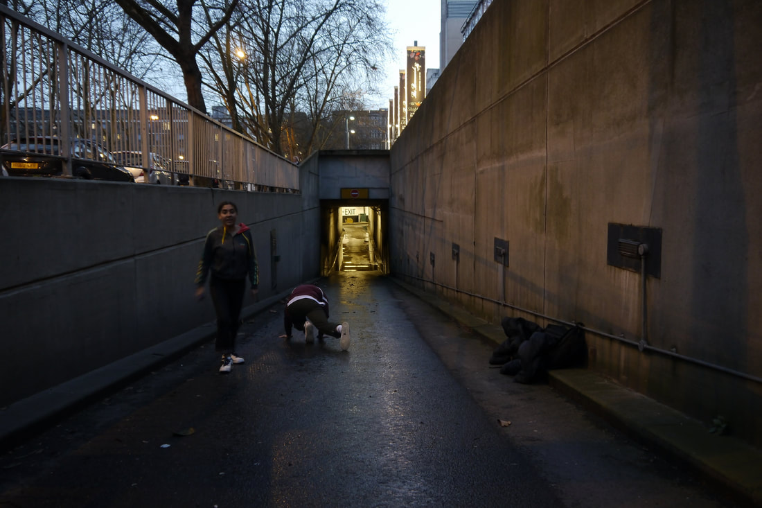
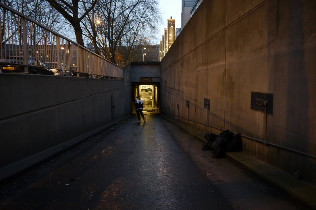
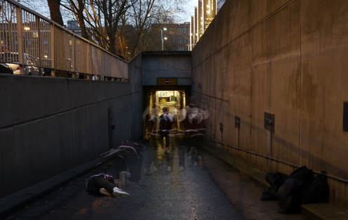
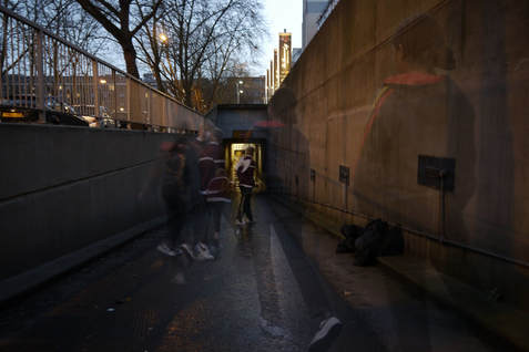
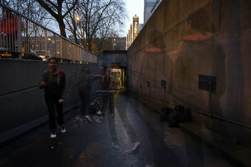
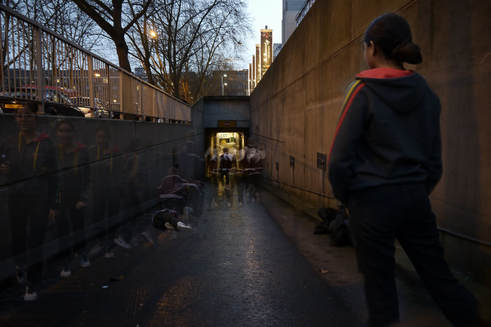
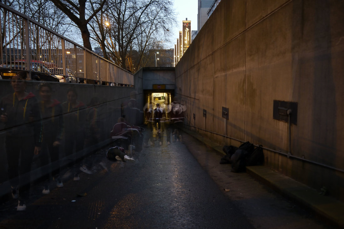
first response- movement on stairs
alexey titarenko
|
|
|
|
To illustrate links between the present and the past, he created powerful metaphors by introducing long exposure and intentional camera movement into street photography. The most well known series of this period is City of Shadows.
|
|
|
|
|
|
|
|
|
|
|

|
|
|
|
|
|
|
|
|
|
|
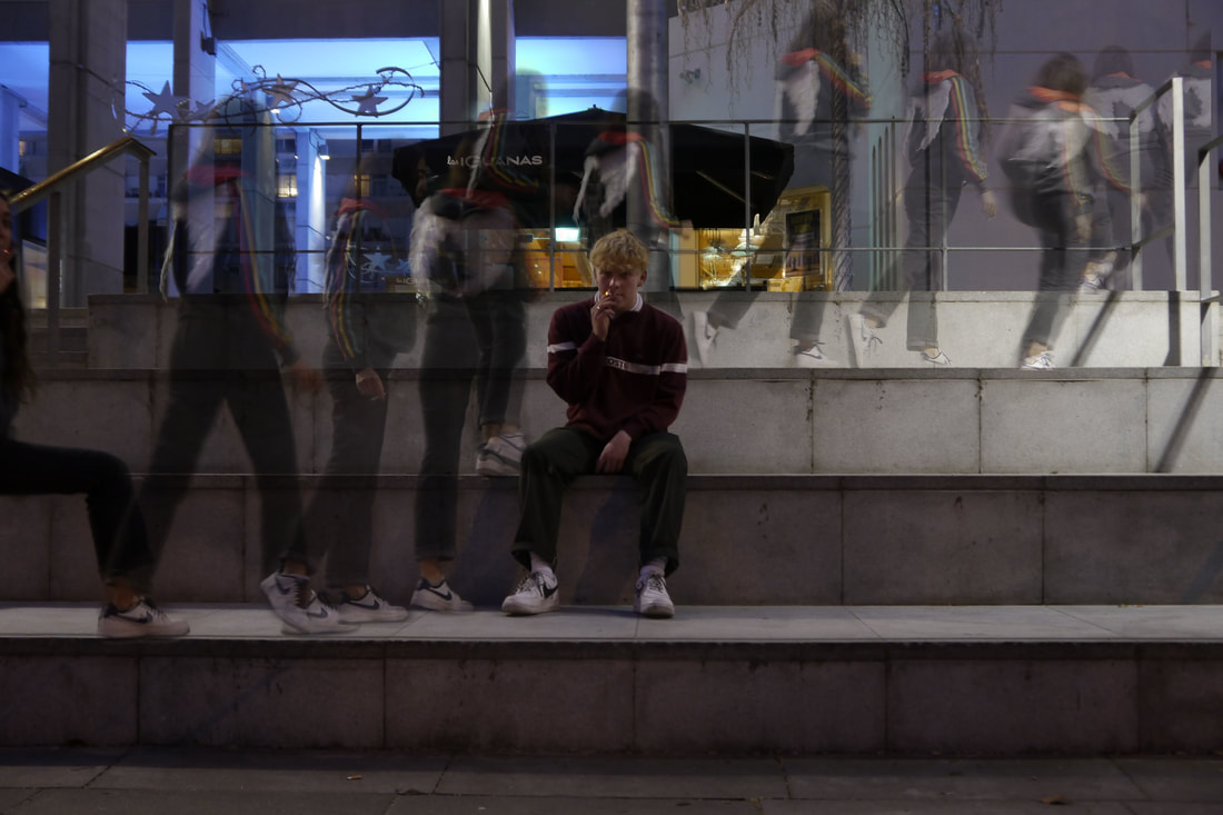
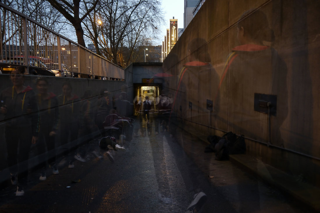
both of these compositions are related to my chosen strand of movement in structure and are a response to alexey titarenko's studies of movement in public places, especially on tube staircases which are shown in my images (also on staircases) and a real sense of motion is created.
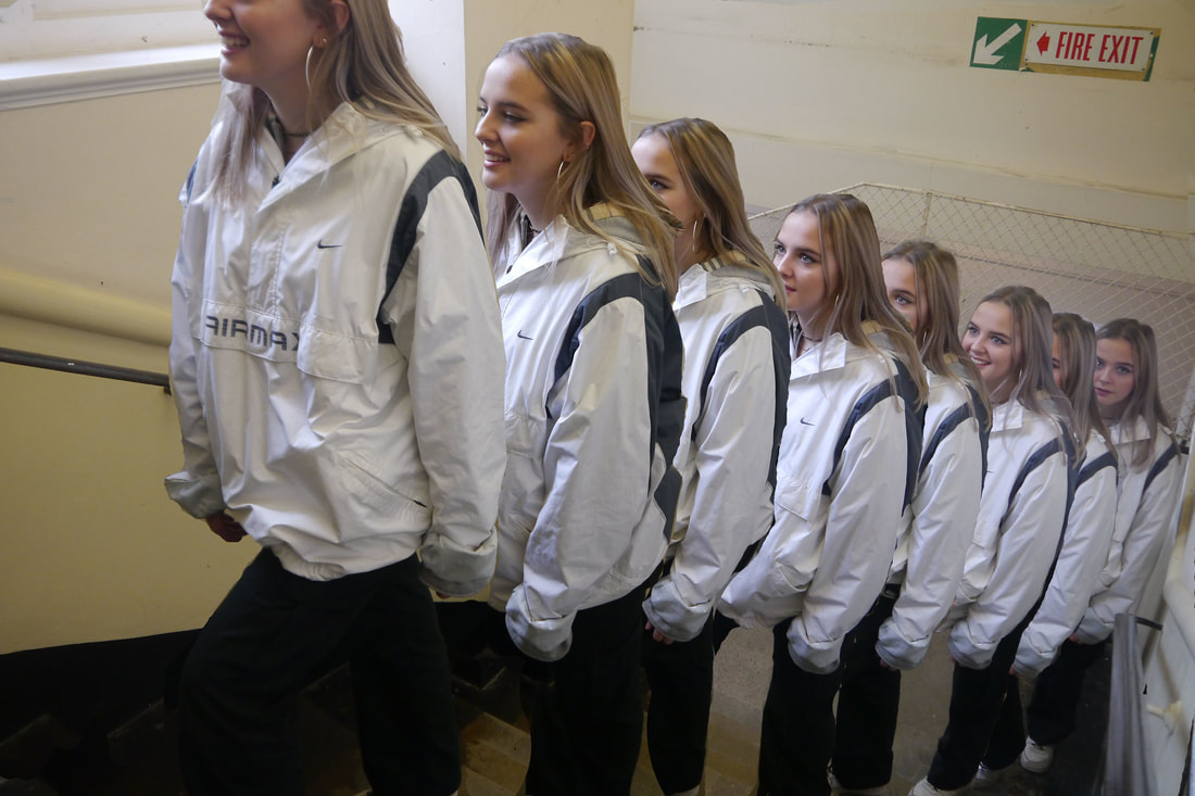
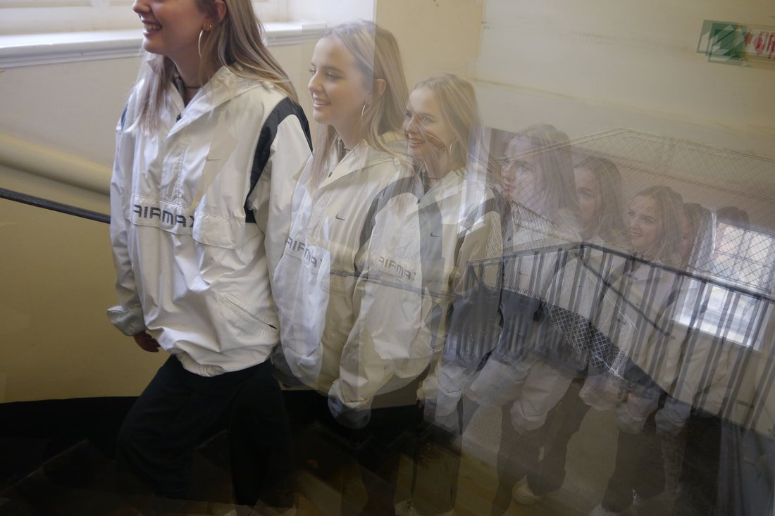
www- the subject i chose to photograph suited the theme as it shows movement in both structures of the girls body's. i managed the exposure particularly well in my first composition as the models body, face and the background was perfectly lit, and in both images i prioritised my shutter speed to capture each frozen movement the models took and i also manipulated the aperture to be high, such as f/20, to ensure that both the actions of the models are in detail, as well as the background. i did this, so that it was clear that only the model was moving, not the setting as well.
ebi- i don't particularly like the lighting in my second composition, as i feel that it is too low and my iso setting was too low, which made the entire picture appear dark and the detail in the model's face is not shown. i also did not use a tripod in either pictures, thus making it hard to edit the pictures and make it appear as though the edited pictures do not effectively form one image. in addition when i edited the pictures, particularly in the second photo, i blurred the entire image rather then just the model's movements, ( which i effectively did in my first composition) thus the entire image is blurred and a clear sense of the girl's motion is not created.
next time, i will ensure that i use a tripod and effectively manage my iso settings, to ensure that my pictures are not dimmed.
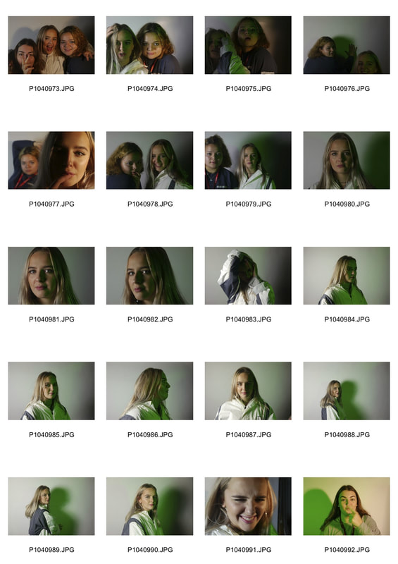
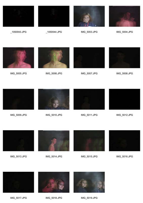
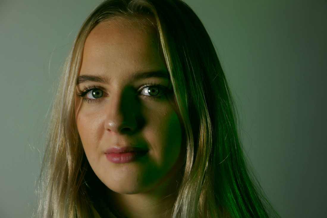
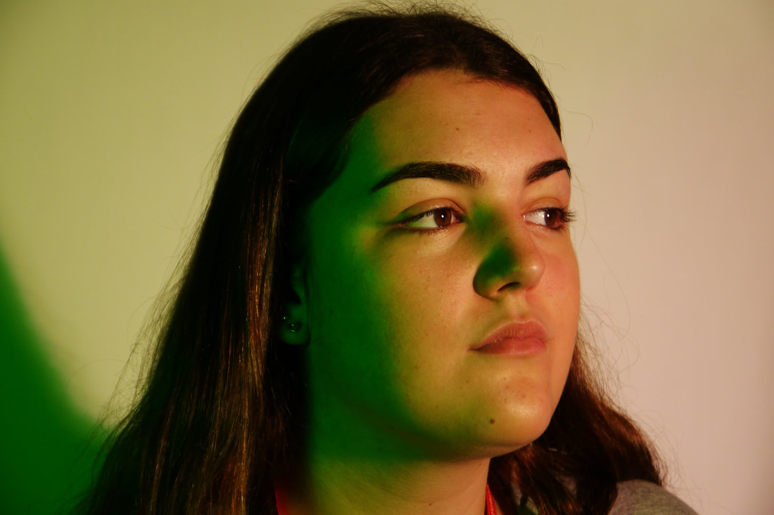
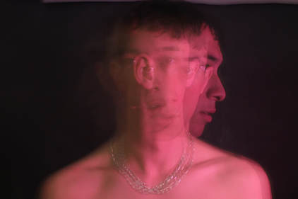
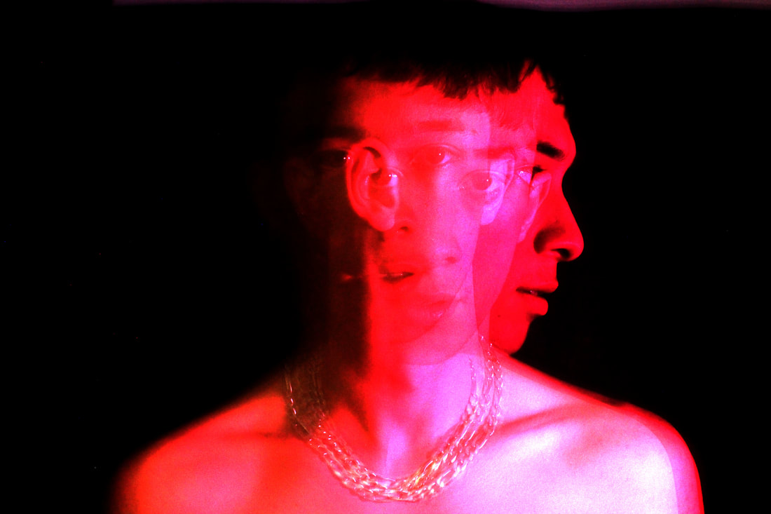
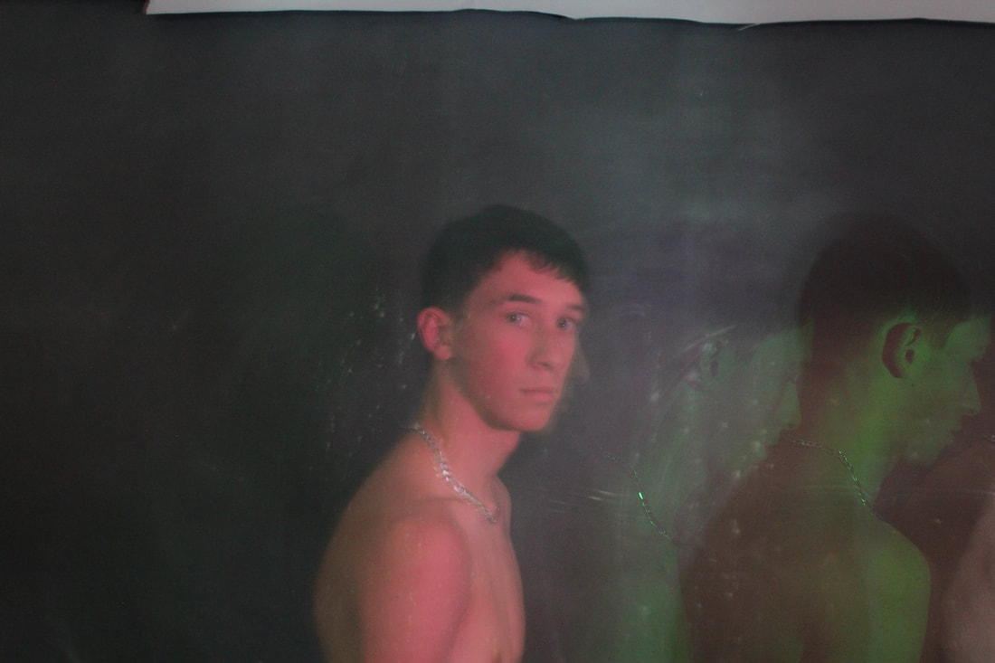
second response- technical focus of movement- strobe light and multiple exposures
|
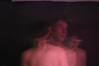
|
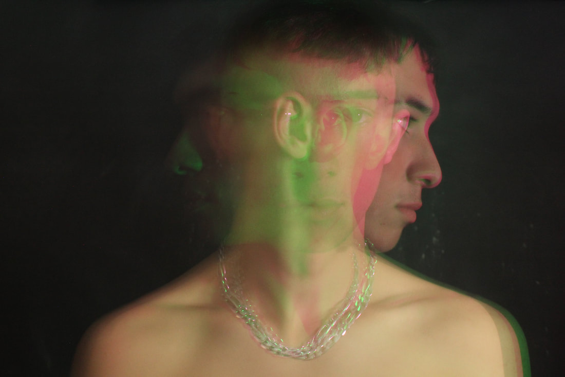
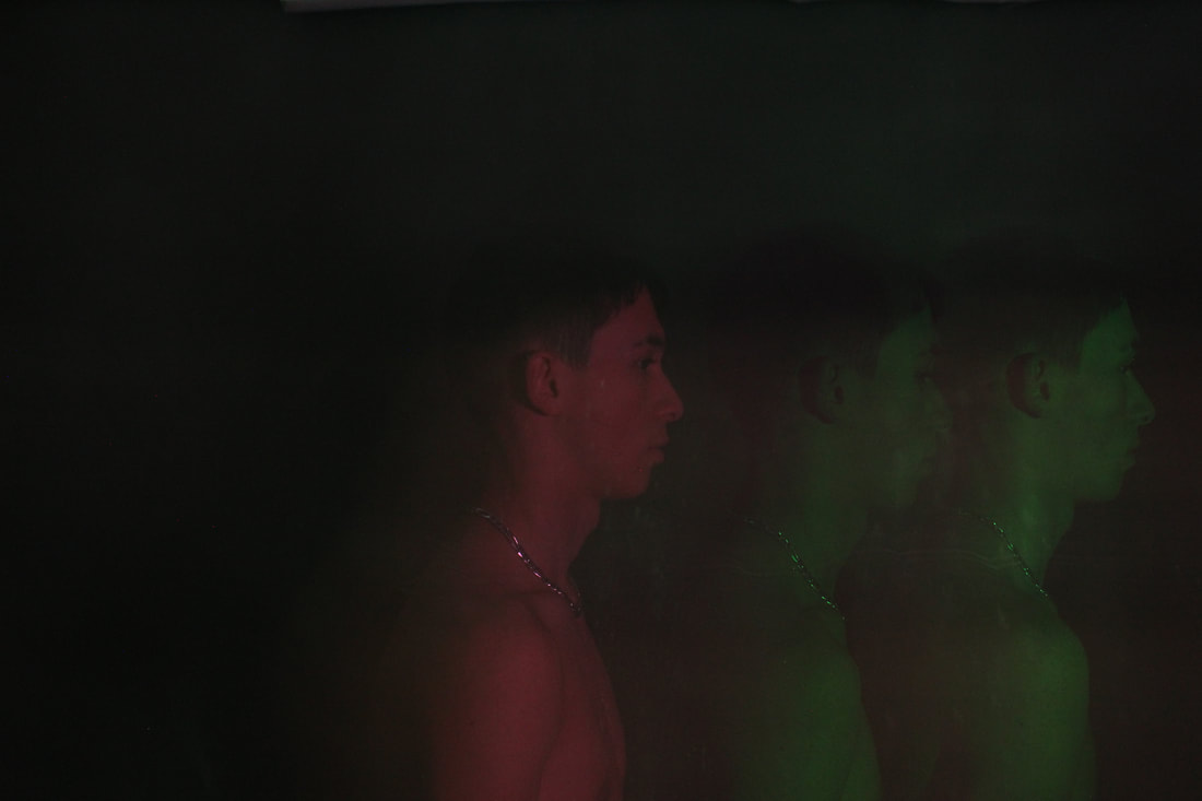
|
To further develop the effect of multiple movements in a portrait, I decided to use the strobe light and the bulb setting on the camera which captured multiple movements of the figure in one frame. By alternating the colour over the strobe while taking the photo, I was able to create different coloured versions of the same person. This links to my theme of movement in structure as I used pairs of complementary colours in each picture, such as the red and green. I had to experiment with the materials put over the lights to achieve a saturated colour, I started by using coloured acetate, some of which did not show up on the camera, I also used translucent folders to achieve a stronger colour. I also experimented with the speed of the strobe light to achieve a sharp image without too many exposures. I also varied the movement in the photos, I started by asking the subjects to turn their heads, but I moved onto asking the subject to move around the frame so that I differentiate the different colours easily and create a more interesting image, moving from left to right. While taking the photos I used a tripod so that each frame was sharp. to improve this response, i should have used allowed a flash of just white light in the middle of the exposure so that one of the captured figures was more prominent and brighter to create a focal point.
narratives shown through movement
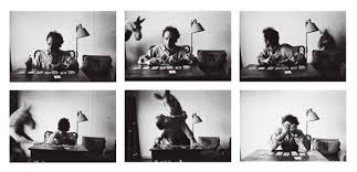
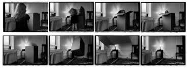
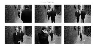
duane michals
Duane Michals born February 18, 1932, is an American photographer. Michals's work makes innovative use of photo-sequences, often incorporating text to examine emotion and philosophy Michals first made significant, creative strides in the field of photography during the 1960s. In an era heavily influenced by photojournalism, Michals manipulated the medium to communicate narratives. The sequences, for which he is widely known, appropriate cinema’s frame-by-frame format. Michals has also incorporated text as a key component in his works. Rather than serving a didactic or explanatory function, his handwritten text adds another dimension to the images’ meaning and gives voice to Michals’s singular musings, which are poetic, tragic, and humorous, often all at once.
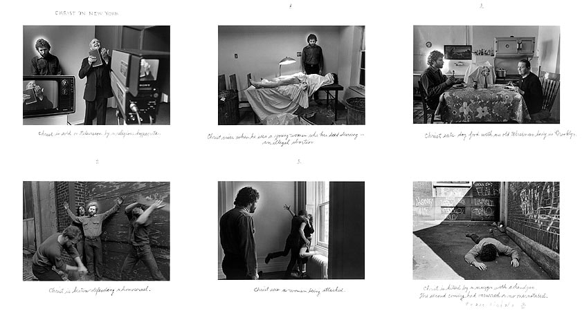
duane michal's photography compositions relate to my development of my third strand; movement of structure. as within his 'sequences' although a narrative is shown, a clear sense of movement is created within his stories, specifically the composition shown (middle below) where michal's shows motion within the narrative of the women battling with herself.
|
|
|
|
third response-sequences relating to death |
|
|
|
|
|
|
|
|
|
|
|
|
|
|
|
|
|
|
|
|
|
|
|
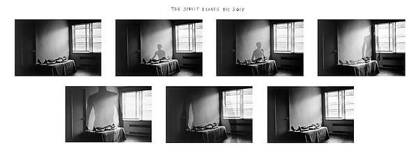
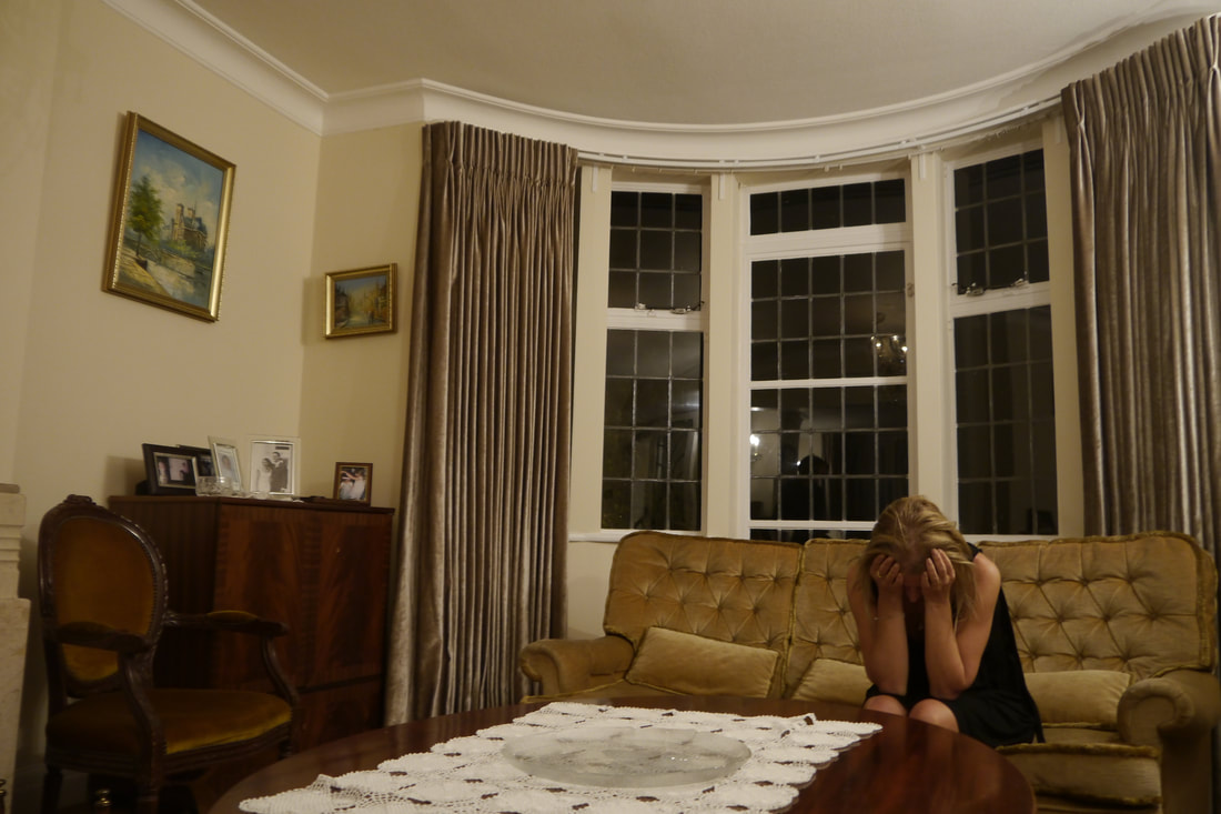
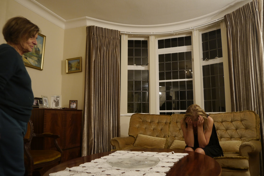
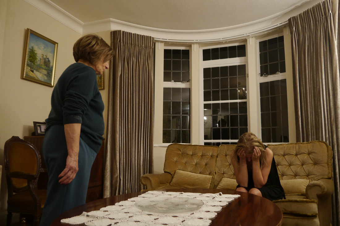
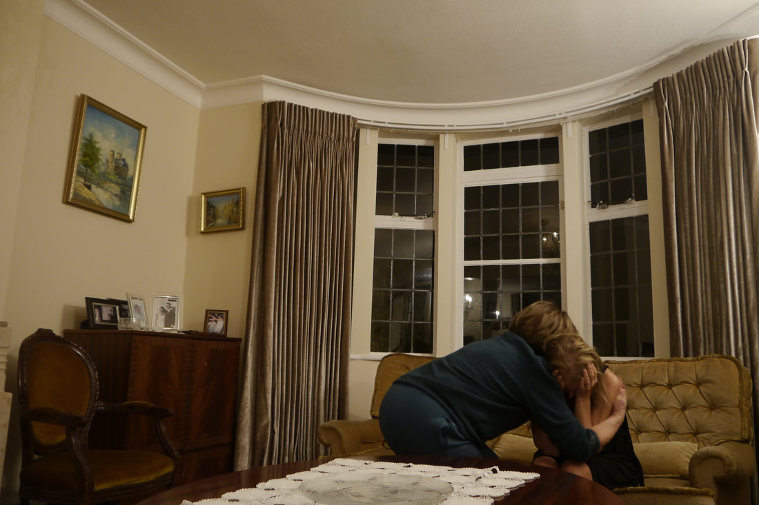
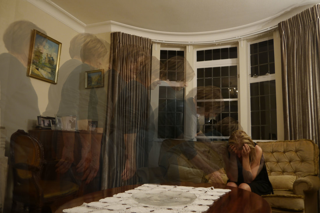
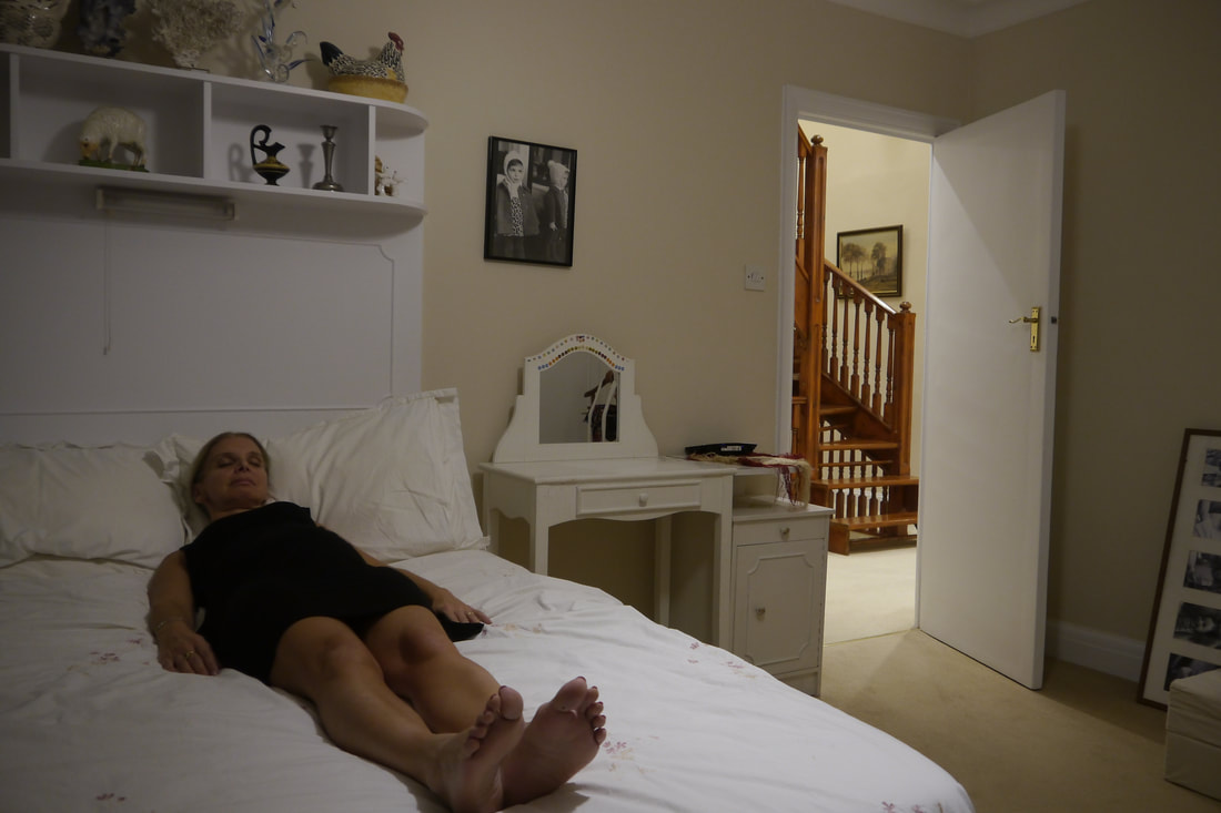
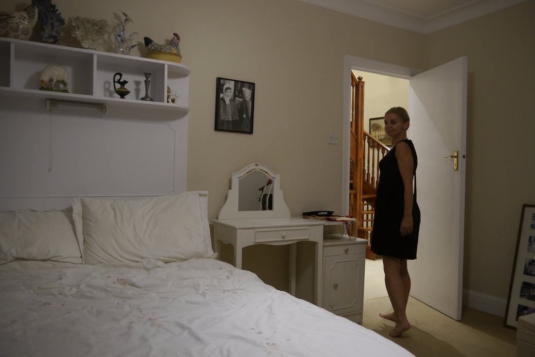
analysis and evaluation
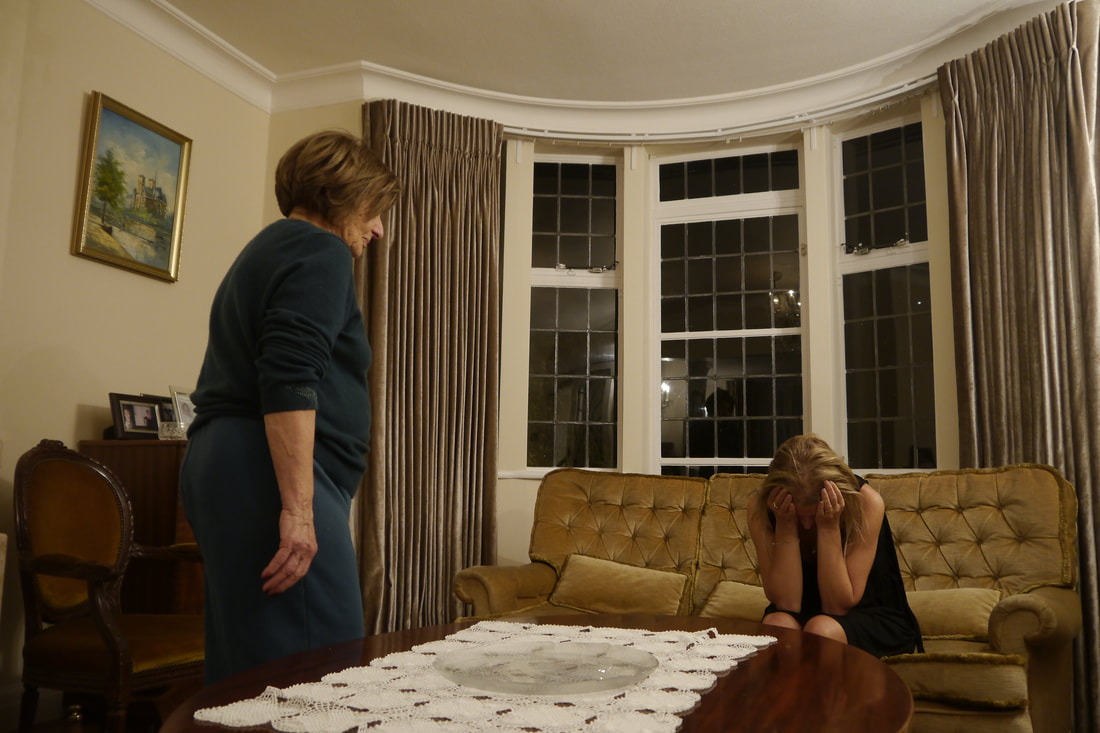
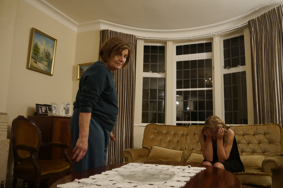
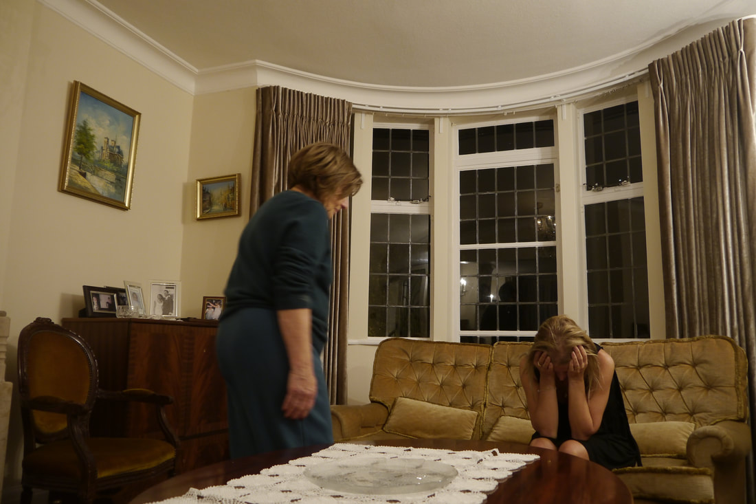
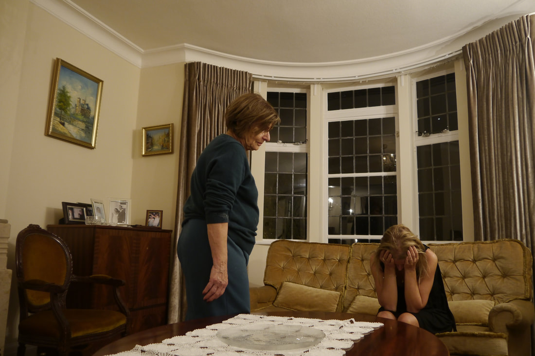
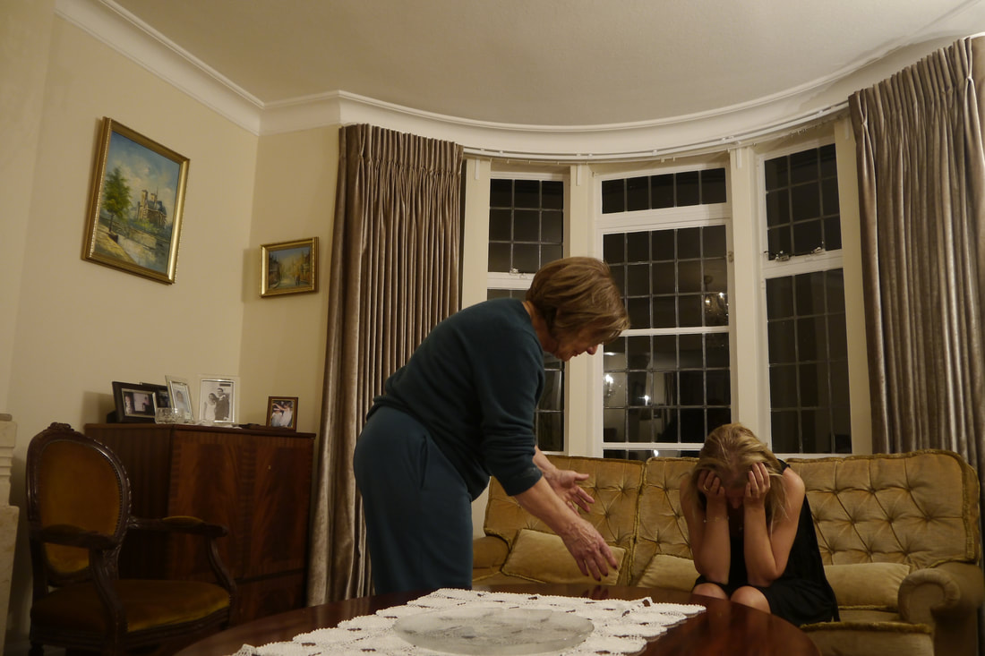
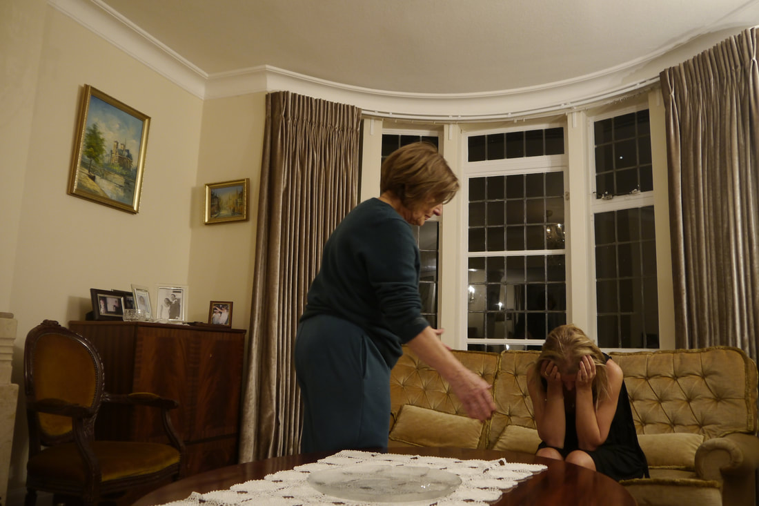
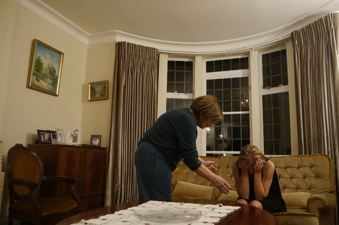
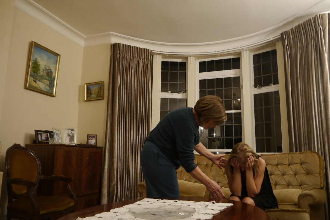
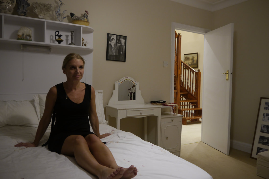
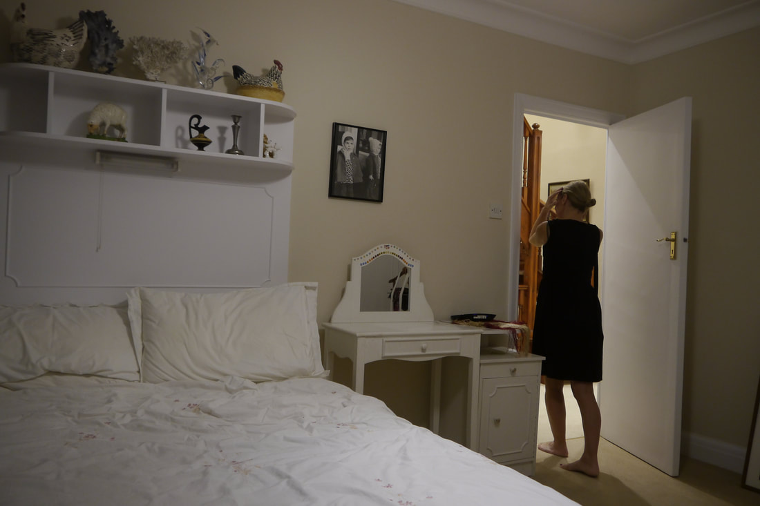
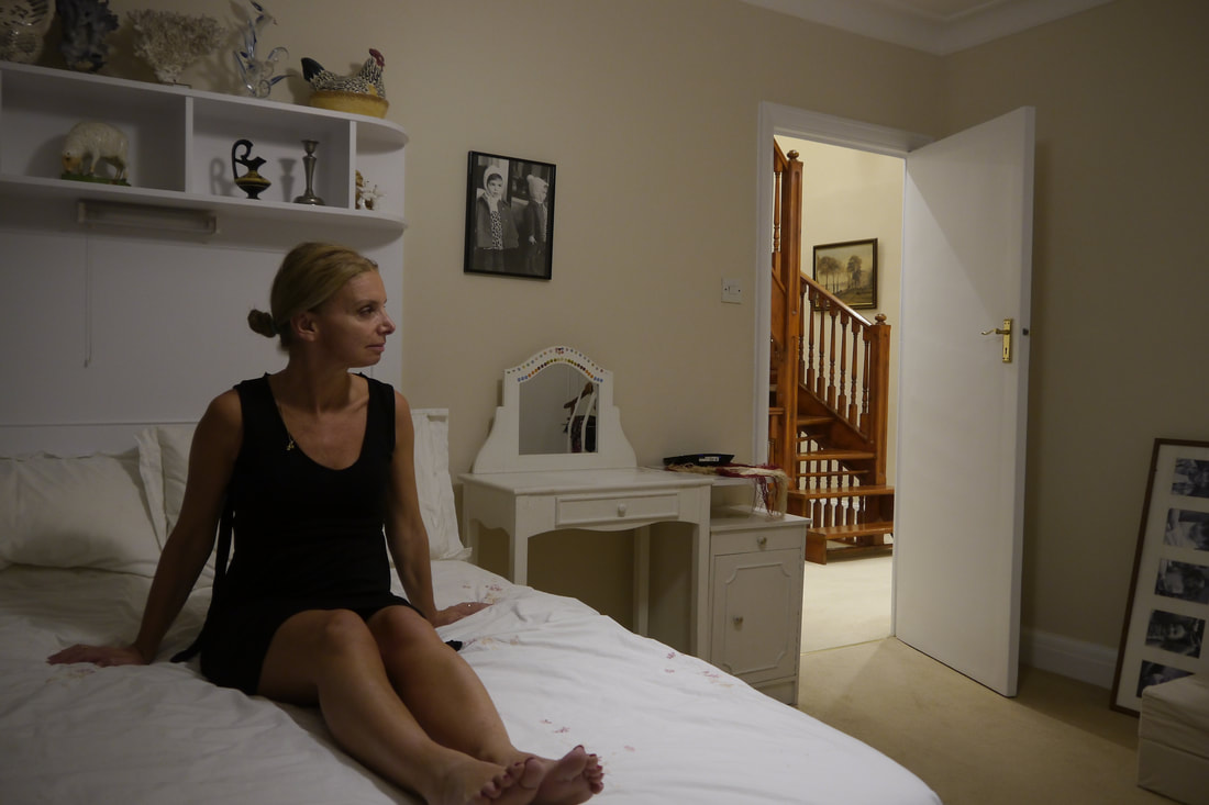
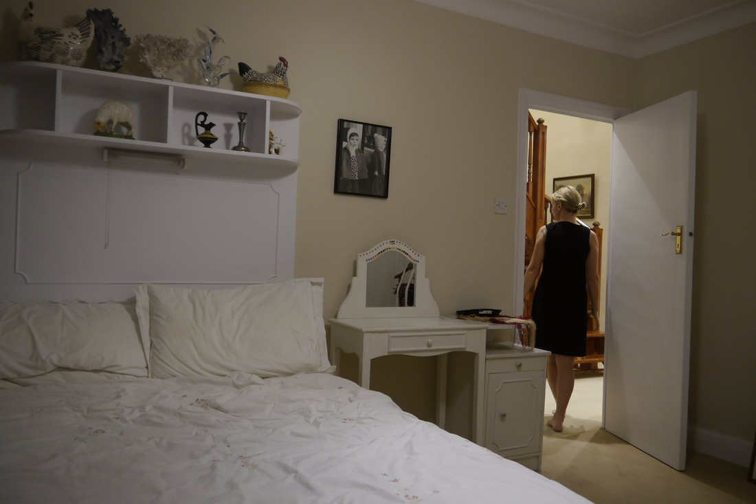
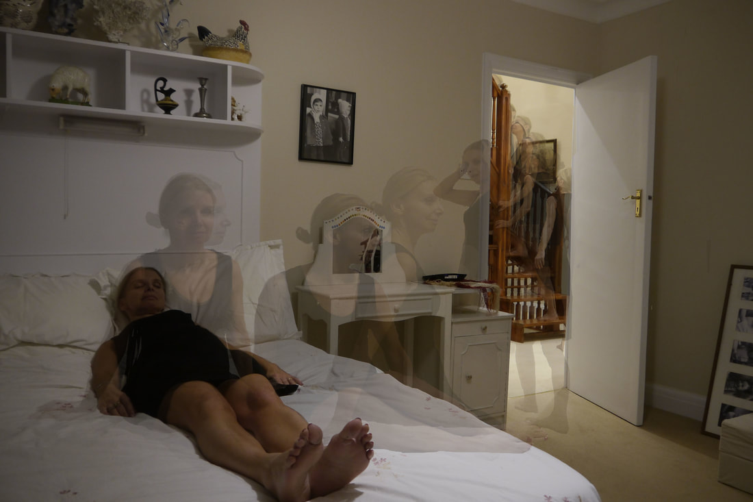
for my third response, i was particularly inspired by duane michal's studies on the soul leaving the body and spirits. this is shown in my first composition which could be interpretated as a women being consoled by her mother's spirit and in the second where the laying women's sould has left her body and is rising upwards on the staircase , which could be as interpretated as the 'staircase to heaven'.
www- a clear sense of movement in the body is shown in my first image, as i edited the pictures to overlap and took many photos of each action my grandma made, so that each movement she made is shown, and i prioritised my shutter speed blur and capture movement. in my second composition, i successfully captured details within the whole picture, through my manipulation of aperture to be high, for example f/ 20, which meant that the viewer can clearly see each of the figures movements and the setting of the picture as the staircase, bed and frames on the wall are clearly shown.
ebi- i feel that the lighting in both of my compositions are too warm toned and 'homely' as they do not reflect the narratives of the pictures, in the same way that duane michals' does, which are more bleak, dark and cold toned. and the low iso setting used, meant the figures' face was not lit in detail in either pictures. in addition, i did not use a tripod so when it came to editing in photoshop the frames of each picture did not fit together- making the editing process much more difficult. furthermore, i was not particularly happy with my final edits, as i used the complicated process of copying and pasting each image over the other, and the rubbing out the settings around each picture, layering them over each other and then changing the opacity. yet the body shapes are not accurately outlined, particularly in the second image, and the sense of the body shapes being layered over one another is not disillusioned to all be in one picture.
next time, i will take pictures without warm toned lights, to relect the bleak narrative, i will use a tripod to ensure that my compositions create the sense that just the figure is moving, rather than the frame itself. in addition, i will use a higher iso, so that more details in the images are shown, and i will use layer masks when next editing my narrative pictures to ensure it illudes that the movements made within the frame are all in one picture.
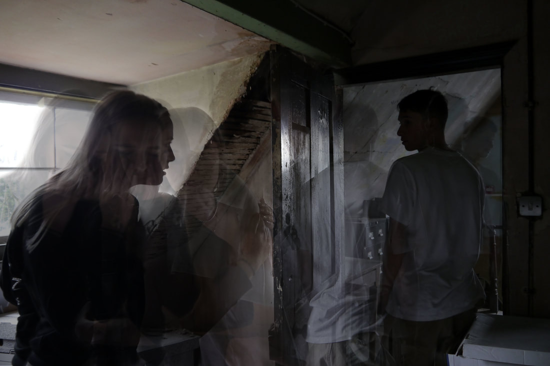
fourth response- narratives of heart break
|
|
|
analysis and evaluation
in this response, my intention was to respond to structure through the narratives of heartbreak and young love shown in the two edited pictures.
www- i felt that subject i chose to compose and photograph is relevant to the development of my strand as heartbreak is another aspect of the structure of life, i also felt that my technique i used of prioritising a high aperture to manipulate the depth of field into keeping the entire image in focus created depth to the pictures and captured certain aspects of the background/setting of both photos that i chose. for example, without paying attention to the aperture of my camera in the second picture, the reflection of light on the old, varnished door would not have been able a focus point in the picture, which i specifically like and think it adds depth to the photo, as it is a constant in the movement of the photo- thus expressing my intentions of creating movement and a story in a picture in a place that has not moved or changed. i also felt that this study was an improvement from my last response, as i felt the location of the old attick in these photos reflects the cold and bleak mood and tone of the pictures, whereas i felt that my last study was far too warm toned and had a sense of COSINESS which did not reflect the narrative it was portraying. the lighting in these pictures also IMPLIES a sense of tranquility and peacefulness in the room although in the pictures it shows that there was where sadness had happened.
ebi- i felt that specifically in the first image, the sunlit background and window is overexposed, and thus makes the faces too dark for the model's expressions to be seen, which then confuses the intentions of my narratives as the emotion in the picture is literally overshadowed. i then increased the lightness of the photos on photoshop, yet this gave it an unnatural look in correspondence to the background, especially in the far left image of nancy ( the girl model) clenching her hair and looking distressed. thus i really prefer the second picture, as it has more of a sense of movement and emotion.
next time, i will focus on making sure the faces in my photos are lit and i will ensure that the pictures are not overexposed so that the intentions of the images are not lost. i will also further experiment with different shuttle speeds of my camera, to possibly create images with a more blurred effect of movement, further inspired by alexey titarenko.
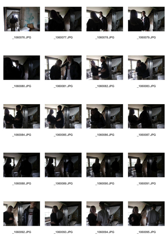
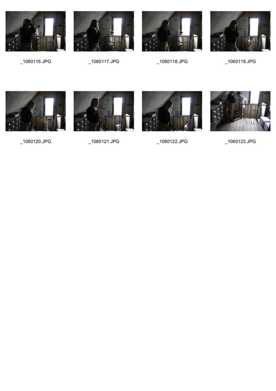
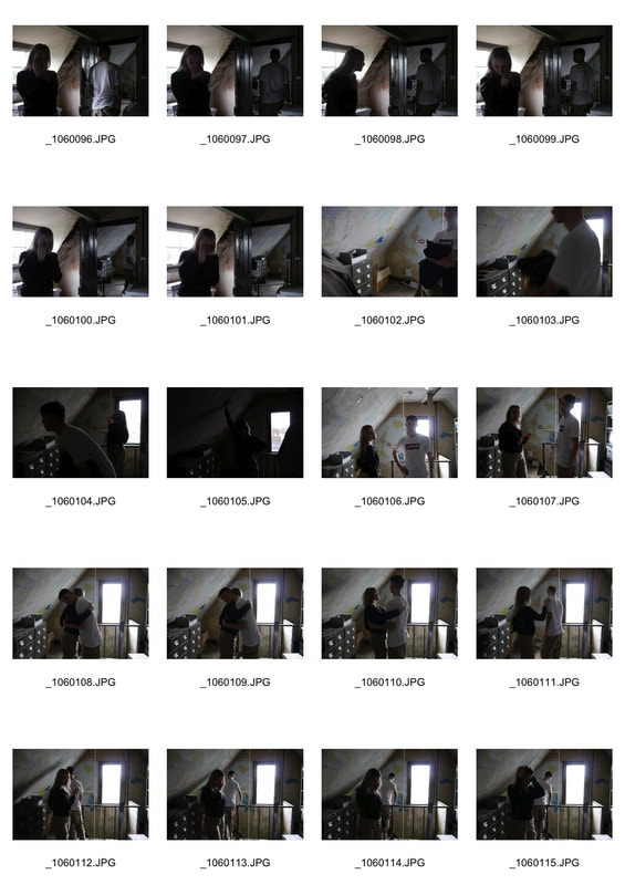
the process

|
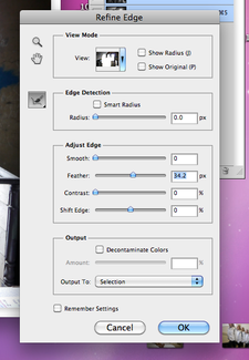
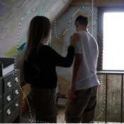
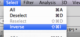
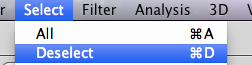
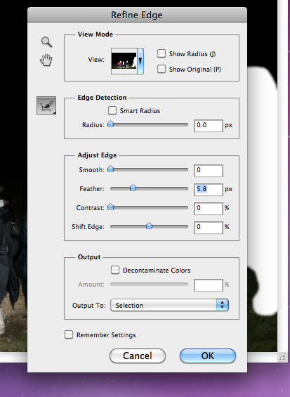
during the process of creating these narratives of young love's relationship breaking, i firstly copied my second picture over my background picture of them hugging. Then using the lasso tool i traced around their body, leaving a space around them.then i went to click Select > Inverse, and then i Clicked the Refine Edges button in the options bar. which brought up a box with further options. i then Moved the feather slider to give a soft edge to my selection. then i Press edthe back space button on my keyboard to delete the background, that had not been selected by the lasso. then i clicked Select > Deselect to remove the section. i had to do this to work on the next layer.
|
|

|
THEN I DRAGGED THIS LAYER ONTO THE MASK ICON, TO ADD A LAYER MASK. THEN I SELECTED THE BRUSH TOOL TO FADE THE AREA SURROUNDING THE FIGURES TO FIT IN WITH THE BACKGROUND LAYER. EVERY TIME I PRESSED 'X' THE BRUSH TOOL WOULD ALTERNATE BETWEEN ERASING ( A BLACK BOX ICON WOULD SHOW UP) OR BRINGING BACK THE IMAGE (WHITE ICON) |

|

|
|
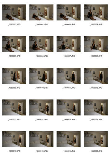
fifth response- narrative of moving angel |
|
|
|
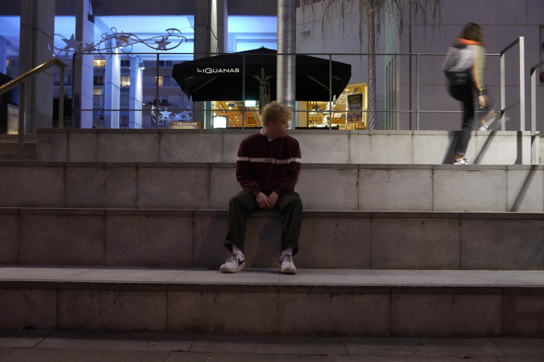
|
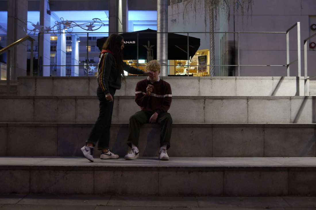
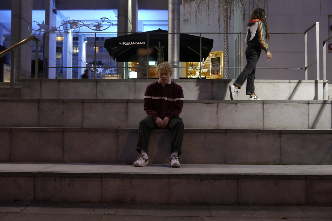
|
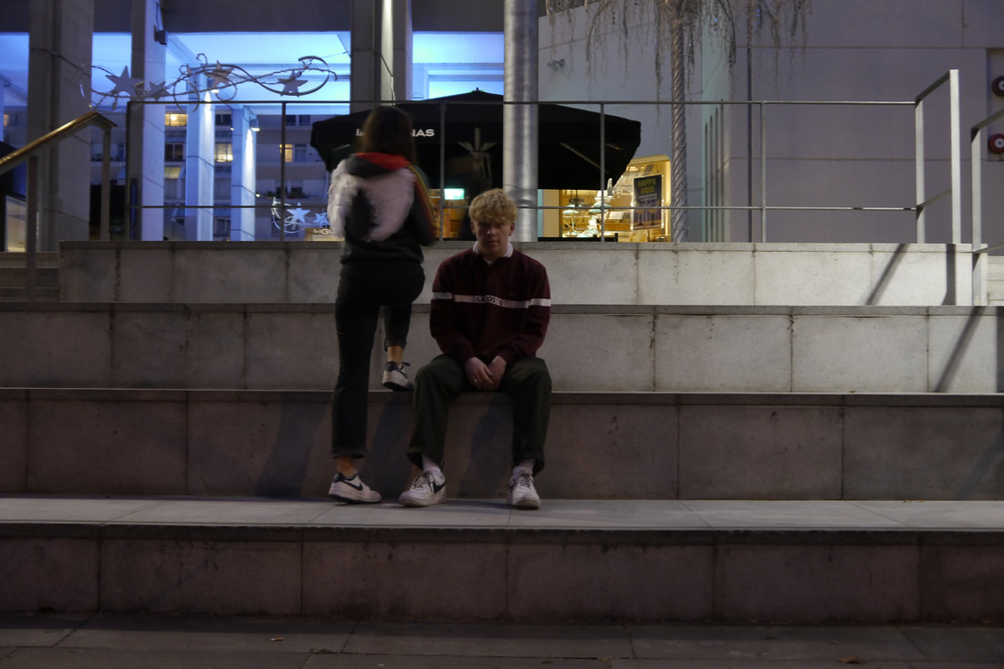
|
|
analysis and evaluation
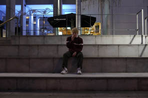
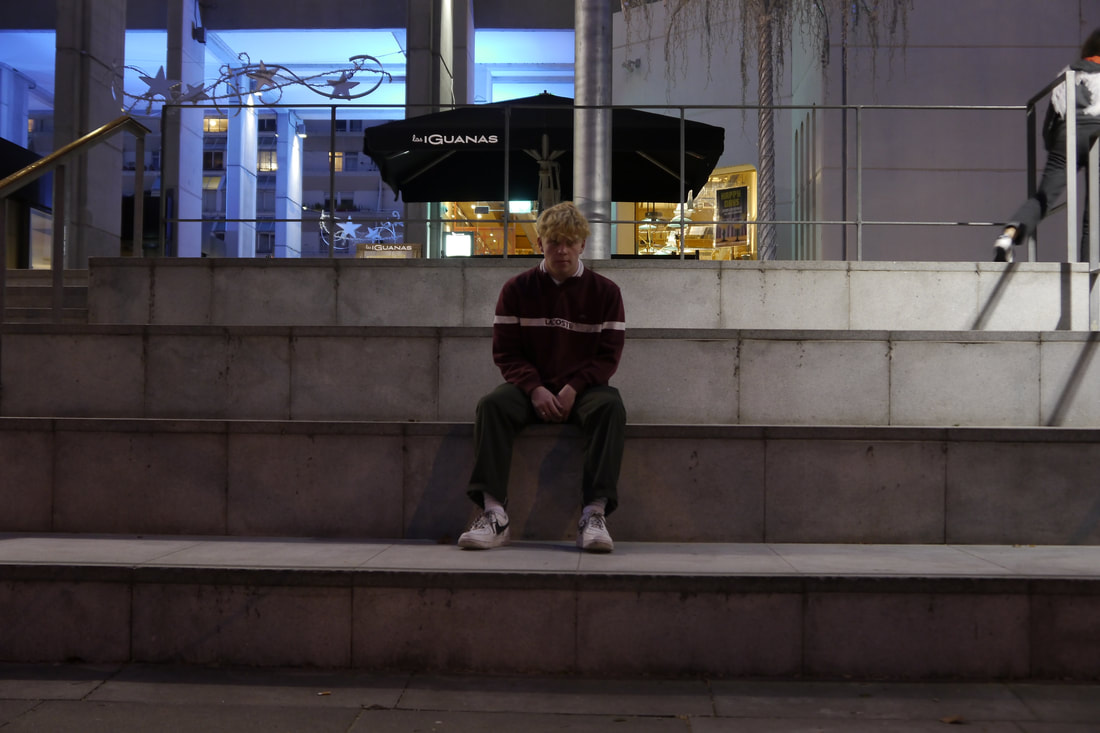
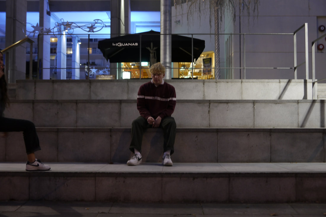
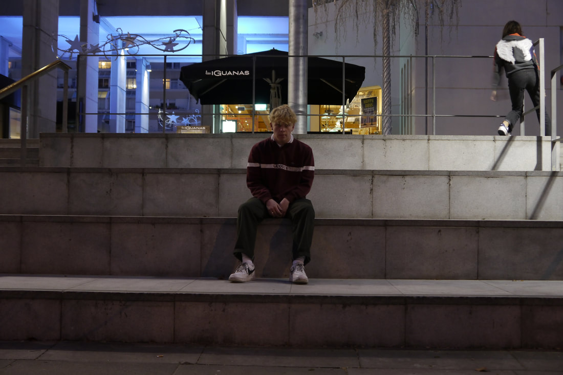
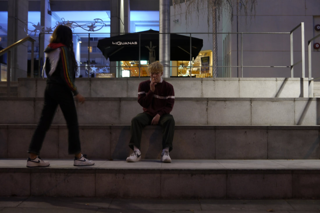
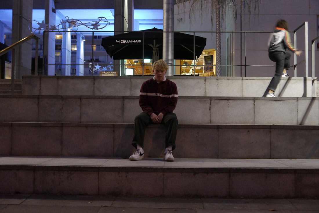
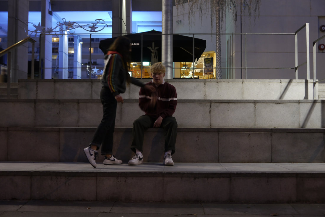
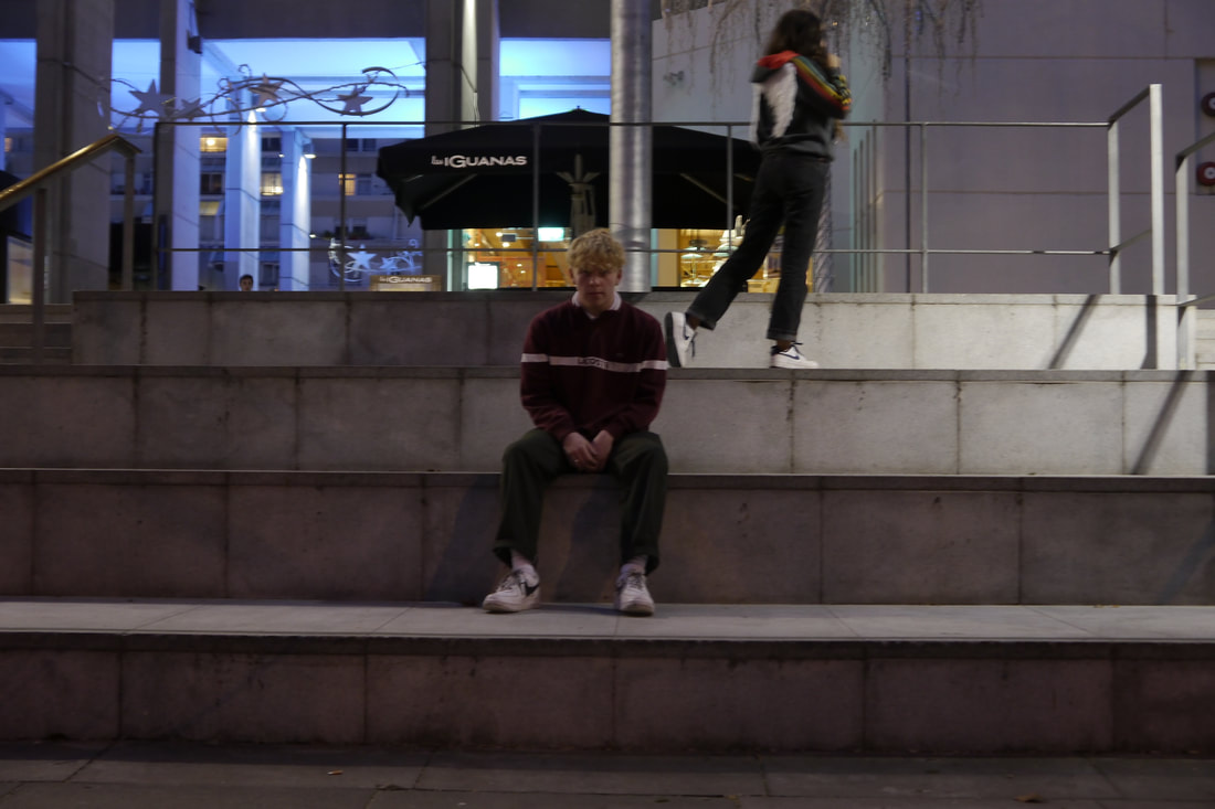
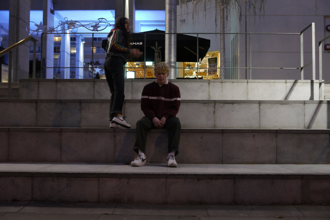
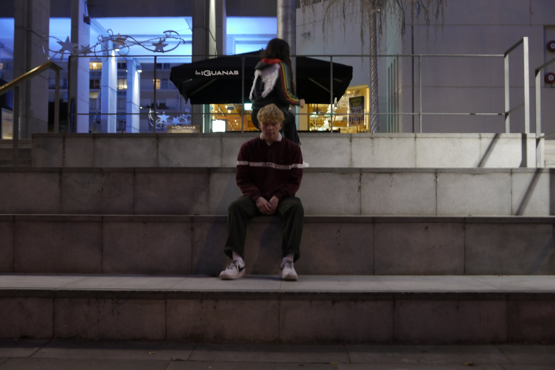
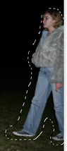
for my fifth response, i wanted to continue my focus to be on movement in structure in contrast to a frozen figure, as shown in my first COMPOSITION from my third response to the theme structure, and this image could be interpreted to have the narrative of a disapproved angel, as the boy is smoking, and then she rises away from him.
when editing these pictures into one composition, i used the same process on photoshop as i did in my fourth response, yet i started with one single image of the boy sitting on the stairs, without the girl in the frame, and then i pasted each picture of her movements over the first image of him.
www- my composition helped to show my response to the theme as it shows the changing structure of the girls figure in movement, as she walks around the boy and again, i took inspiration from duane michals' subject of angels, and narratives within pictures. i managed the exposure very well as my middle iso setting allowed me to capture the detail in the boy's face and the background, with the stairs he was sitting on being lit. this was also because of the MINIMUM APERTURE i used, FOR EXAMPLE F/22, as LESS LIGHT IS ALLOWED INTO THE CAMERA AS THE HOLE IS SMALLER- WHICH ALLOWS THE CAMERA TO FOCUS ON ALL OF THE SUBJECTS INSIDE OF THE FRAME; thus making the background as detailed as the front of the image. in addition i used a tripod to ensure that when it came to editing my pictures on photograph, combining them into one, that it was only the girls figure that moves across the frame, rather then the frame moving with her.
the setting also expresses my intentions which were to create a bleak setting, yet with faint glows and light, in order to reflect the narrative of the picture, for example it is lighter where the 'angel' is rising higher, in the top right corner of the frame. i also chose these concrete stairs, next to the brunswick centre in russel square as they contain SYMMETRICAL elements of brutalism, which is appealing to the viewer's eye.
ebi- yet the subject i chose to did not necessarily fit the brief of my responses to the theme structure, as the composition of my narrative is not particularly powerful nor interesting enough. and i did not create enough of a depth of field in this composition, as although the background holds detail equaly to the figures, i should have used LOWER THE F-STOP FOR EXAMPLE F/3 as THE LARGER THE HOLE IN THE CAMERA (APERTURE, the more it ALLOWS LIGHT TO REACH THE FILM TO COMPENSATE FOR THE DURATION OF THE SHUTTER CURTAIN TRAVELLING TIME THUS FOCUSING ONLY ON A SPECIFIC POINT OF THE PICTURE, OFTEN BLURRING THE BACKGROUND. this would have created a pin point effect on the figures, thus making the pictures focus be on the movement on the girl's body rather then figures and the background which made a flat image.
next time i will create a larger depth of field by using a lower aperture setting, in order to ensure that my final composition does to resemble a flat image.
|
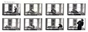
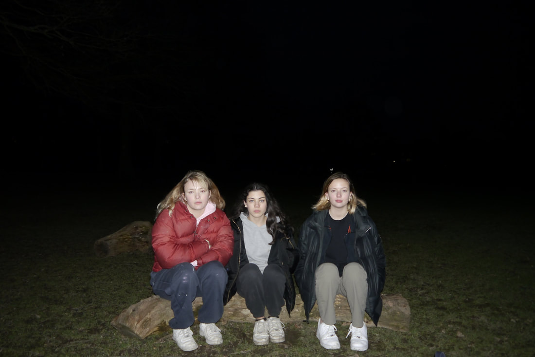
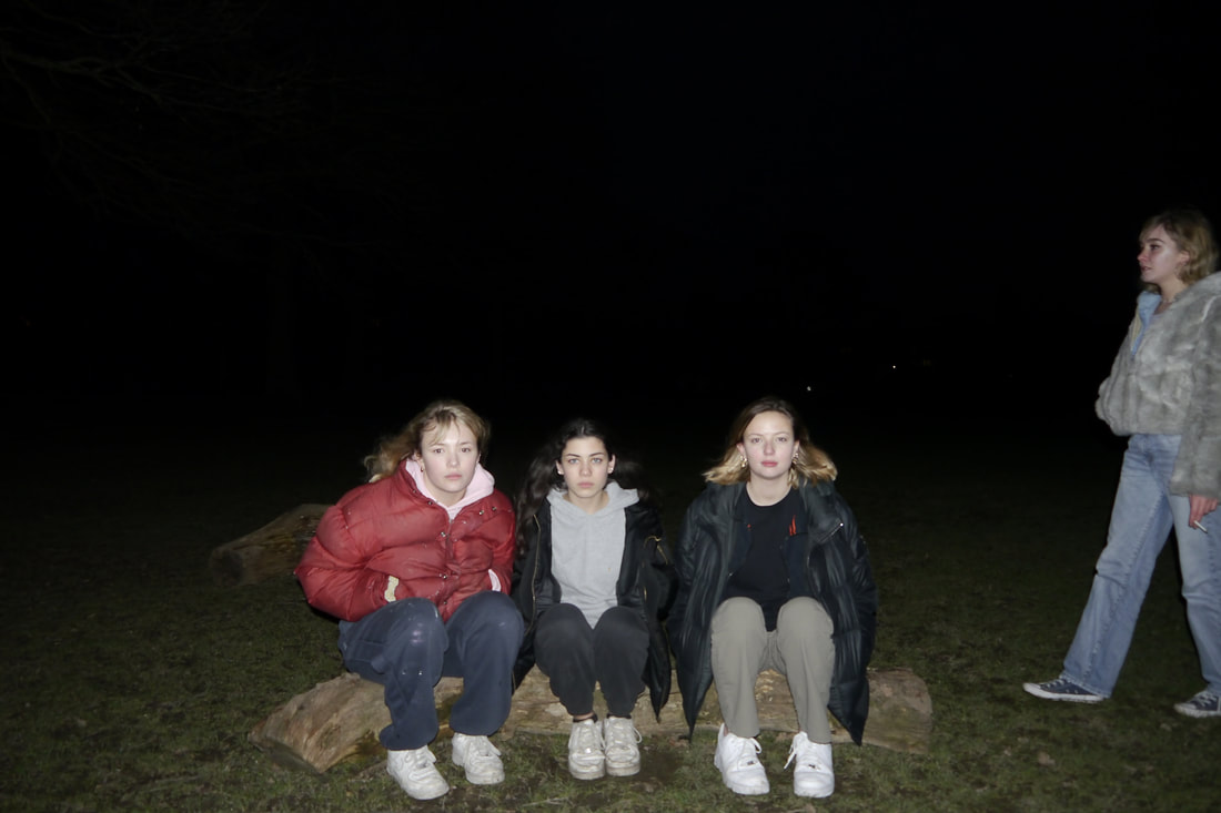
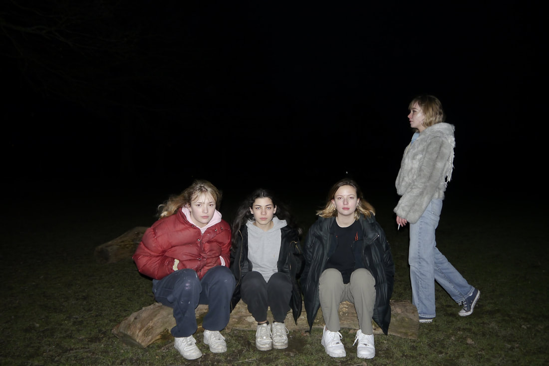
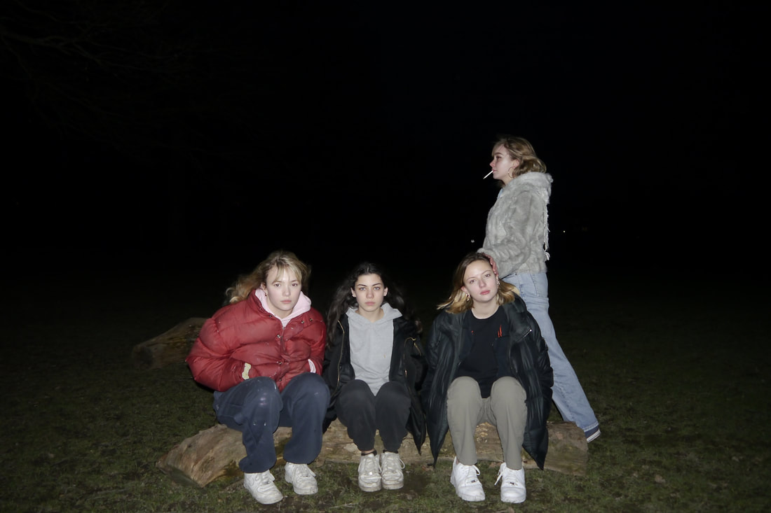
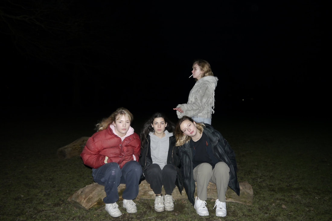
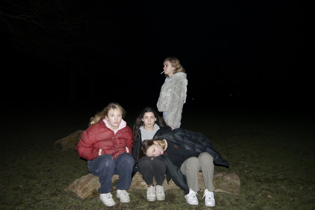
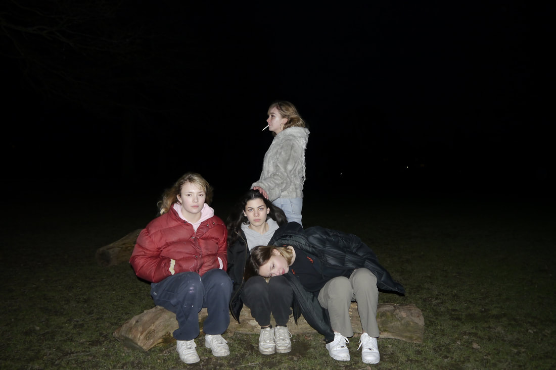
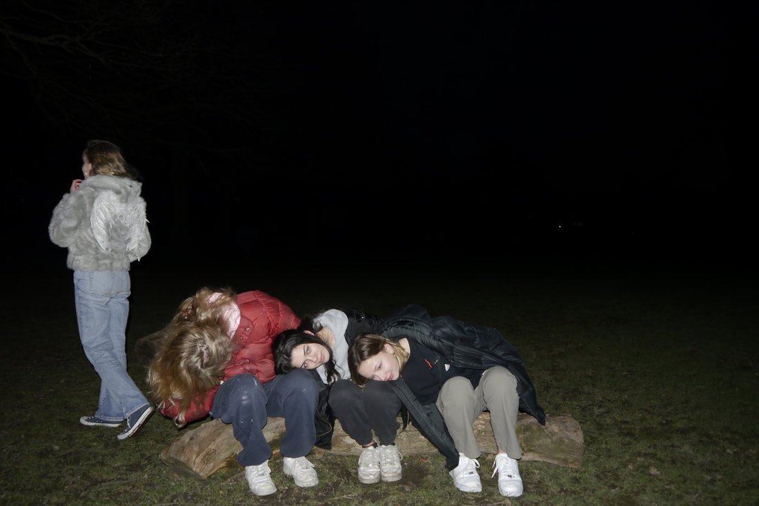
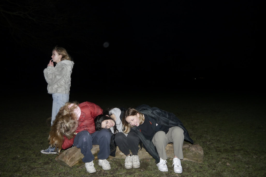
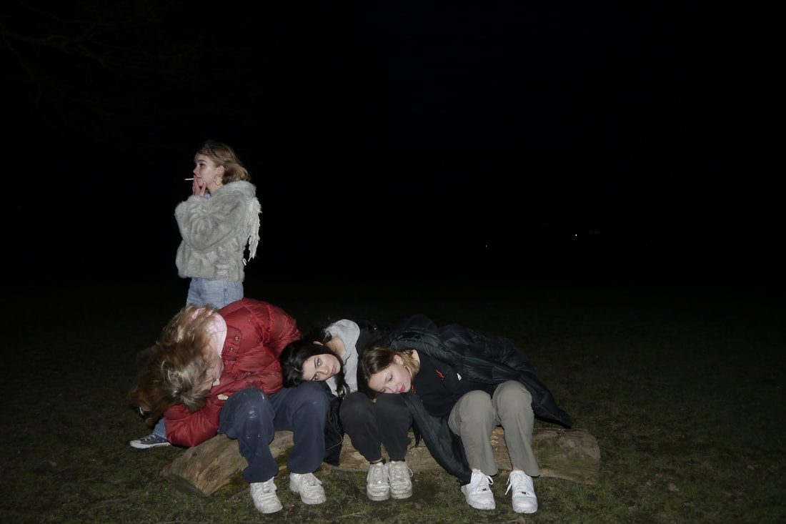
sixth response- narrative of the fallen angel |
|
|
|
|
|
|
|
|
|
|
|
|
|
|
|
|
|
|
|
|
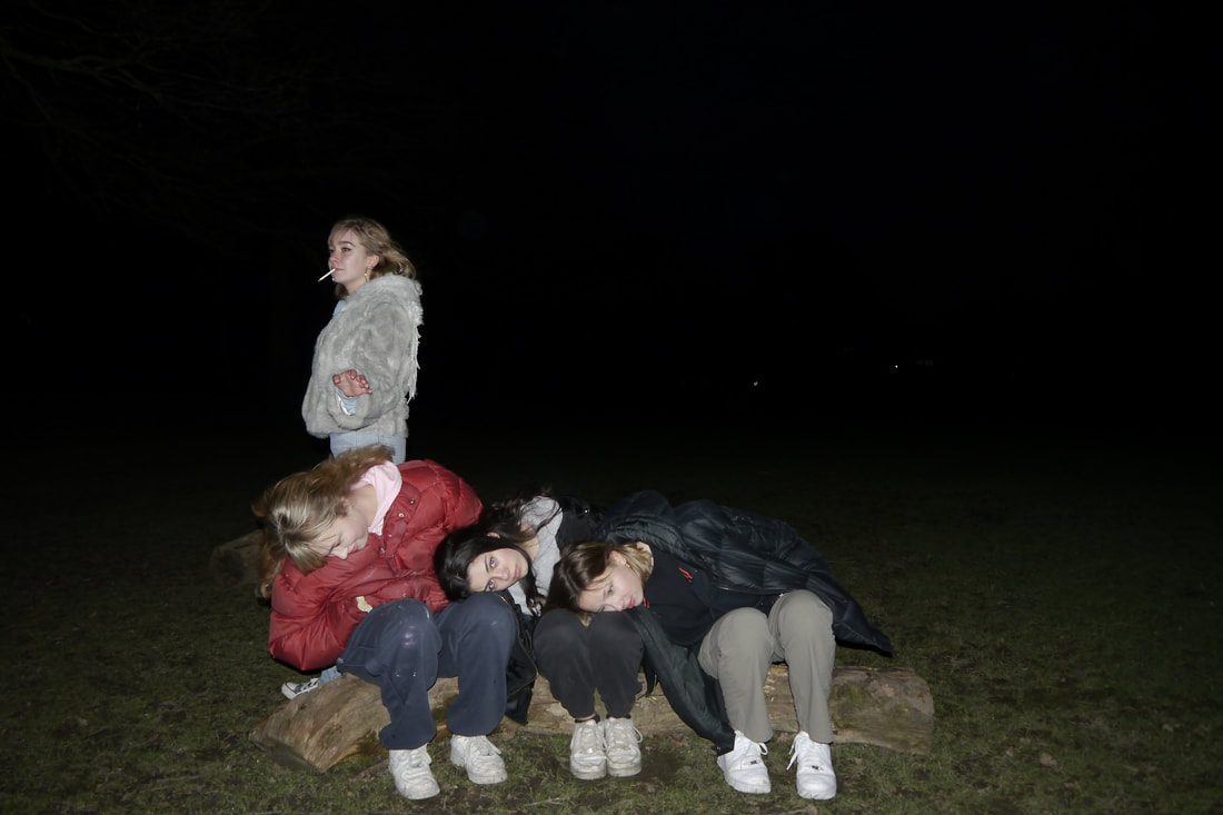
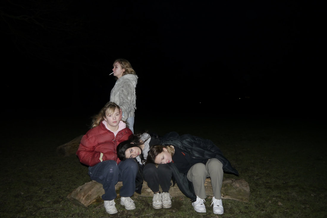
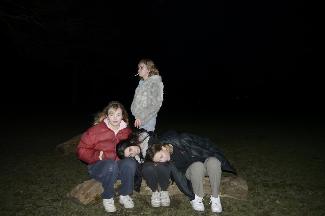
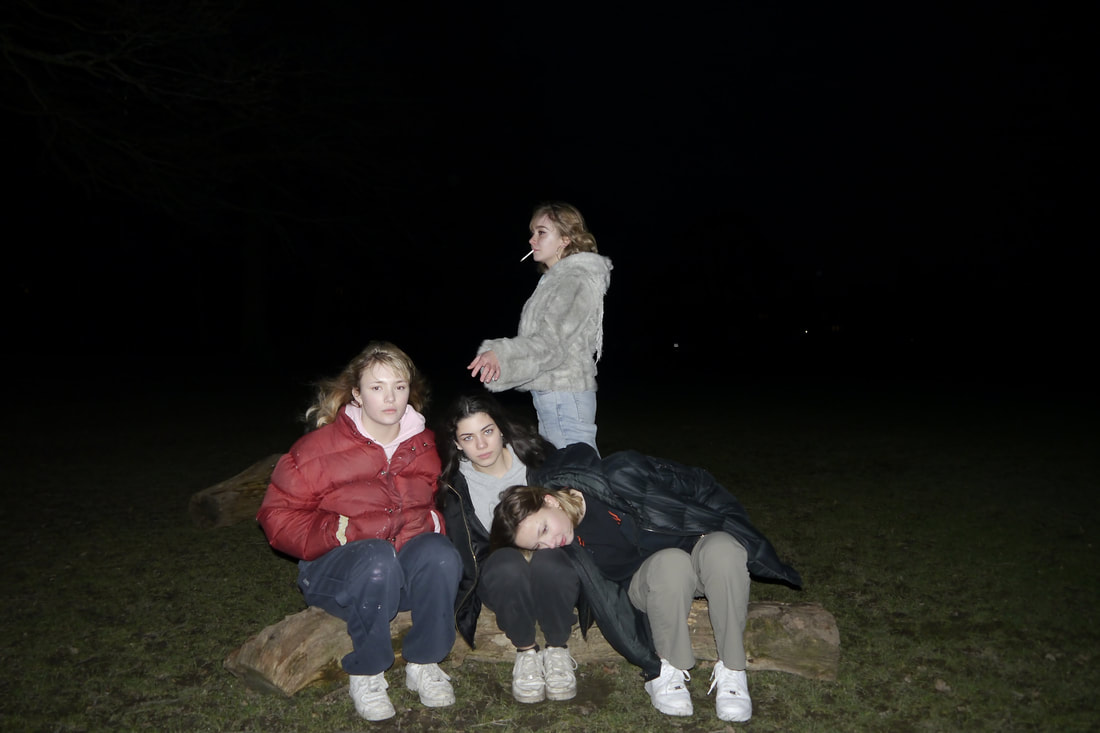
analysis and evaluation
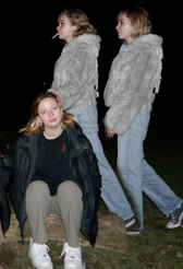
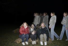
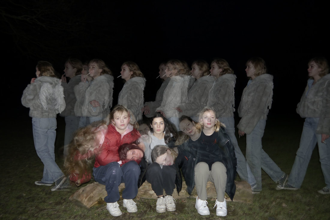
this response links to the theme structure, as it shows the movement of structure in the models as the girl walks along the back and the three girls on the log move their body into lying on each others laps as the girl along the back pushes them into doing so. when creating this composition, i repeated the process used in my fourth response.
www- although this is the most posed and structured picture out of all of my compositions so far, its clear sense of movement created, emphasises its relativeness to the theme. i successfully managed my intention to capture each movement in detail, as i prioritised my shutter speed to capture each frozen moment in each picture, and through my aperture settings i manipulated the depth of field to further capture the detail in each figure as they moved. in addition as i took the pictures at night, i successfully created a contrast between the figures and the background, as i used flash so that each of the models stood out and their movements were clearly shown, i also used a tripod in order to avoid the camera shaking so that it was the figures who moved and not the setting.
ebi- the subject matter i chose to photograph does not necessarily tie in with my other responses to structure, as although there is a clear sense of movement in the final edit, it could be INTERPRETED to not have a clear narrative. and next time i should go to the park to photograph at a different time of day, possibly just after sunset as a bleak sense would still be created and the models would still stand out in contrast to the background as the sky would be darkening, yet there would be more depth in the picture as in the final edit it looks rather flat, as the background is underexposed.
next time not only will i photograph at a lighter time of day, i will look further at the work of alexey titarenko in order to created a more blurred sense of movement in the picture.
|
final response- the narrative of the rising angel
|
|

|
|
|
|
|
|
|
|
1) |
|
2) |
|
3) |
|
4) |
|
5)
6)
artist &me
duane michals
|
explanation and analysis of my final pieces.
|
